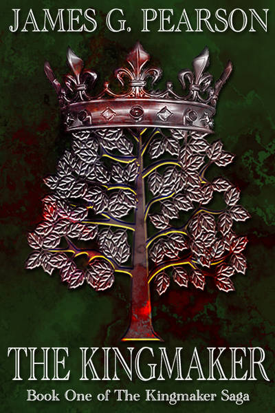
Certainly eye-catching. My first impression is that, based on the cover, the story is a political drama. A blood soaked tree, so there's infighting for the throne perhaps? Nice cover, I think it's intriguing.
The crowned silver tree makes me think major kingdom. I associate that image with Gondor, actually. Then it being soaked in blood makes me think war. Kingmaker sounds like Kingkiller, so I do associate with ASOIAF a little bit, making me think something close to civil war. So a major kingdom torn apart by civil war? I'd read that based on the cover alone Nice job.
That's brilliant! It's what I'm aiming for. There is war, conspiracy and intrigue within the book. The crowned tree is the symbol of The Kingmaker, a line of legendary soldiers. The books protagonist is the last in the line.
Great cover; however, I'm not sure the "Book 1 of the king maker saga" is at all necessary, aside from being slightly unesthetic. This being said, the golden contours of leaves are amazingly well done, and the general result is quite compelling.
Thanks, Nagash! The only reason I've put the "Book 1" is because there will be a series. Nine books in total, spanning three generations. Not sure what else would be better, or a better way of saying it.
I do agree with those who felt it unnecessary to include the words "saga," book one would be better in my opinion. For me personally I have to get hooked on the first before I care how many come after. It can be overreaching for an author who is not yet established. If that makes sense...
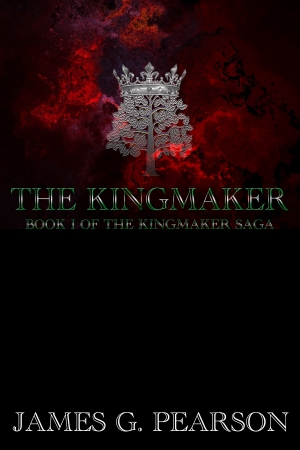
I liked the first one better. I didn't see any synopsis or such about the story, but if that's supposed to be blood on the tree and crown then I'd try a different technique to make it look more like blood. Like psychotick said, the second one has a big blank space and the red is too bright.
That is strange. Since I changed the cover to this, sales have gone up by 50%. I agree about the blank space, I'm pondering on what to put in it. Or if I should just make the text larger.
It's very attention grabbing, personally the only thing I would change is the brightness of the yellow. I's a little off putting to me. But, that's just a minor little nitpick in my very amateur opinion . Overall I would definitely look twice at this book in a store.
The second cover is better than the first. Not great, but good. It feels a bit empty or undynamic, however dramatic. The first looks tacky, like a gold tooth (unless you do that cover in embossed foil, in which case it might kill).
But you can't have the book title and the series title be the same thing. It's weird, like calling your band James Pearson and the James Pearson Trio (feat. James Pearson).
Kingmaker is good as a title, provided others in the series echo it somehow (Queen Maker, Thief Taker, Ring Breaker, King Finder, etc.). The series title should be more evocative as well, such as A Song of Fire and Ice. Be epic. Or leave it out altogether and title book 2 like a movie: Kingmaker: The Reckoning or Kingmaker: The Unkinging.
Looks sweet, and I like how it does not appear too digital. That really adds to the whole feel of it being an archaic, medieval kingdom. Did you make it yourself?
 Scribe