• Welcome to the Fantasy Writing Forums. Register Now to join us!

Anybody care to share their map?

cariadhe

Dreamer
I noticed the references to Celtic or Nordic or whatever-it-is mythology and the Bible :) Japheth and Sheba and Ishmael, oh my! I know, it's corny. I'm tired.
 

Johnny Cosmo

Inkling
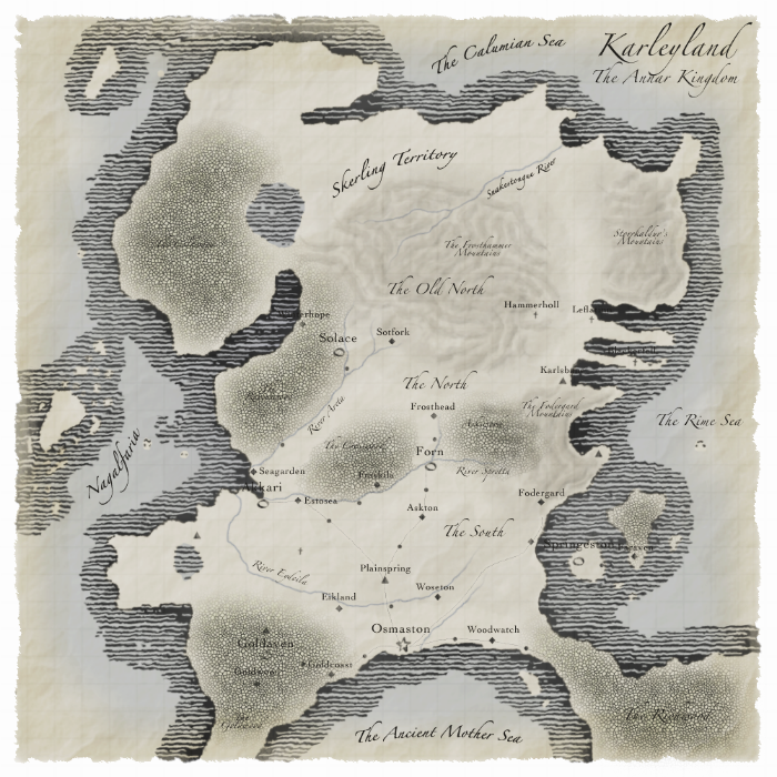
Here's my latest map. It's not finished yet; I know there's not many labels, the ones that exist are hard to read as they've not been placed properly, the 'mountain' texture is a bit rubbish, and the trees aren't exactly great. Still, I like the style (it reminds me of the in-game Oblivion map). Oh, and it's been resized from 1000x1000 to 700x700 so it fits the post window.

Edit: Image deleted in this post because I'd posted about a million versions. So scroll down...
 
Last edited:
Wow, that's really awesome Johnny! I really don't mind the trees, although I will admit the mountains aren't quite defined enough. They are a little hard to recognize without a close inspection. Still, great map!
 

Telcontar

Staff
Moderator
Nice map, but yeah - that mountain texture blows. ;) Looks like snake skin. Water looks good, especially the divide between coastal and deep ocean.
 

Johnny Cosmo

Inkling
Ha, either snakeskin or as if I've spilt water over a few bits of the map. I might end up going for drawn representations of mountains, like my previous map (way back in this thread). My only issue with the trees is that they don't seem to match the 'hand-drawn' style that well, otherwise I think they're okay. Here's an update... are the mountains any better?

Edit: I've been tinkering all night, so I thought I append my progress. Fantasy cartography is addictive. I've altered the size of the tree patterns, deleted the borders so that it's clearly open sea beyond, started to tweak the labels (but not by much), altered some of the colours, added a grid (1 square = 50 miles), and deleted the line border so that the water and land come together in a tidier fashion (I also like the way the lakes and the islands to the west look without borders... very natural I think).

Papermap-3-1.png
 
Last edited:

Telcontar

Staff
Moderator
Whoops, seems I mistook the forest for the mountains! Nevermind the snakeskin comment...

New texture does look better, but I'd suggest going with the typical ^^^ type mountains. They're time-honored and they work just fine.
 

Johnny Cosmo

Inkling
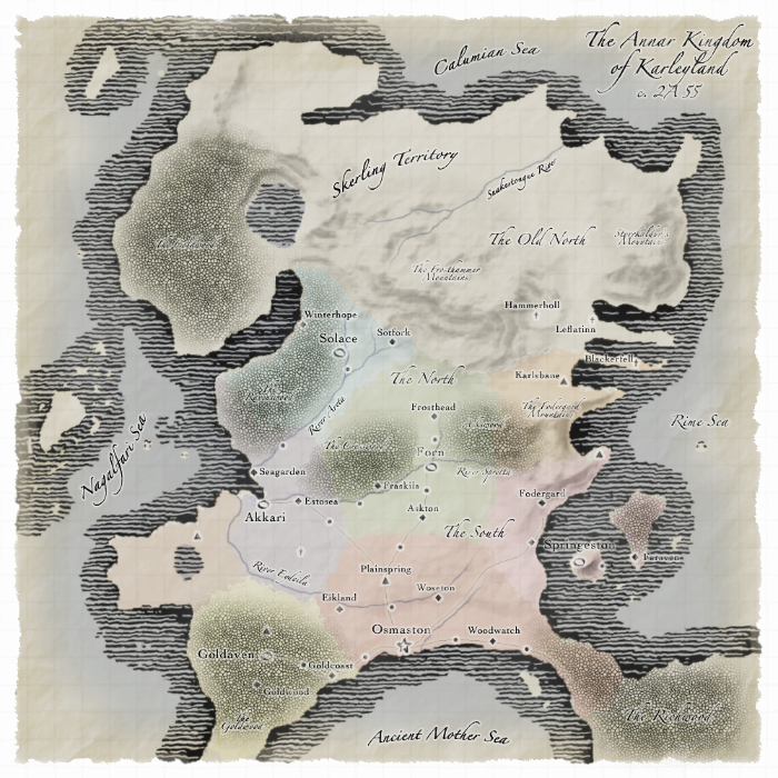
I didn't really want to do that. I tried it on my last map (a few pages back), but I'm hopeless at making it look natural. Perhaps I'll mess around with something like that another time, but not yet. I do have an update on this one though. Anyone got any opinions on the mountains? Also, any suggestions would be welcome...
  • Mountains much improved, I think. They look semi-realistic, whilst still retaining a sort of painted look.
  • Some text has been placed and highlighted better, but the labelling is still no where near finished.
  • I thought I'd create a coloured regions layer. It won't be on my final map. It's more for personal reference (but I thought I'd better mix things up a bit here...)
  • Some other small tweaks that are hardly noticable, but let me rest easy...
PaperMapColoured.png


Sorry guys! I seem to be abusing this thread as my own map-making journal. Perhaps other people should join in and walkthrough their process in the thread. I'm sure we could all learn a lot.
 
My process is, I can't draw for shit and don't really want to learn. I'll hire somebody to make my map the same as I'd hire someone to make the cover art. :)

Say, Johnny, you ever consider taking a commission? If my world map looked half that good it'd be plenty good for me :)
 

Johnny Cosmo

Inkling
I'm still only really a beginner, but I'd be happy to help other users out if I can. It'd have to be in my own time of course... I'm pretty slow at it.

I'm sure there are others far more capable on these forums that might like to help out too. Perhaps it is something we can explore if a cartography forum gets going.
 

Telcontar

Staff
Moderator
Ah, yep, that's done it Johnny. Those mountains look good. Now all that this map is missing is little stylized sea monsters haunting the deep part of the ocean...
 

Johnny Cosmo

Inkling
Now all that this map is missing is little stylized sea monsters haunting the deep part of the ocean...

That's if my world includes sea monsters, of course. ;) And I've not actually got much space to draw any bits of art on the map... when all the names are on their it's going to be a packed.
 

Telcontar

Staff
Moderator
Bah. I'm talking about the time honored tradition of fearing the edges of the map - OUR historic maps had such sea monsters, and would you say our world includes sea monsters? Perhaps you could, but certainly none that troubled actual travelers...
 

Johnny Cosmo

Inkling
Actually, you do have a point, considering the style. I was originally thinking of my map as just a personal reference, but I guess it looks more like an in-world map now. There are very dangerous seas too, come to think of it. I might just do that if I can find the space.
 

Jabrosky

Banned
I modified my story-in-progress (which is now titled Godstone) and so have modified its world. The place names you see on here are temporary placeholders until I can think up more creative names, but they should give you an idea of each culture's real-world inspiration:

godstoneworld1.jpg

If someone could make a prettier version of this map or suggest some creative names for each of the regions, I would greatly appreciate it.
 
Top