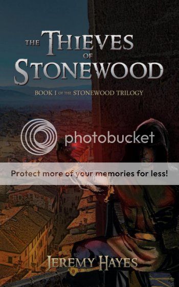
Hello. I have written a fantasy novel titled "The Thieves of Stonewood". Just thought I would post my cover here to get any feedback. My book goes on sale by the end of this week
I love what you're trying to do with it, but there's something that isn't working. You've got five elements to the image:
- Background. Beautiful, don't touch it.
- Dark figure. I think you should increase the contrast/brightness. He needs to look dark without completely fading away, which is happening even at full size. In a thumbnail he's easy to miss entirely.
- Bright arm. Great concept. It helps draw the eye towards the center of the image. I think you should make it more clear that it's bright because of the red light. Try adding some shading on the bottom half of the arm and heightening the red tones.
- Dark glove. It looks like a blurry blop in the middle of the screen. Try sharpening it and increasing the brightness. It looks bad but might be easy to fix.
- Red gem. Great touch. But it's also way too blurry and dark. I think you should give the gem more definition and also pick up the amount of light it's giving off. You're not delivering on the effect you're after the way you have it.
Nice font for the title. The author title gets lost just slightly - maybe try the next size up.
The text looks too... uh... lonely. All the text is perfectly placed around the center, with a huge margin, and it's bothering me a little that the top of the cover is being wasted. At the same time the "book I of..." reads more like a subtitle, for it's placed right after the title.
You can kill two problems with only one solution. Move the text about the trilogy to the top, before the title, and, maybe, do it a little smaller or the title, slightly bigger.
I mostly agree with Devor, but I don't think I would touch the author text size, or it will become more prominent than the picture. The balance is good right now, you could reduce the gradient instead, everything is so shaded and soft that a solid color text would pop out.
Hey thanks for the input guys.....it's tough to work with the character though...I wanted it kinda dark purposely. The character was a drawing my best friend did over 20 years ago...just a picture he drew with a pencil and coloured with pencil crayons...probably only took him about 10 minutes....he died many years ago so it really meant alot for me to use one of his drawings for my cover. In fact I will be using his artwork for all three covers. But...making the drawing brighter just made the imperfections more visible...so I figured making it darker would help it blend in more with the stock photo of a real town that is the background.
But...making the drawing brighter just made the imperfections more visible...so I figured making it darker would help it blend in more with the stock photo of a real town that is the background.
The quickest way to make the character noticeable is to increase the backlight and drop some more light on his upper body. Since it's a night scene, it must be turned to blue as well.
I've made a quick example (not sure of the color accuracy of this laptop). If you want the .psd just ask, I'll keep it for a day, but it's a little messy.
I have the proof copy here and it looks much better in print form. Things become a littler "duller" and it's a little darker than the photo here. The character and the background blend in much better
Hey Nihal...that looks pretty good. I like the glow around the gem...very nice job. Alas for me the book is on sale and I have ordered tons of copies already...
 Dreamer
")