-
Welcome to the Fantasy Writing Forums. Register Now to join us!
You are using an out of date browser. It may not display this or other websites correctly.
You should upgrade or use an alternative browser.
You should upgrade or use an alternative browser.
my first attempt
- Thread starter Trebor
- Start date
That's not bad for a first try.
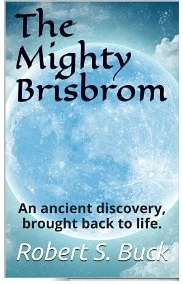
I would say that it's very imbalanced. There's so much at the top and bottom that my eyes are drawn to the middle, even though there's really nothing there. I would suggest:
- Make the moon smaller and use it in the middle area, or else add something to that region.
- Simplify the top by fitting the title to one, or at most two lines.
- Tinker with the font or size of the subtext to give it less focus. Consider moving it just below the title.
- White author title running into the corner of a white cloud - it needs to pop just a little more. That might be as simple as a sharper shadow, but you might need to tinker with it still more than that.
Good luck!

- Thread starter
- #3
I'd also suggest using two fonts rather than three.
Addison
 Auror
Auror
My guideline for cover art is think original 'art' before 'cover art'. You have a moon in the background, its size, placement and circular shape are eye catching. Use that to draw the eyes to the cover and other writing. Use curved lines, lines of motion, to draw the reader's eye from the title, to the moon and down to your name.
thejdubb02
 Dreamer
I agree as well that is a bit off balance but over all its very nice and clean.
reduce the scale for 'the' and add dark at the bottom to balance the dark at the top. it would pop more if the title and author lines were the same colour, more balance. and the byline could be one line, instead of two.. I think it may be too dark. it is pulling at the eye... I would tab it (the byline) in to attract a bit more attention to the main title and author.. have you tried adding a bit of yellow green to the sky around the moon to make the moon pop out more? that would make it glow a bit more. What about a silver shadow upon white lettering for author and title ? charcoal byline. I really like it. what you've done is great. it looks cool. should be super with a bit of finessing.
- Thread starter
- #8
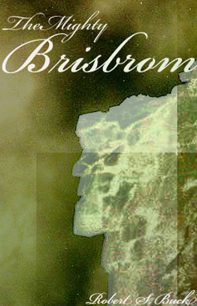
I don't know why you switched, or if you should go back, but I would say that this version doesn't work.
I don't know how to say this, but is that supposed to be a face jutting out of a landmass? I think the other version was much more workable.
I don't know how to say this, but is that supposed to be a face jutting out of a landmass? I think the other version was much more workable.
Abbas-Al-Morim
 Sage
Sage
Is it just me or does the image look very pixelized? You should try and get a more hi-def version. I must admit I prefer the original cover.
- Thread starter
- #11