-
Welcome to the Fantasy Writing Forums. Register Now to join us!
Recent content by risu
-

Anthology On Sale
It's almost been a year since FULL DARK: An Anthology was released, and to celebrate, the price has been dropped to $0.99 and will remain so through the month of October. All of the proceeds are donated to the Gary Sinise Foundation, a charity that helps active military, veterans, and first...- risu
- Thread
- Replies: 2
- Forum: Self-Promotion
-
I don't think I can send you .docx files via the forums. Do you have an email address I can send...
I don't think I can send you .docx files via the forums. Do you have an email address I can send it to?- risu
- Profile post
-
-
Have the blog, learning how to find similar bloggers?
Hey Gabriella! I was poking around the forums and saw your post. (I'm such a terribly inconsistent lurker, I tell you.) I know it's been a few months since you posted this, but I figured I'd throw out what I found helpful for me. A few years ago, I started posting with the Insecure Writer's...- risu
- Post #3
- Forum: Writers on the Web
-
Series Covers
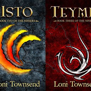
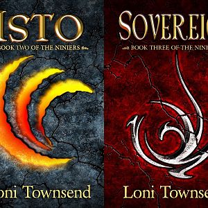
Alright, say I change the title and treat all the titles the same, which includes making books 2-4 titles all the same font size, having the light come from the same direction, having them all be the same shade of yellow, and not adding any cover-specific glows. Thoughts? Revised covers for...- risu
- Post #8
- Forum: Cover Design
-
Revised covers for uniform title treatment
- risu
- Media item
- Comments: 0
- Category: Cover Art
-
Series Covers
There's not another name that really fits with consistency of theme. In book one, the conflict is a war between Thanmir, in book 2, it's that istos are killing everyone and one character is turning into an isto and is fighting her nature, in book 3, a character from book 1 (he is referred to by...- risu
- Post #7
- Forum: Cover Design
-
Series Covers
Great observations. The titles of Books 2-4 are all the same height (for consistency) with the subtitles all in the same place for each image, thus why Sovereign got squashed. Isto and Ninier are actually unmodified for their font size, it's just that Ninier has more skinny lines for the letters...- risu
- Post #6
- Forum: Cover Design
-
Series Covers
Hi all! I just redid the cover for the third book planned for my series, and I think I'm at a spot where I'm finally happy with it. So I figured I'd take it to you guys. Thoughts? Criticisms? Loni Townsend - Sovereign by risu posted Oct 13, 2017 at 12:16 PM I've only completed writing the...- risu
- Thread
- Replies: 9
- Forum: Cover Design
-
Loni Townsend - Series small
- risu
- Media item
- Comments: 0
- Category: Cover Art
-
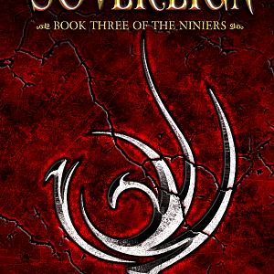
Loni Townsend - Sovereign
- risu
- Media item
- Comments: 1
- Category: Cover Art
-
The Dotard
I agree about the white glow on the text. It's overpowering and distracting. You could try a solid outline around the text rather than a blur behind it.- risu
- Post #3
- Forum: Cover Design
-
The Wolves of War
The picture is engaging, but the title is hard to read, as it really blends in with the fur. I think it's the combination of color and texture. For the back cover, have you considered a transparent black overlay for the image? Maybe black, but transparent enough to still see the wolf eye. I...- risu
- Post #4
- Forum: Cover Design
-
Legends of Mythrous Strange Lands
On first glance, I thought it was a topless pineapple. :( Sorry.- risu
- Post #4
- Forum: Cover Design
-
Character POV chapter writing
I know Eye of the World by Robert Jordan, published in 1990, used multiple POVs, some POVs having a chapter to themselves. Is that what you're asking? The Eye of the World - A Wheel of Time Wiki - Wikia- risu
- Post #2
- Forum: Writing Discussions