-
Welcome to the Fantasy Writing Forums. Register Now to join us!
You are using an out of date browser. It may not display this or other websites correctly.
You should upgrade or use an alternative browser.
You should upgrade or use an alternative browser.
Here's mine. I know it will probably still need more tweaks. I think I'm getting there though.
- Thread starter K.Hudson
- Start date
Prince of Spires
 Istar
Istar
The link tells me I need access to the document (and don't have it)...

CupofJoe
 Myth Weaver
Same here.The link tells me I need access to the document (and don't have it)...
- Thread starter
- #4
K.Hudson
 Scribe
Okay I'll try something else
The link tells me I need access to the document (and don't have it)...
- Thread starter
- #5
K.Hudson
Scribe
I wish they'd just let you upload an image. I'll have to find a place where I have an actually useable link and come back.
This one should definitely work. I tested it in a dfferent browser and a different device that are not logged in:
https://www.dropbox.com/scl/fi/lqnzg6z11av9rwwqm1j0k/Cover1.jpg?rlkey=k93mn8xunibkxyzu3pmgea845&st=qpz4icqv&dl=0
This one should definitely work. I tested it in a dfferent browser and a different device that are not logged in:
https://www.dropbox.com/scl/fi/lqnzg6z11av9rwwqm1j0k/Cover1.jpg?rlkey=k93mn8xunibkxyzu3pmgea845&st=qpz4icqv&dl=0
Last edited:
pmmg
Myth Weaver
Sorry K. Could not open it.
pmmg
Myth Weaver
Yes scribes does not have great tool for posting images. You have to make a media item to do it.
- Thread starter
- #8
K.Hudson
Scribe
Well, I made the central part of it, my profile pic at least, until I can figure this out.
What I'll end up doing is just logging back into imgur.
I find, for some reason, so many websites have made it harder to share links of your images. You used to just do mypic.jpg as a link, but now there's this webimage bull they set up for some reason. Probably for the sake of IP laws and AI scraping or something like that.
- Thread starter
- #9
K.Hudson
Scribe
Could also try my substack. Why not? I did post my cover on a note there.
 substack.com
KHudson (@khudsonwriter)
I’m thinking this will be my first edition cover. Subject to change if I end ug being able to do something better.
pmmg
Myth Weaver
HI K.
Sorry you had such trouble. I can see it above, and in your Avi.
Getting pics on MS is not made easy, and many of us have had to figure it out. The convoluted way this happens is you have to make a media item, and link to it from there. Or...you can host the pic off site, and link to the offsite location (which can sometimes invite other issues). It does pay to have a place where you can host pics if you want to post such here. Anyway...media items is where you can post it up to start.
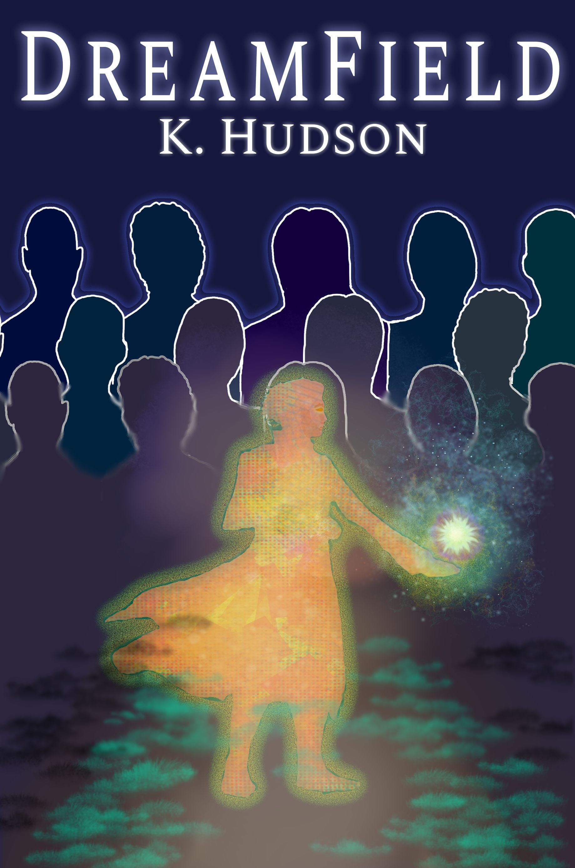
After all of that, what do I think?
Well... it looks ghostly. And the people framed around make it look like she is trapped by them and needs escape.
I think it needs better framing, in that the title and author name both being up top make the bottom not seem busy enough. Something needs to go there. I would divide the words into title on top and name on the bottom.
Sorry you had such trouble. I can see it above, and in your Avi.
Getting pics on MS is not made easy, and many of us have had to figure it out. The convoluted way this happens is you have to make a media item, and link to it from there. Or...you can host the pic off site, and link to the offsite location (which can sometimes invite other issues). It does pay to have a place where you can host pics if you want to post such here. Anyway...media items is where you can post it up to start.
After all of that, what do I think?
Well... it looks ghostly. And the people framed around make it look like she is trapped by them and needs escape.
I think it needs better framing, in that the title and author name both being up top make the bottom not seem busy enough. Something needs to go there. I would divide the words into title on top and name on the bottom.
Prince of Spires
Istar
To me it feels like the foreground image is a bit blurry, probably because of the faded edges around the image. It also feels like the foreground and background image don't really belong together with how different they are in style.
My biggest issue with the cover is that it doesn't really tell me anything about genre. If I had to guess, based on the cover I would go for some kind of literary novel. And I'd give it a pass for that reason. Though of course if it is literary fiction and not fantasy, then go for it.
My biggest issue with the cover is that it doesn't really tell me anything about genre. If I had to guess, based on the cover I would go for some kind of literary novel. And I'd give it a pass for that reason. Though of course if it is literary fiction and not fantasy, then go for it.
- Thread starter
- #12
K.Hudson
Scribe
Thanks, I'll take these notes into accountTo me it feels like the foreground image is a bit blurry, probably because of the faded edges around the image. It also feels like the foreground and background image don't really belong together with how different they are in style.
My biggest issue with the cover is that it doesn't really tell me anything about genre. If I had to guess, based on the cover I would go for some kind of literary novel. And I'd give it a pass for that reason. Though of course if it is literary fiction and not fantasy, then go for it.
- Thread starter
- #13
K.Hudson
Scribe
Looks like I'll have to start from scratch again, because somehow I didn't save the version with the layers. 


Come to think of it, that's probably good news. I just had a few ideas on how I can recomposite the image so it looks a bit more genre specific, and gets rid of some of the other problems at least.
I also wanted the design to be a lot cleaner then it ended up being.
Come to think of it, that's probably good news. I just had a few ideas on how I can recomposite the image so it looks a bit more genre specific, and gets rid of some of the other problems at least.
I also wanted the design to be a lot cleaner then it ended up being.
Last edited:
- Thread starter
- #14
K.Hudson
Scribe
Decided to go with a different concept. I think I like this better. I hope a reddit link works.
https://www.reddit.com/r/BookCovers/comments/1orpx4w
https://www.reddit.com/r/BookCovers/comments/1orpx4w