- Thread starter
- #21
LadyofKaos
 Scribe
So I took it in another direction.

I hate to say it, but I think your time would be better spent saving money to pay a professional or at least acquire premium materials and design guides. There are several basic design rules that must be adhered to when designing print work.
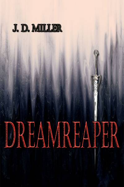
Firstly, your sword image. I imagine you've pulled that sword image from google images or another free source; if it's as pixelated as it is at that size then it simply will not translate to print. Print work is usually designed at 300 pixels per inch rather than 72, meaning that it prints much smaller than it appears on the screen. You can also usually be pretty certain that if you haven't paid for this sword image then you're breaking the law. Obviously it's unlikely that anyone would notice unless your book becomes extremely popular, but isn't that what you're aiming for?
I would also bet that you've designed this in digital RGB colour mode as is the default in Photoshop, when you should be working in CMYK to ensure your colours actually print the way you view them on screen (print work is limited to fewer colours than you have on screen.)
A general design rule is to keep a fixed padding around the edge of your design in which text cannot go; Dreamreaper should be the smaller so that the distance from the edges are the same as the distance that your name is from the edge.
I would advise you ask a print professional's opinion on how this would turn out. I imagine he/she would tell you that it would be extremely pixellated and your name would be impossible to read because of the fuzzy black stroke around it. This image would pass for a thumbnail on amazon after the tweaks I suggested, but not much else. Remember, there's a reason that most popular books use illustrations rather than images from the internet.
