-
Welcome to the Fantasy Writing Forums. Register Now to join us!
You are using an out of date browser. It may not display this or other websites correctly.
You should upgrade or use an alternative browser.
You should upgrade or use an alternative browser.
Feedback request for my cover: Blood and Amber
- Thread starter Marscaleb
- Start date

LordFalco
 Minstrel
As one who designs his own covers, I'd have to ask whether the character is floating or is a giant standing on those fences. It's an easy fix if one of those assumptions is correct. The world seems overly curved from this modest altitude. If the character is meant to be a paste-up, then it would help to outline him in white. On the plus side, contrast is good, since all remains clear when you squint at the scene.

pmmg
 Myth Weaver
I took them to be a paratrooper. Looking at it with more attention, I see good bit of detail in this, with the WW1 clothing, the trenches, and the blood spatter. I am wondering what Amber has to do with trench warfare. The curvature of the land does make me think it is over a planet, and not a battlefield. If I saw this cover next to a bunch of others, I am not sure I would be sold. WWI does not really interest me, but there is a bit of 'what is this about' in the cover. Obviously, its a simplistic art style, that does not make me think a dark and gritty tale waits underneath.
- Thread starter
- #4
Meant to be flying in the sky, but also I made artistic embellishment. I'm not sure how well that is or isn't working.As one who designs his own covers, I'd have to ask whether the character is floating or is a giant standing on those fences. It's an easy fix if one of those assumptions is correct.
Well, I can't say I'm trying to sell to "you specifically," so if the specifics of my story don't do it for you then that's fine. But if I've invoked interest, it sounds like it's doing its job.If I saw this cover next to a bunch of others, I am not sure I would be sold. WWI does not really interest me, but there is a bit of 'what is this about' in the cover. Obviously, its a simplistic art style, that does not make me think a dark and gritty tale waits underneath.
Foxkeyes
Minstrel
I like it.
Some thoughts:
How does the title tie in with the image?
I'm not sure what the image is suggesting. Child soldier. Two worlds. Historical war. Giants. There's a lot here. It could be worth finding the core idea and focussing on that.
Would it look better if the soldier had one foot in either world?
So many colours tend to clash.
Our member 'Finchbearer' designs book covers.
Finchbearer
 Istar
Istar
She does.
And I feel prompted here by Foxkeyes to offer my thoughts.
Firstly, I remember reading your critique request a few threads ago, and I know loosely that your story is about a middle aged man who dies and wakes up in the body of a child named Amber, so although I know that you’re trying to depict your main character Amber here, for others who don’t know the basic plot, the image is largely out of context.
Does our critique matter at this point? It looks like you’ve clearly enjoyed making it, and arguably that is all that matters at this stage.
A few points on book cover design in general, from my perspective; the first instinct for self publishing authors is often to want a realistic depiction of the main character front and centre stage as cover art - I don’t think this is always necessary, and actually I think the strongest covers are those that are more ambiguous in nature. Go to a big well known bookstore in your area and take a look at the bestsellers - not many will have the main character depicted on the cover.
If and when you approach a professional, I would suggest you keep an open mind. You might want this image ‘but made better’, but instead, give the designer / illustrator / artist to take the plot of the book and allow them to come up with a range of ideas and concepts. You may well be pleasantly surprised, and that is the job of a book cover designer, to creatively and visually communicate your story.
Good luck with it.
pmmg
Myth Weaver
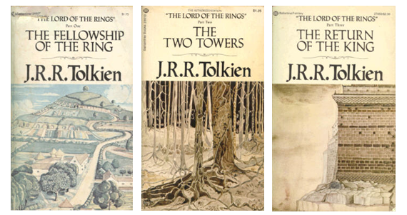
Just for the record, if a designer was to say, 'Hey, I have a really great idea for this', I am open. In part, though, I would want to believe it is beneficial and not detrimental to the marketing tool aspect of it. A lot of books with some awful covers make it, but I am not sure the covers helped. LOTR, I always thought had some terrible book covers and art work. I don't think they really helped it. Conan had some beautiful and iconic covers. They get ripped off a lot.If and when you approach a professional, I would suggest you keep an open mind. You might want this image ‘but made better’, but instead, give the designer / illustrator / artist to take the plot of the book and allow them to come up with a range of ideas and concepts. You may well be pleasantly surprised, and that is the job of a book cover designer, to creatively and visually communicate your story.
Last edited:
pmmg
Myth Weaver
Meant to be flying in the sky, but also I made artistic embellishment. I'm not sure how well that is or isn't working.
I dont think the flying comes across. My initial reaction is that the MC is separate from the background. They are just center stage. Not unlike a Star Wars poster, where all the hero's are not really standing under a giant Darth Vader head, or the Death Star. I am not sure what I should think she could fly?
Last edited:
Finchbearer
Istar
That is a matter of personal taste. Which Tolkien book cover designs are you referring to? Tolkien at the time of publishing his novels rejected the publishers designs that were presented to him, and he instead designed his own, of which I think are the most beautiful fantasy book covers of all time. He took so much inspiration from Anglo-Saxon culture and mythology, that is really imbued in the artwork and I think they’re incredibly well designed, he had such a talent.LOTR, I always thought had some terrible book covers and art work. I don't think they really helped it. Conan had some beautiful and iconic covers. They get ripped off a lot.
Finchbearer
Istar
I think what it comes down to for me is that when I’m reading a book, I like to do the visualising. I don’t need the book cover to tell me what the main character looks like. I like to create that image in my own mind, that’s part of the fun of reading. As a writer I have a clear image of what my characters look like, but isn’t it an amazing thought that your potential readers will create entirely their own image?
Prince of Spires
Auror
I would love for cover designers to say this. Just hand them the manuscript and let them go wild. In my experience though, the cover designers ask for a lot more input in regards to what you want on your cover. You'll need to provide a general idea of what you're looking for.Just for the record, if a designer was to say, 'Hey, I have a really great idea for this', I am open.
Finchbearer
Istar
Yes to this.I would love for cover designers to say this. Just hand them the manuscript and let them go wild.
To elaborate though, I think it’s worth pointing out that this really is the privilege of the self published author, you get to have control over the cover design. Go traditionally published and you will have little to no control over the cover design. It can be a double edged sword however when an author may not know who to approach, an artist? An illustrator? A graphic designer? I would always suggest to go with someone who really specialises in book cover design, who is able to work with both typography and image, creating that seamless visual communication that is needed for any book cover.
I think for me, my background is in branding and identity design…throw in a bit of promotional. It used to be problematic when a client would come in with a pre-conceived idea to be honest because I’d feel pushed to create something that I didn’t necessarily think worked visually or conceptually.
Design really is a process at the end of the day, yes a brief is a good foundation to work from, but I think it’s always more productive for both designer and client to be open and flexible in terms of this process. Everyday I sit down and create things I’m learning something new, so I’m not going in with the attitude of ‘my way or the highway’, it’s more, ‘hey, I think this could work, what do you think?’ It’s a dialogue, a conversation.
Foxkeyes
Minstrel
I love the Conan covers. A genuine fantasy feel.Just for the record, if a designer was to say, 'Hey, I have a really great idea for this', I am open. In part, though, I would want to believe it is beneficial and not detrimental to the marketing tool aspect of it. A lot of books with some awful covers make it, but I am not sure the covers helped. LOTR, I always thought had some terrible book covers and art work. I don't think they really helped it. Conan had some beautiful and iconic covers. They get ripped off a lot.
pmmg
Myth Weaver
Too much Tolkien art to post it all.
These are the covers that were popular when I was in high school. They do nothing to make me want to look further.

This is a link to Covers over the years.
Lord of the Rings Book Cover Designs
Of them all, I am most drawn to the 1981-84 covers (which, oddly, look a bit like a Conan cover...), but I don't really like any of them.
Now they seem to be screen shots from the movies, so I think their cover issues are in the past.
These are the covers that were popular when I was in high school. They do nothing to make me want to look further.
This is a link to Covers over the years.
Lord of the Rings Book Cover Designs
Of them all, I am most drawn to the 1981-84 covers (which, oddly, look a bit like a Conan cover...), but I don't really like any of them.
Now they seem to be screen shots from the movies, so I think their cover issues are in the past.
Finchbearer
Istar
Those ones are a bit of a non-entity imo. I still hold Tolkien’s original designs as the best suited for the job. If it ain’t broke…Too much Tolkien art to post it all.
These are the covers that were popular when I was in high school. They do nothing to make me want to look further.
This is a link to Covers over the years.
Lord of the Rings Book Cover Designs
Of them all, I am most drawn to the 1981-84 covers (which, oddly, look a bit like a Conan cover...), but I don't really like any of them.
Now they seem to be screen shots from the movies, so I think their cover issues are in the past.
pmmg
Myth Weaver
Hard to argue that his original ones do not match his vision of how it should be. The whole thing is a work of art, not just the text inside.
No doubt, marketers got their hands on it and went with the others for reasons not related to his vision.
No doubt, marketers got their hands on it and went with the others for reasons not related to his vision.
Foxkeyes
Minstrel
The Bodleian Library in Oxford held a wonderful Tolkien exhibition a few years ago. Included in this were many of his great fantasy paintings.Hard to argue that his original ones do not match his vision of how it should be. The whole thing is a work of art, not just the text inside.
No doubt, marketers got their hands on it and went with the others for reasons not related to his vision.
- Thread starter
- #18
Honestly, I've seen a lot of cover art like that across the past decade, and I hate those covers. Particularly, they are usually a photo (or photoshop work) of a character, just standing there, trying to look cool even though they are literally doing nothing, with a vague background that says more about color than the actual location they are in.the first instinct for self publishing authors is often to want a realistic depiction of the main character front and centre stage as cover art
I've never really understood the appeal of such covers, and I distinctly want to avoid that.
But I know that I'm not the person they are targeting; I don't really buy books anymore these days. And covers need to appeal to the tastes of the people who are actually going to buy them, not just the guy who likes to collect copies of Clive Caldwell art on his computer.
The covers *I* like are the fantasy covers that show you something about the story, something that shows you what's in the story, ideally showing a scene from the story. The book I'm reading right now shows a warrior, standing next to a giant spider, talking to a centaur. You can see from how the scene is set up that the warrior and the giant spider are allies, and the centaur is suspicious of the two, and the warrior is trying to talk to the centaur to put him at ease. THAT is a good cover; it shows you that the story has centaurs and giant spiders and the main character tries to rationalize and not just fight. (Also a castle in the background, and I love castles.)
But like I said, I'm the person that book covers are targeting these days. From my perspective, it looks like the (fantasy) covers that are actually selling are the bland "main character standing there doing nothing" covers.
The cover I designed here works as a good blend between the two, or at least such was my intent. We show the main character front and center as is the style these days, but I'm also showing a scene from the book, and moreover, I'm not making the main character just stand around striking a pose. She's splattered with blood, she's crying, there is a fear-filled broken expression on her face, and also she's hovering in the air because magic. The setting can be more clearly discerned with the trenches in the background and the rifle in her hands.
While I was drawing it, I thought the image would look cooler if I warped the world with a sort-of fish-lens perspective. And I thought it would look even cooler to warp the sky in the opposite direction. I also had the thought to try to portray and effectual two different worlds with a bright and pleasant scene on one side with a grim battlefield on the other.
The end result is a design that I think works well as art, but as I've looking at it more, I find the whole "two worlds" thing doesn't fit the narrative. At least, not like this. In mind mind I was thinking to contrast the hopes and plans of the MC against the grim reality. But the image looks a bit too literal.
- Thread starter
- #19
Just for the record, if a designer was to say, 'Hey, I have a really great idea for this', I am open.
I would love for cover designers to say this. Just hand them the manuscript and let them go wild. In my experience though, the cover designers ask for a lot more input in regards to what you want on your cover. You'll need to provide a general idea of what you're looking for.
To elaborate though, I think it’s worth pointing out that this really is the privilege of the self published author, you get to have control over the cover design. Go traditionally published and you will have little to no control over the cover design.
Honestly, the idea that I would be cut off from the cover design is what makes me most apprehensive about attempting to traditionally publish when my story is finished. I dislike modern covers so much, and it's not just because of me as a fantasy fan, but also me as an artist. I don't know if I've seen any cover designs in the past decade that are something I would want attached to my name.
I would love to work with a professional designer, or so I think, but I am worried about how that would go down when we start clashing creatively.
What pmmg suggests sounds like a good way to do it, and conceptually I like the idea of a cover designer drawing up a few different ideas and saying "tell me what you think." But that doesn't sound conducive for someone who gets paid per-job. That's why cover designers want to know as much as they can up-front, so they can just show them the one design that works with what they asked for.
pmmg
Myth Weaver
I am worried too...don't want to lose any friends over it
But, in the world, stuff can be rough. Ideally would be to take submissions, pick the best of, and the others are out of luck. I would find it hard to do that, but I have been in the business world. Sites like Fiver are geared towards this.
What I really want is a partner with some skill, who is interested in the success as much as I am. Don't we all? But opportunities abound. Good people to work with may be right under your nose. And in the end, if an artist has an idea, let their passion show.