• Welcome to the Fantasy Writing Forums. Register Now to join us!

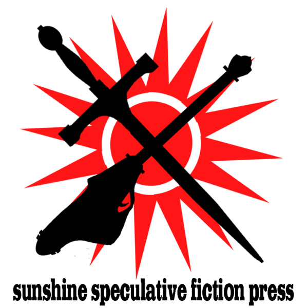
Logo for my publishing company

BWFoster78

Myth Weaver
Looking for feedback.

The concept is: the sword represents fantasy and the gun, a 50's style laser blaster, represents scifi. The sun represents the fact that this company specializes in lighter, less dark and gritty, works.

sunshine_speculative_fiction_press_logo_with_lc_ty_by_emuzin2-d5ydgdt.png
 
Last edited:

CupofJoe

Myth Weaver
Okay, so it might be that I was watching "Nazis: a warning from history" this morning but that was the first thought that struck me... a black "cross" on a red and white background...
 

Ankari

Hero Breaker
Moderator
I would lose both the sword and blaster. Keep it simple. The sun alone should suffice.
 

Nihal

Vala
Do you plan to use it on your publications, don't you? In this case there are a number of points you must address:

1. It's good to avoid more-than-one-color logos. It's quite simple: Many covers are colorful. You're probably going to need a black and white version and in this case this current design will fall apart. You must address this issue right now, before choosing the final design. Make a grayscale version, it might work.

2. The text is too small in relation to the symbol. It's going to be unreadable when scaled down (happens to some publishers logos, but it's definitively a bad thing). Not only this, it's too long and has too many words, being uninviting. You should consider keeping only one part of the name or abbreviate it. E.g.: "Sunshine Speculative", "SSFP".

3. Again, for scaling purposes it's a good thing to have an all-caps text. It also looks good!

4. This font family isn't passing the right message. It has almost an "old west" vibe.


Now, based on my taste:
You could even keep the sword-n-gun (looks pretty scaled down), but I would change this laser design. It's clashing with the other two symbols and it kinda looks like a stylish guitar.
 
Last edited:

Devor

Fiery Keeper of the Hat
Moderator
Assuming you have three separate images, I would try this:

- Keep the sword hilt top-left.
- Put the blaster-barrel top-right, still with the trigger side down (so, rotate and flip).
- Rotate both of them slightly so that the image flattens and they don't cross at 90 degrees.
- Shrink the sun. Put it between the blade and the barrel with a little overlap at the cross (over the cross, but lower).
- Adjust the slogan so that it lines up evenly with the image on the left and right.
 
Last edited:

BWFoster78

Myth Weaver
Nihal,

Thanks for the response.

I had him create a version with text and one without. I plan on using the one without the vast majority of the time. If I do use this one, I'll have him make the changes that you suggest.

I was thinking that the logo would be mainly on the spine of the book, which doesn't have a lot of other color competing with it. Is having two colors horrible for that? Overall, my spines are going to be pretty simple overall. Single color background, text of the book title and my name, and this logo (without the text).

Any suggestions as to gun design?

Thanks!

Brian
 

BWFoster78

Myth Weaver
Assuming you have three separate images, I would try this:

- Keep the sword hilt top-left.
- Put the blaster-barrel top-right, still with the trigger side down (so, rotate and flip).
- Rotate both of them slightly so that the image flattens and they don't cross at 90 degrees.
- Shrink the sun. Put it between the blade and the barrel with a little overlap at the cross (over the cross, but lower).
- Adjust the slogan so that it lines up evenly with the image on the left and right.

I like both 1 and 2.

Regarding the sun, that could be cool. Alternately, what do you think it would do if we left the sun as is but lightened it, made it more of a faded red?

As to the text, mainly I intend to use the image without the text. I probably shouldn't have included it here. Speaking of which, is that a good decision, or should I try to "fix" the text and use it.

I appreciate all the help from you and Nihal. I am not a graphics guy.

Thanks.

Brian
 

BWFoster78

Myth Weaver
I would lose both the sword and blaster. Keep it simple. The sun alone should suffice.

Uh...

Then it wouldn't be the symbol that I want. A ton of companies, and at least one country, use a sun. As it is, all three elements have meaning, and I like the meaning.

Thanks for the input, though.
 

BWFoster78

Myth Weaver
Okay, so it might be that I was watching "Nazis: a warning from history" this morning but that was the first thought that struck me... a black "cross" on a red and white background...

Well, that was a particularly effective logo...

Seriously, I don't think I'm in too much danger of it appearing that way, especially if I follow Devor's suggestions.

Thanks for the input, though.

Brian
 
Top