• Welcome to the Fantasy Writing Forums. Register Now to join us!

What to think about this designer's advise?

Graylorne

Archmage
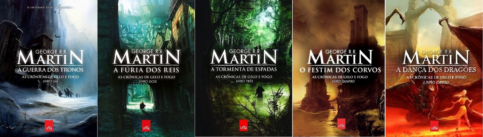
IMPORTANT: I strongly recommend NOT creating scene from the book on the cover. A reader will browse a small thumbnail of your cover (among many others) for only two seconds before deciding whether to click for more information. Creating a specific scene from your book simply makes the thumbnail less clear and less likely to generate sales. The best book covers have a simple image that evokes an emotion and tells a straightforward message.Write a great book, but leave the cover to a professional.


I ran into this advise just now on the website of a cover designer. Link added to quote.

As all my books have covers depicting a scene from the book (besides being designed by a Dutch expert and not precisely cheap either), I wondered if we're creating the wrong covers for the US markets. So what is your opinion?

8256444_orig.jpg


Even as a thumbnail, these aren't exactly a smear.
 

Nihal

Vala
First, I must say I am no expert on book covers for the US. With that said, I think it's a misguided advice. The message is right, but the means aren't.

It's not that having scenes on the cover is bad, it's the excess of information—and the information overload happens for the lack of focus and/or a bad composition, not because it's "a scene from the book". These problems can appear even in a single character portrait, they're just easier to happen when it's a scene, busier by default.


Examples of covers with scenes by a big traditional publisher here:
capa-guerra-dos-tronos+-+C%C3%B3pia.jpg
 

Devor

Fiery Keeper of the Hat
Moderator
As all my books have covers depicting a scene from the book (besides being designed by a Dutch expert and not precisely cheap either), I wondered if we're creating the wrong covers for the US markets. So what is your opinion?

8256444_orig.jpg

For the advice, I think Nihal covered it. In a book cover you're conveying a message - a busy scene is more likely to clog it up. That doesn't mean don't do it, just be aware and design your scene accordingly.

For your specific covers, I do think you've run afoul of a couple of issues, especially the font. You could also experiment with fading or dulling areas of the background to help guide the eyes. But the artwork is beautiful and there's no reason they shouldn't be compelling.
 

Graylorne

Archmage
Thank you both, that's a load off my mind.

I began to doubt, because my covers are so totally different from his, that mine perhaps weren't adapted to the market.

I see what you mean about composition and focus, Nihal, although I couldn't do it myself. Those GRRM covers are great, more on the grand scale, as befitting his style. Mine were designed to recapture the nostalgic old school feeling.

The font is a weak point, more designed with the print book in mind. The Revenaunt covers are copyright of my Dutch publisher, I only have the right of use. The Shardheld covers are mine; I could have a word about changing the font, but only if its free. I can't afford additional costs. :)
 
First, I must say I am no expert on book covers for the US. With that said, I think it's a misguided advice. The message is right, but the means aren't.

It's not that having scenes on the cover is bad, it's the excess of information—and the information overload happens for the lack of focus and/or a bad composition, not because it's "a scene from the book". These problems can appear even in a single character portrait, they're just easier to happen when it's a scene, busier by default.


Examples of covers with scenes by a big traditional publisher here:
capa-guerra-dos-tronos+-+C%C3%B3pia.jpg

Those covers are 1000 times cooler than the simple iconography covers of Martin's works here!

Agreed with what everyone else has said. You just don't want too much going on in your cover. You've got to catch their attention.
 

TWErvin2

Auror
That's the same information the artist who created covers for my works relayed to me. An image that gives a feel for the novel, a hint at what to expect, and not a specific scene.


Today, I think it's even a bit more difficult creating a good cover. You have to balance between it appealing to a reader, both in full size and also one that can attract attention/interest as a thumbnail.
 

Mythopoet

Auror
It sounds like that designer is embracing the cover design fad going through big publishing right now which ends up producing a lot of covers that look too similar to stand out from each other. I'm not a fan.
 

Graylorne

Archmage
I suppose that it's a matter of different trends then. Many covers on Amazon are to my eye so generic they don't suggest anything anymore. I went purposedly for something both recognizable and highly individual. Whether it works? I don't know. Let's say, if I could afford a canary I couldn't feed it on my English book sales as yet.
 

TWErvin2

Auror
It sounds like that designer is embracing the cover design fad going through big publishing right now which ends up producing a lot of covers that look too similar to stand out from each other. I'm not a fan.

It's a form of branding, and it's been around for quite some time, especially with a series or trilogy. Whether readers prefer it, that's the question.
 

Quillstine

Troubadour
I like all forms of covers, having a shelf full of varying styles of book art is one of the many fun parts of being a book owner.
I think sometimes a scene on the front can really help give you the mental picture of parts of the book. I for one enjoy the time when you hit the part of the book where the scene on the cover is being described and you can flick to the cover and go “Oh look at that”. I think most readers really do stick to the adage “Don’t judge a book by its cover”. Sure if a cover really jumps out at me I am more likely to pick up the book but if the cover is gaudy I am not less likely to pick it up (if that makes any sense at all).
In terms of personal preference though, I love incredibly simple covers. I have worked in a lot of book shops and got my grubby little hands on many copies of pre-release novels. These I think have the best covers, plain color and simple single “token” picture toward the top in the center. There so extremely simple and I really loved the clean look.
Here is one I did about a year ago for one of my major fantasy WIP’s. It gives the general idea of what I mean….I did this myself, and in about 20 minutes so I know it’s flawed, just gives a general idea. Ultimately, I would like to have my books covered with something like this….or genuine leather binding which would also be cool!


Cover1_zpsb859ea30.jpg
 
Top