In this day and age, publishing a book you’ve written is as easy as uploading a file to a website and clicking a button. You can even get a copy printed and sent to you in the mail. Easy.
That’s just the actual publishing though, and the printing.
Writing the book is still difficult, and making it look good once that’s done can also be tricky.
A while back, I came across the following question:
“Is there a free tool which lets me copy and paste the text of my book and get it formatted for paperback?”
To my knowledge, there’s no free tool that does it all automatically, but there are plenty of free tools that will let you you format your text yourself. In this article, I’ll show you the basics of how I do it. It’s not quite as simple as just copying and pasting the text, but it’s also not super complicated.
I will not be mentioning anything about covers. That’s an entirely different can of worms.
The Tools
For my own books I’ve used OpenOffice for both writing and formatting. It’s free, and it does what it’s supposed to. Another free option is LibreOffice, but I’ve not tried that one myself. If you’ve got access to MS Word, that’ll work too, but it’s not free.
Essentially, pretty much any modern day word processor will do the trick. The important thing is to understand the basic principles, and I’ll get to that in a bit.
Before that, I need to pick a template for my book. I could create one up myself in OpenOffice if I wanted to, but since there are free ones available for download, I might as well use them. Amazon provides a number of templates for various formats on this page – click on Step 1: Choose a template and then on Blank templates to see what sizes are available. Other marketplaces, like Lulu for example, will will also provide templates you can download for free (here – the Download Template button updates based on the format you select).

I write novellas, which are pretty short, so I pick the smallest template available (5”x8”) or the book will be very thin. If you have a long story, use a bigger template, as a small one might make your book very thick. Check your bookshelf and see what formats your other books are.
If you want to get an estimate of how thick your book will be, copy the text into the template, and check the page count. Then compare that with another book of the same format and see how many pages that is. Optionally, use a spine width calculator, like this one. Also keep in mind that the page count will change during the formatting.
Layout and Formatting
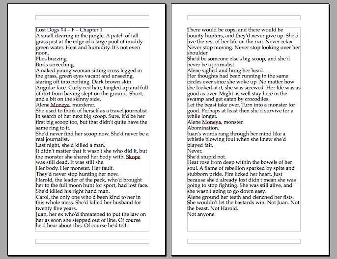
I open up the template, copy my story from the original file, and paste it into the template. In this article I’m using the first chapter of the book I’m currently working on. I have included screenshots of what the pages of my layout look like, and a lot of the time the text is too small to read. Don’t worry about that, the purpose of these images is to show off the full pages rather than the actual prose.
What’s worth noting is that with the templates from Amazon I linked to earlier, the first page is the book’s title page, and it looks a little bit different to the rest of the pages. Because of this, I just add the book’s title to the first page, and then I add a completely blank page after it. The first chapter then begins on page three, and it looks a little like this (notice how I didn’t do any actual formatting yet):
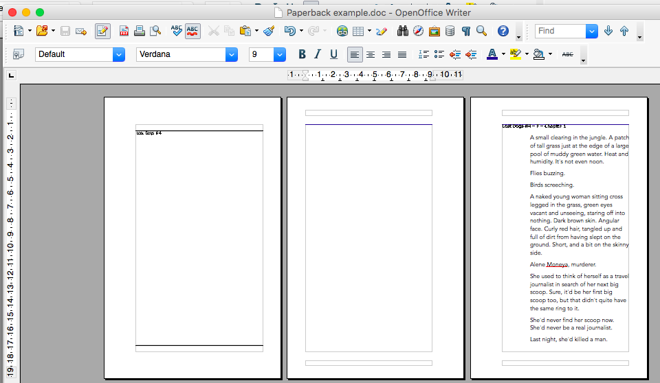
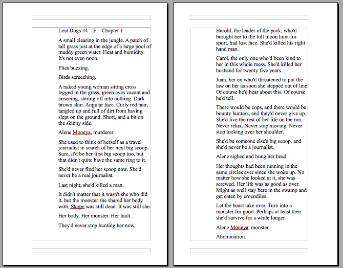
You may also want to add some additional pages to the front of the book, like for a copyright notice and ISBN etc., or with additional details about what part in the series it is. Dedication, acknowledgements, foreword – things like that. It’s up to you. For the purpose of this article, I’m keeping it simple, but for reference, here’s the page layout for the start of one of my previous books:
The blank pages are the backs of the forward facing pages – the ones on the right side when you open the book up. I put the copyright notice on the back of a page, but for the rest of them I kept the text on the front of the page.
You may notice that the box with the text isn’t centred on the page. It’s alternating between being on the left and on the right side of the page. This is because of the book’s gutter – where the pages attach to the spine. Front-facing pages will have the box of text closer to the right side of the page, and back-facing pages will have it closer to the left.
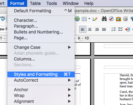
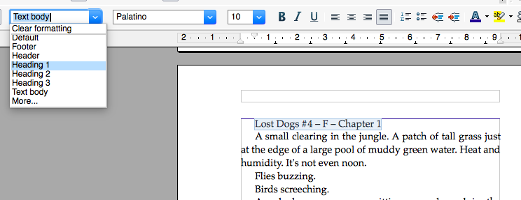
Before I get started on the formatting, I make a note of where I want the text to be different from the standard so that I can easily find it later. The reason for this is that the first thing I do is to clear my document of all formatting data, like this.
- Select all text by pressing Ctrl+A (or Command+A on a mac).
- Click on the Styles dropdown menu and select Clear Formatting
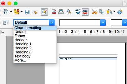
In this way, I now have only raw text to work with. There’s no formatting data left over from my previous file to confuse things or mess up my modifications. It’s a fresh start as far as formatting is concerned.
The first page of the first chapter of the book now looks like this:
It’s a wall of text, and it’s not very pleasant to read. Too dense. It doesn’t look good on screen, and it looks even worse in print. Here’s where the actual formatting begins.
First up, I apply a default format to all text:
- Select all text (Ctrl+A or Command+A).
- In the Styles dropdown menu (same as before), select Text Body.
My document now looks like this:
It’s better, but it’s still not good. For example, there’s a whole lot of white space to the left of the text that just doesn’t need to be there.
What’s important is that I’ve applied a style to my text. That way, I can modify the style itself, and it will affect all text with that style applied to it. It saves me having to manually tweak the formatting of each chapter/page/paragraph. It’s especially helpful if I decide to adjust something after I get to the point where I have more than one style in the book (like chapter headers, or internal monologues written in italics).
I open the Styles and Formatting options:
It looks a bit like this:
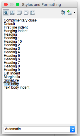
To edit my style, I right-click on Text body and select Modify from the dropdown menu. This brings up a huge mess of options, but fortunately I don’t need to tweak all of them.
I start with Indent & Spacing. This controls how each paragraph is positioned relative to the page and to other text:
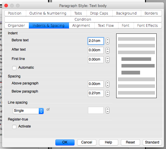
Note the bars in the right of the window. That’s an example of how the text looks, and it updates as you make changes to the style.
I mentioned there was a lot of white space on the left side of the page, and I now see that the indentation Before text is a whooping 2.01 cm (about 0.8”). There’s no need for that kind of indentation so I change it to 0.00 cm.
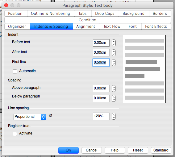
I do like it when the first line is indented though, and from experience I know that 0.50 cm (about 0.2”) looks good to me. This helps show off that a new paragraph begins, and then I don’t feel the need for any extra space at the end of the paragraph, so I change that value to 0.00 cm too.
Finally, I adjust the line spacing. I change the option from Single to Proportional. This opens up a new option, and I change the value in the field from 100% to 120%. This increases the space between the lines a little bit, and makes the text less dense.
Here’s how the settings look for me now:
This is fine as far as indent and spacing goes, so I click OK, and check how my pages look now:
This looks better to me, but I’m still not satisfied, so I open up the dialogue to edit my Text body style again. I click on the Alignment tab and select for the text to be Justified, and then I click on the Font tab to select what font I want to use.
In the example above, the font is Times New Roman, and the size is 12. I change the font to Palatino, which is slightly wider, and the size to 10. The page now looks like this:
Much better. It’s starting to look like a page in an actual book now. I just need to add a chapter header and I’m good to go.
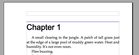
Fortunately, it’s not much different to what I just did with the regular text. I select the title of my chapter and apply the style Header 1 to it.
I also change the title a little, and it ends up looking like this:
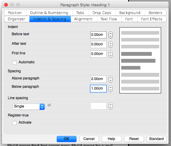
Sure, it’s a title, but it looks a bit bland. To fix that, I’ll adjust the properties of the Header 1 style. I choose to go with the same font as the body text (Palatino), but I make it a little bigger (16 pt), and I make it bold.
I also want my title to be centred on the page, so I tick that option in the Alignment tab.
Finally, I want a little bit of space above the title, and a little bit after, so that it really stands out. I could add a few empty lines above, and a few below, but then I’d have to manually do that for every chapter. It’d be a hassle – especially if I change my mind halfway through (it’s happened).
Instead, I use the options for space above and below a paragraph in the Indents & Spacing tab, here:
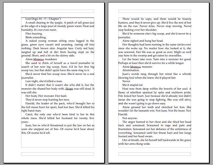
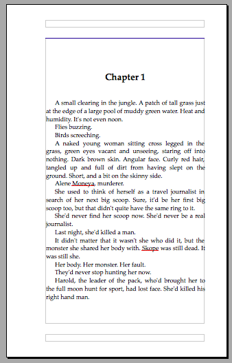
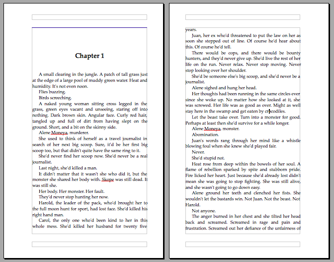
With these changes, the first page of my first chapter looks like this:
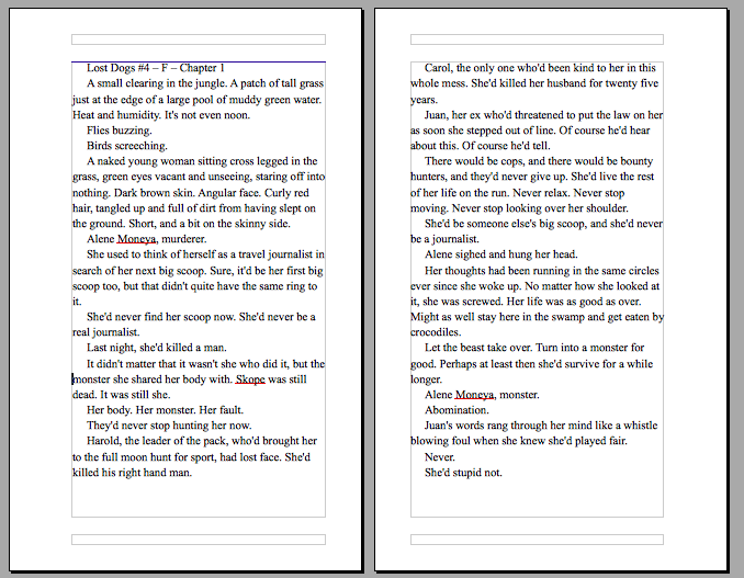
There’s one more thing to address before I’m happy with the formatting. You may have noticed the text doesn’t go all the way to the end of the page. It’s extra visible if you scroll up and check the images that show two pages side by side.
This is due to a setting in the Text flow tab in the Style window, here:
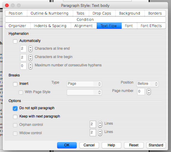
Under Options, it says Do not split paragraphs. If I uncheck that, the text will run all the way to the end of the page. I’ll have the first part of the paragraph at the bottom of one page, and the second part at the top of the next one.
This usually isn’t an issue, but if you’re unlucky it can get a bit weird. Here’s what happens if I disable the option.
I end up with one single word at the top of the next page, which doesn’t look very nice.
A single last line of a paragraph at the top of a new page is called a widow, and I can get rid of it by enabling the Widow control option. The first line of a paragraph alone at the bottom of the page is called an orphan and I get rid of them by enabling the Orphan control option.
My preference is to split paragraphs and to enable both Orphan control and Widow control.
In my second book, I forgot about this option completely, and the Text body style didn’t split paragraphs at all. For the most part it was fine, but in some places long paragraphs were moved to the next page, and it made a few pages look like they were the end of a chapter. Fortunately, as it was a print-on-demand book, I was able to fix the issue and upload a new version before many copies were sold.
At its most basic, this is it as far as formatting a book for print goes. Create the styles you need, and apply them to your text.
Obviously, you can get a lot more complicated with it than what I’ve described here. I’ve not even told you how to add page numbering, but if you want to learn how to do it, you’ll find instructions here:
Also make sure to apply a style to your page numbers so they match the rest of your page.
A Few Words On Numbers?
In the examples above, I tweaked the default values of the app and added numbers of my own. I didn’t say anything about it at the time, but I’d like to take a moment to explain at least some of them.
Line spacing: At the very start, just after I cleared all formatting from the document, the pages looked like dense walls of text. Increasing the space between the lines makes the text a little less dense and easier to take in. Read more here.
Font: I changed my document’s font from Times New Roman to Palatino. Both fonts are common but Palatino is a little wider, and I feel it’s more pleasant to read. Times New Roman also used to be the default font on most computers I used while in school and at university. I don’t want my book to remind me, however subtly, of my final year paper on hydrodynamics. Read more here, and even more here.
First line indentation: A little bit of blank space at the beginning of the first line of a paragraph is a good way to indicate that a new paragraph begins, especially if the last line of the preceding paragraph goes all the way to the end of the line. Do not use first line indentation if your text is centre-aligned, or it’ll make the first line come out off-centre. Read more here.
Space above and below chapter headers: The numbers here I found through trial and error. I’m sure there’s been science done to determine the optimal space around a chapter title, but there’s something to be said for going by your gut instinct too.
Cost vs. Readability
Using more space between the lines, and a font with wider letters, means the text takes up more room on the page. This in turn leads to a book with more pages, which costs more to print, and more to buy.
Personally, I’m fine with this.
If someone wants to purchase a physical copy of one of my books, they’re already paying upwards to twice the price of the ebook version – not including shipping. Clearly, the experience of reading my story in an actual printed book is worth it to them.
I may cut the price by perhaps fifty cent if I reduce the line space and font width to lower the page count. It’s money, but if someone is already paying upwards to a tenner for the book, they’ll expect a book that looks good and that’s pleasant to read.
Being hit in the face with a massive wall of text isn’t pleasant, and I’d happily spend a little extra to avoid it. After all, I’m going to spend a good few hours reading, and I don’t want a simple thing as too dense text to ruin the story for me.
Final Words
This is a very basic guide to formatting. It’s a big topic, and there’s a lot to learn. There’s a reason many authors pay good money to have their books professionally formatted.
- Do you format your own books, and what’s your experience with that?
- What advice would you have for someone who’s looking to format their own book?
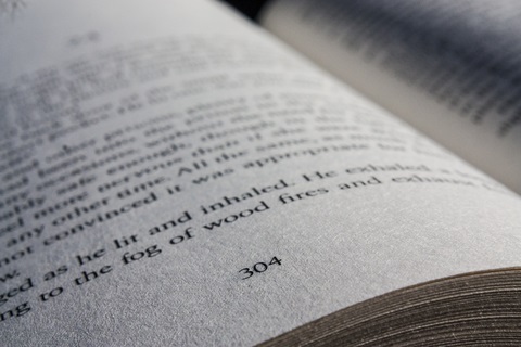
Also, before I leave you, here’s a picture of what the first page of one of my books look like in actual print:
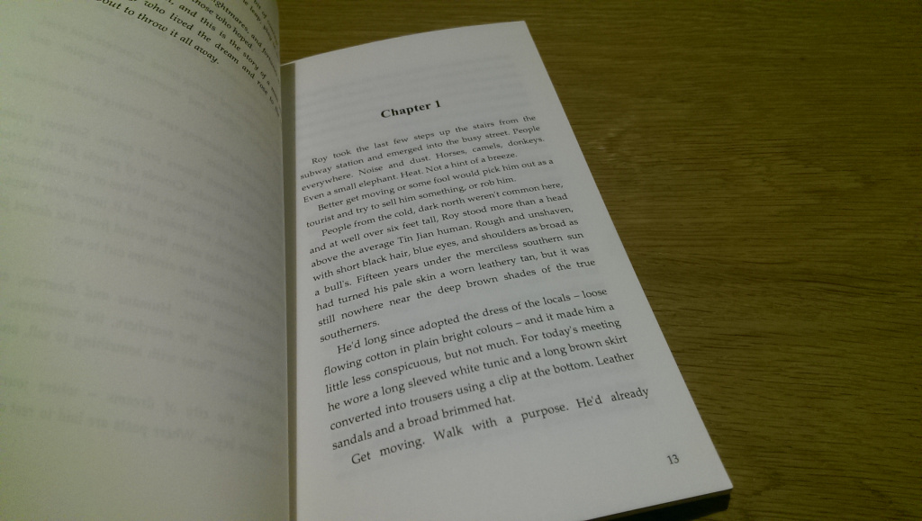
Apart from one little thing, this is the same style I described in this article. Can you tell what’s different (it’s not the page number)?
Optical justification makes it so that the letters matchup in the ustification even if there is a comma or hyphen or whatever… so those end up outside the justification line. It just looks better, IMO. Instead of:
rrr
rr-
rrr
you have:
rrr
rrr-
rrr
As a rough example, heh heh.
InDesign also controls for hyphen ladders… I’m not sure if other apps do that.
I don't know what optical justification is. Probably not. They're really good for formatting novels—I'm not as certain about books with a lot of images. And, of course, it only works with a Mac.
Vellum does optical justification in their print? I doubt vellum has enough detailed control for my taste, but it’d be cool if it did do that one little thing.
Vellum does optical justification in their print? I doubt vellum has enough detailed control for my taste, but it’d be cool if it did do that one little thing.
It's hard enough just charging my friends for my books – and they're supposed to be for sale. 😛
Svrt, can I just pay you to format for me? 😀
I've heard about it, but I haven't used it myself yet. It's the kind of thing I'd like to get my hands on once the budget allows it. 🙂
I don't know of any free tool that does this. I do know good paid tools. I use Vellum, which does this beautifully.
I think it might be one of those things that can look odd, but that it's difficult to put a finger on if you don't know about it.
Visually it’s very cool. First time I saw it I was like… ewwww, ahhhh. But I’m weird, and always thought normal justification was a tad odd.
You got me there. This was something I wasn't actually familiar with myself, and I had to look it up. Doesn't seem to be a feature available in OpenOffice.
It's probably a bell though. The article I found that explained it talked about hanging punctuation. 🙂
Optical justification, not sure if it’s a bell or whistle, but I love it. heh heh. But then, I did layout out on several major medical books an age or so past, so I’m particular about things. I see some stuff in print novels that make my eyebrows scrunch.
I completely with you on this. If you're not doing anything fancy with it, you don't need all the bells and whistles of high end layout solution. 🙂
I also use Open Office both for writing and (most) formatting. It does the job quite well enough for a typical novel. My ex is a wiz with InDesign but I don't let her do my books anymore.
I’m a nutcase and use InDesign, going through and manually eliminating all widows, orphans, runts, and hyphen ladders as I don’t trust automation 100%. And I check every hyphen I see in case it’s one I don’t like, LOL. There’s always a few that are just damned awkward so I tweek until I like it. InDesign is killer, bit of a learning curve, but helluva app.
Going to layout Eve of Snows in hardback here soon, just to have some more fun.
I’ve been tempted to offer my services on the cheap for basic novels, because I take a strange, twisted pleasure in laying out books, but then I wonder about my sanity.
Wow, I didn’t know it was this easy. I swear I went about doing this the hardest way possible. I am going to have to play around with the settings I have since I am writing with a different program but you saved me a ton of time. Thanks for the information!
Happy to hear it was useful. Best of luck with your own work. It really isn’t all that complicated once you get the basics down. 🙂
Thanks, glad you like it. 🙂
I’ve already told you, but I think this article will be very useful for me… In the future somewhere. I’ll be sure to return to it then. 🙂