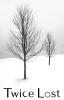
The Twice Lost cover is sleek and the font works. But the title on the very bottom, with no other information (like the author or series), is too buried and makes it look empty. Even moving the title up a bit would help, but overall I think something's missing.
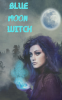
The Blue Moon Witch cover art is wonderful. It's well balanced to the space and leaves open a perfect spot for the title. But to be frank the font looks like graffiti on a mural. The font color kind of works, balancing with the orb in her hand, but it definitely needs texture.
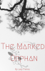
The Marked Orphan cover is.... trying, really hard. Just eyeballing it I've got three suggestions, but without tinkering with it myself I can't really be sure about any of them: 1) Rotate the tree about 40 degrees to the right. 2) Move the flower to the left, BUT leave the stem on the right where it is and spread out the dots that link the two. 3) Move the word Orphan up, and make the author's byline a little taller and much wider, moving it up too.