• Welcome to the Fantasy Writing Forums. Register Now to join us!

Another Cover Just for Fun

Devor

Fiery Keeper of the Hat
Moderator
I would cut the top-left to recreate some of that white space from your original - also that part happens to look a little weird.

I don't like the versions with the red top and bottom. Again, maybe some kind of texture and color combo would get it working really great, but I would suggest keeping to the black and white and splash of red.
 

Trick

Auror
I like the corner cut idea. It does give it back some of the power the first version had.

Still debating the red top and bottom.

attachment.php


And here's also a quick textured version that I like better than the last attempt.

attachment.php
 

Devor

Fiery Keeper of the Hat
Moderator
And here's also a quick textured version that I like better than the last attempt.

I'm not a graphic artist. Everything I know about it was either self-taught or based on abstract marketing principles from class. I only know a very small handful of tricks.

I don't know if you've seen this or not, but this is the artwork I made for the Trope Reboot series I'm doing on the blog.

Trope_Reboot_Cover-475x317.jpg

I hired an artist to make the crystal ball - which I've heavily modified - but I made the background image myself. I did it with the following technique:

- I stole about a dozen pictures of clouds off of the internet and overlayed them them on top of each other as separate layers in photoshop.

- I tinkered with the transparency of each image until I liked the final and could no longer recognize a single image.

^ That's my texture.

- I put a color gradient over it - one of those complicated, multi-color gradients that I worked up.

- I put the same color gradient over it again at a different angle and softer transparency, to hide that "it's a color gradient" shape.

- - -

The point that I'm making is that a good texture/color pattern takes a little more tweaking to work. The more you try to do with your image, the harder it is to get right.

If it were me, I can see that you're on a track with the texture in the main image where there's a few things I would want to play with and it could come out pretty well. I'm thinking maybe a touch of tannish yellow coming from the top right, maybe a couple filters over your texture to lighten it and soften it a bit.

But if you don't get it quite right it'll look horrible. And it's going to mess with the top and bottom borders, which'll mean you have to find a similarly complicated solution for that.

You get to the point where, even if it kind of works, and you send it to a graphic artist, that person may have no idea what you were trying to do and screw it up.

Black and white is easy. It's striking. It's reasonably solid. I can't swear it's the best solution, but it's the one I recommend.
 
Last edited:

Foah

Troubadour
I just felt like chiming in with a piece of advice, which I pressume is welcome!

I would suggest revising the typography a bit. Not necessarily the typeface, but the negative space and margins, or padding. It feels cramped, and while there are different schools on how to handle your typoegraphy to reach a certain goal, I feel like this is a bit off any way you look at it.

For a title, or a set body of text, to work in a tight and blocky environment like your header and bottom, they really need to utilize a typeface that was designed to be used that way. A typeface can be less rounded, more constricted, and have a more visual similarity to squared shapes to--or it can be an opposite yet complimentary.

If you're set on the typeface you have, I would encourage you to play around with margins and space. The more "correct" it feels when you look at it (spacing and padding when it comes to fonts are WAY MORE down to what's optically and aesthetically pleasing rather than mathematically correct), the better right?


EDIT:
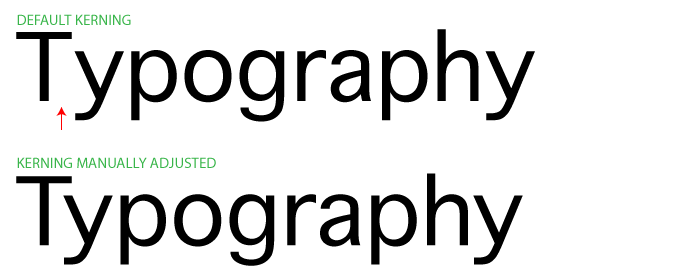
If you find that playing with the text areas give some good results, I suggest you also read up a bit on kerning typography. I would guess that you're using a font called Ringbearer, or a font that's heavily influenced by LotR fonts. The thing about the free-to-use fonts and typefaces is that they aren't always fully fleshed out with how each character reacts with other characters. In short, all combinations of letters don't always look great. This has alot to do with kerning, which is the spacing between letters depending on the neighbouring letters.

tips-1.png


I think I'll stop my rambling there, but good luck and hope my words were of some value!
 
Last edited:

Trick

Auror
The point that I'm making is that a good texture/color pattern takes a little more tweaking to work. The more you try to do with your image, the harder it is to get right.

If it were me, I can see that you're on a track with the texture in the main image where there's a few things I would want to play with and it could come out pretty well. I'm thinking maybe a touch of tannish yellow coming from the top right, maybe a couple filters over your texture to lighten it and soften it a bit.

But if you don't get it quite right it'll look horrible. And it's going to mess with the top and bottom borders, which'll mean you have to find a similarly complicated solution for that.

You get to the point where, even if it kind of works, and you send it to a graphic artist, that person may have no idea what you were trying to do and screw it up.

Black and white is easy. It's striking. It's reasonably solid. I can't swear it's the best solution, but it's the one I recommend.

I don't disagree. I think what I was going for with the patterned one is similar to this cover, which should have a similar target market (I've shown it larger in an earlier post). It seems very simple to me. Perhaps that's my issue, the one I used is just complex enough to draw attention when it should really just provide a backdrop:

20890560.jpg


As for Black and White being striking and simple, I agree with that too. I think my concern was that at thumbnail size it will blend into the white background on most sites. I thought a thin frame might work like the below, but I don't really like it when it's full size.

attachment.php


I just felt like chiming in with a piece of advice, which I pressume is welcome!

I would suggest revising the typography a bit. Not necessarily the typeface, but the negative space and margins, or padding. It feels cramped, and while there are different schools on how to handle your typoegraphy to reach a certain goal, I feel like this is a bit off any way you look at it.

For a title, or a set body of text, to work in a tight and blocky environment like your header and bottom, they really need to utilize a typeface that was designed to be used that way. A typeface can be less rounded, more constricted, and have a more visual similarity to squared shapes to--or it can be an opposite yet complimentary.

If you're set on the typeface you have, I would encourage you to play around with margins and space. The more "correct" it feels when you look at it (spacing and padding when it comes to fonts are WAY MORE down to what's optically and aesthetically pleasing rather than mathematically correct), the better right?

Thanks, Foah. Yes, all advice or opinions on the covers are very welcome. I am no graphic artist but drawing (by hand) and some graphic art have always been a part of my process and I find that designing covers is a learning experience that I really enjoy.

I see your point about the typography and, fortunately, no, I am not set on this font. I had it already and like it thematically only. If it doesn't work out for this cover, that's totally ok.


EDIT:
If you find that playing with the text areas give some good results, I suggest you also read up a bit on kerning typography. I would guess that you're using a font called Ringbearer, or a font that's heavily influenced by LotR fonts. The thing about the free-to-use fonts and typefaces is that they aren't always fully fleshed out with how each character reacts with other characters. In short, all combinations of letters don't always look great. This has alot to do with kerning, which is the spacing between letters depending on the neighbouring letters.

It's actually two fonts by the same designer that I assume are the same but one is a messy-modified version of the other. I don't know what his influences are but LotR fonts could definitely be influential for him.

If I find a better one once I set out on that search, I will keep your thoughts in mind.
 

Trick

Auror
I thought more about why I like this cover so much...

20890560.jpg


It's the interplay of the text with the image!


So, I went for a muted version of that to eliminate the boxy-frame style that simply didn't do justice to the image. Hopefully it's an improvement.


attachment.php
 

Devor

Fiery Keeper of the Hat
Moderator
"The Mark of a Thief" looks good there.

Darkling Sun . . . you're trying to do too much at this point.
 

Trick

Auror
"The Mark of a Thief" looks good there.

I like it too. I think that change is a keeper.

Darkling Sun . . . you're trying to do too much at this point.

Yeah, I thought you might say that. I like the elimination of the boxiness but the dripping... something... adds busyness instead. I have a thought on that already though. Working on it.
 

Trick

Auror
Here's another version. Not sure how I feel about the red "The Mark of a Thief" but with both main title and subtitle in white, it looked a little funny, so I went for it.

attachment.php
 
Last edited:

Devor

Fiery Keeper of the Hat
Moderator
The red looks okay on "Mark of a Thief," but there's some lighter gray behind "of" that I would black out for clarity purposes.

I don't like the dancing letters. Just keep the title straight across.

I think the latest changes have made your byline problem worse. Your image is now top-heavy and the byline looks quite squished.
 

Trick

Auror
The red looks okay on "Mark of a Thief," but there's some lighter gray behind "of" that I would black out for clarity purposes.

I don't like the dancing letters. Just keep the title straight across.

I think the latest changes have made your byline problem worse. Your image is now top-heavy and the byline looks quite squished.

I'll bite. I am partial to the dancing letters but I'm willing to admit they are odd.

attachment.php
 

Devor

Fiery Keeper of the Hat
Moderator
That looks so much better than where you began, Trick. I've got kids messing with my attention right now, but I think you're getting very close to where it needs to be.
 

Trick

Auror
That looks so much better than where you began, Trick. I've got kids messing with my attention right now, but I think you're getting very close to where it needs to be.

Thanks, I think so too. The commentary is very helpful and much appreciated. No worries! I appreciate you checking out today's versions :)
 

Devor

Fiery Keeper of the Hat
Moderator
Okay, nitpicky font time. This might sound pedantic, but it makes a surprising difference.

Look at the back of the guy's foot, on the bottom left. Imagine a straight line from the left-tip of that foot all the way up and down the page. You should:

- Line up the edge of the "D" in Darkling with the edge of that line on the guy's foot.

- Space "Darkling Sun" to leave the same margin on the other side as well.

- Line up the right edge of Mark of a Thief with the edge of the "N" in "Sun." Also, lower it just a tad.

Finally, I suggest stretching the byline to the same margins as the other text.... if you can get it to look okay. You may need to tinker with the kerning (the space between letters) and adjust the height a little to compensate.
 

Trick

Auror
Okay, nitpicky font time. This might sound pedantic, but it makes a surprising difference.

Look at the back of the guy's foot, on the bottom left. Imagine a straight line from the left-tip of that foot all the way up and down the page. You should:

- Line up the edge of the "D" in Darkling with the edge of that line on the guy's foot.

- Space "Darkling Sun" to leave the same margin on the other side as well.

- Line up the right edge of Mark of a Thief with the edge of the "N" in "Sun." Also, lower it just a tad.

Finally, I suggest stretching the byline to the same margins as the other text.... if you can get it to look okay. You may need to tinker with the kerning (the space between letters) and adjust the height a little to compensate.

That all sounds like a good idea but before I do it, is this change a good idea for the sake of balance?

attachment.php
 

Devor

Fiery Keeper of the Hat
Moderator
That all sounds like a good idea but before I do it, is this change a good idea for the sake of balance?

That does look better. I almost suggested it but thought stretching the byline might help the problem, and you should at least try it regardless.
 

Trick

Auror
That does look better. I almost suggested it but thought stretching the byline might help the problem, and you should at least try it regardless.

Okay, here it is lined up. I think my byline is a little distracting and may need to finagle with the amount of black space above it and beneath the title to balance it out. If that doesn't work, I think it'll need to be smaller.

attachment.php
 

Devor

Fiery Keeper of the Hat
Moderator
Yeah, I think you could use a little more black / white space all around. The byline especially, but the title too.

Otherwise I think that's about as far as we can get with this image, and it's pretty decent.
 

Trick

Auror
I'll be tweaking it for sure. But looking at the earlier versions against this one, it's pretty well improved.

Thanks, I really appreciate you weighing in and continuing to check back.

Sent from my LG-H631 using Tapatalk
 

Foah

Troubadour
I much prefer the typography as it is now compared to before. Big improvement. Not entirely sold on the "Mark of the Thief" part, but the rest looks good. Bold, easy to read, easy on the eyes, and still lets the artwork do "all" the talking really.
 
Top