Demesnedenoir
 Myth Weaver
I'm looking at this and wondering if others will be bugged by one little thing or not, so without saying what it is, take a look!

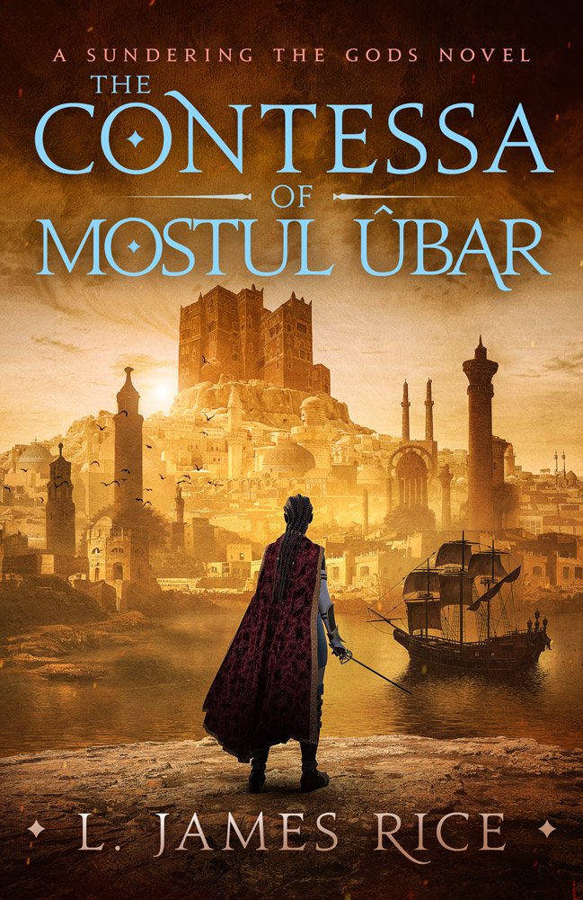
You are thinking it makes her hair look too long?
I did see the braids, I don't see anything wrong with her cloak.
You are thinking it makes her hair look too long?
I did see the braids, I don't see anything wrong with her cloak.
There is enough of a breeze to fill the sails of the ship in the harbor. Which means there is enough of a breeze to move her cloak.
Does the cloak have pockets? And if so, do they contain any weighty objects?
All looks fine to me, the cloak didn't stand out to me as "wrong" in any way. Even after having it pointed out, it wouldn't bother me. Just the wind being the wind.
As a graphic designer, this is really nice, the typography needs to readable and appropriate to the subject, which I think it is.
The only thing bothering my eyes is the the words ‘Mostul Ubar’, where I think they could do with being made a smaller point size and tracked slightly - extending the space between the letters so they aren’t bunched up.
The image has a central figure and creates a rule of three drawing the eye to centre of the book, so from that perspective, that also works.
That probably isn’t the kind of critique you were looking for…
Still looks really good! And it’s just my opinion after allNope, that fits well in what I want to hear. Unfortunately, I finalized it before reading this because I think you're right.

At last! A consensus!Late to the conversation, but I wish to add my vote to the "Nutty" column.
