Malik
 Auror
Auror

My one nagging thought is that the tagline text on the top is too small, or needs a different color. In a thumbnail that top line starts to look like the bottom line of an eye chart.
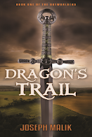
On the other hand, I don't know if punching up the tagline is really necessary; I mean, it will show up on a Kindle or hardcopy cover just fine, and allit says that this is the first book of a series -- a series that isn't even written, yet. It's not like it's critical information at this point.
Also, increasing the tagline font would require moving the sword down, and that would mean moving the titles, as the sword's crossbar is spaced the same as the titles (subliminally making the sword the first word of the title. See what we did there?) Moving the sword means moving the light behind the crossbar, and the shadows on the text, and so forth. It's actually a fairly major edit.
As it is, the title and author text show up pretty well as a thumbnail, and I guess that's the biggest thing.
Thoughts?
Last edited:


")