cdgallantking
 Dreamer
So I'm putting out my first novel in the very near future. Working with a budget of less than $0, I turned to fiverr.com to find a designer to do the cover art. I'm not looking to discuss the merits or drawbacks of such an arrangement, that's just what I've decided to do in this case.
I sent the exact same requirements and specs to two designers, and got back two wildly different designs. I'm very torn as to which one to go with, so I'm throwing this up to the hivemind to get feedback on which one people prefer.
First, here's the blurb for the book. After reading this, which cover do you think suits best? (Yes, I know the blurb needs work as well, but bear with me)
***
They say love hurts and time heals all wounds, but sometimes the reverse is also true.
Isaac was very good at wasting time. Video games, a mindless job, no responsibilities - he had a simple life and few wants and, despite being hopelessly average, unassuming and kind of useless, had somehow miraculously married the most beautiful and wonderful woman in the world.
He had no idea how good he had it, until it was all taken away.
Time does not like being wasted. It is mercurial, inexorable and carries a wicked grudge. And sometimes, just sometimes, it enjoys playing games with people's lives. To be perfectly honest, Time is a bit of a jerk.
Isaac had never learned to appreciate what little time he had, and now he must travel to the ends of the universe and face unspeakable evils in a cat-and-mouse game with Father Time himself for the slim chance to win back a few fleeting seconds of happiness. The price of failure? Only the end of all existence.
Ten Thousand Days is a fairy tale set in the modern day, a fantastic journey of desperate love and horror with a twisted sense of humour. It's a story of what a young man will do for love, and it's not always pretty...
***
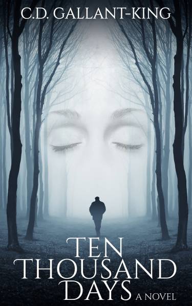
And here are the two options. The first one (with the closed eyes) completely ignored the instructions of what I wanted, but the more I look at it, the more it grows on me. Unfortunately it also looks like 90% of the eBook covers out there, so I'm worried it will blend into the wall of similar covers on the Amazon shopping page.
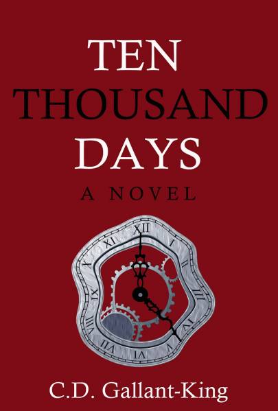
The second cover (the red one) is actually very much what I asked for, but I don't really like it. It's what I wanted in theory, but in practice it's kind of ugly. On the other hand, it may stand out more.

So what do you think? Why one do you folks prefer?
I sent the exact same requirements and specs to two designers, and got back two wildly different designs. I'm very torn as to which one to go with, so I'm throwing this up to the hivemind to get feedback on which one people prefer.
First, here's the blurb for the book. After reading this, which cover do you think suits best? (Yes, I know the blurb needs work as well, but bear with me)
***
They say love hurts and time heals all wounds, but sometimes the reverse is also true.
Isaac was very good at wasting time. Video games, a mindless job, no responsibilities - he had a simple life and few wants and, despite being hopelessly average, unassuming and kind of useless, had somehow miraculously married the most beautiful and wonderful woman in the world.
He had no idea how good he had it, until it was all taken away.
Time does not like being wasted. It is mercurial, inexorable and carries a wicked grudge. And sometimes, just sometimes, it enjoys playing games with people's lives. To be perfectly honest, Time is a bit of a jerk.
Isaac had never learned to appreciate what little time he had, and now he must travel to the ends of the universe and face unspeakable evils in a cat-and-mouse game with Father Time himself for the slim chance to win back a few fleeting seconds of happiness. The price of failure? Only the end of all existence.
Ten Thousand Days is a fairy tale set in the modern day, a fantastic journey of desperate love and horror with a twisted sense of humour. It's a story of what a young man will do for love, and it's not always pretty...
***
And here are the two options. The first one (with the closed eyes) completely ignored the instructions of what I wanted, but the more I look at it, the more it grows on me. Unfortunately it also looks like 90% of the eBook covers out there, so I'm worried it will blend into the wall of similar covers on the Amazon shopping page.
The second cover (the red one) is actually very much what I asked for, but I don't really like it. It's what I wanted in theory, but in practice it's kind of ugly. On the other hand, it may stand out more.
So what do you think? Why one do you folks prefer?