• Welcome to the Fantasy Writing Forums. Register Now to join us!

Novella Cover feedback request

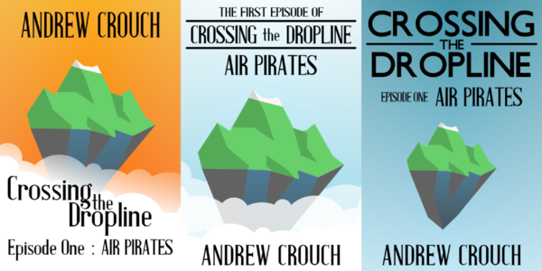
Would love feedback and thoughts on the cover for the novella I am trying to polish up and get published in the next few months. It is 26K words and will be a self-published e-book only offering.
Cover2_m.jpg

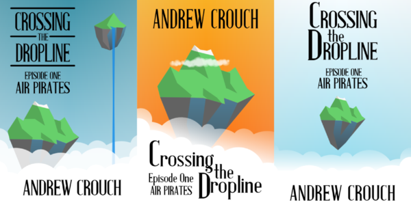
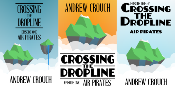
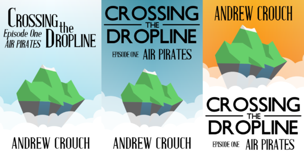
The book is fantasy but with a 1930's level of technology. The cover is supposed to be like a vintage 30's style travel poster and features the region the book takes place. A region of floating islands above a layer of dark clouds.

The series is called "Beyond the Dropline" and will consist of a set of novellas each called an episode.

Thoughts, critiques, feedback welcome.
 

CupofJoe

Myth Weaver
When I saw your cover I thought of this image Kasmir.
If you are going for an art-deco feel, I'd go with stronger font. Something like Johnston which I think is what they use on the early London Underground maps [those with the big round "o"].
I like the semi-abstract look of the cover but I'm not sure that I really get how that image relates to the story from what is on the cover... I don't think they have to relate [I can think of plenty of covers that don't match the stories and are great covers]. Maybe the linkage needs to be more clear or broken entirely...
 

Caged Maiden

Staff
Article Team
yeah, for me, the colors are a little matchy.. because art deco seems to be a little more contrasting. But I think the image itself is good, I just didn't get that the dark bit on the bottom was a cloud. It looks like nothingness, maybe a sea or something. The font, for me was the miss. I'm gonna post a couple inspiration pics and let you know how I'd incorporate a little of them. Hope that's okay.

95beb5eb-560c-4ba6-991a-a08a3ffb360a_BN_PosterProfit_013.jpg
I just think the colors stand out more in this one. The main color I dislike in your example is the sky blue with the green banner. What about a black banner with white or another color writing there? I think that would add a lot.

ec683be10078efcc5af9a6b196573b4c.jpg
I put this one in because it reminded me of your color scheme. I think the font, however, makes this poster. I think you need to put your name in a distinct but not confusing or hard to read font like this.

Okay, in short, if you put your hand over the banner and top part and change the font on your name to a more distinctively art deco font, I love this cover. But for me, the top portion looks a bit bland and detracts from the much better bottom 2/3.
 
Thanks both of you for the feedback. It is very helpful.

CupofJoe : The image is supposed to evoke a part of the world where mountains float in the sky. This is where the story takes place. The travel poster style says that it is perhaps an exotic part of the world, but attainable. I found a Johnston-like font and tried it for the episode title. I have a version with the same font on the author name aswell, but I don't like it quite as well.

Caged Maiden : It is more than ok to provide examples. Yours were very helpful. Especially the art deco skyscraper. I wanted to do clouds on the original edition and couldn't find a decent example. These were perfect. So I redid the picture slightly and took a stab at bolder colors even though the blue and green ideas remained. I tried playing with the font some as well, that is apparently whre I struggle the most with this kind of design. The suggestion of a white banner appealed as well. I hope the top third looks a bit better and yet is still readable.

So here is round too. I definitely like it better.
Cover3_Nickel_m.jpg
 

Graylorne

Archmage
Yes, me too. The first one had me thing 'Titanic'. This second one is much clearer and active.

Only I would like the font in 'Crossing' and in the author name a tiny bit taller.
 

Caged Maiden

Staff
Article Team
I love the one you re-did. That's so much more interesting visually. The thing I didn't like was the green banner. I liked the island, but the banner was a little not bold enough to be interesting. I think if you returned the island to the subtler original green it could be fine, but I definitely like the revised cover. And, wonderful font. Much better!
 
I actually preferred the first one, it was softer and the colours worked well with each other.

What about a sunrise or sunset background, and the feeling of solitude with the mountain in the centre?

I had a few possible ideas that I turned into similar covers, perhaps you'd like to see them?

If so, should I post them on this thread?
 

Caged Maiden

Staff
Article Team
Okay, here's my list of "keeps":
--keep the fonts and layout. LOVE it.

Changes:
--I'd have a look at the color green of the island and the color blue of the sky. They're vibrant yes, but almost kinda fake? Don't know whether that makes sense. They look like default colors in a generic paint app. I would encourage you to play with shades of colors for only the sky's blue and the island's green, until you get something a little more muted but very intentional-looking. For example, the colors in the skyscraper pic. They're intentional, but muted. Like I love the color of the sky. It might, however, not work with your picture, but maybe give a few colors a try and see whether you can come up with something a little less bright.

Sorry if I sound like a nag. I loved the color green of the original one (except for the banner being green), but disliked the too-blue sky. I think the sky is still a bit too bright (at least on my screen).

Also, just one more thing. Is there any way to make the front-most cloud just a touch more transparent? I think it would look really interesting to definitely see the island behind it. Just a little bit would go a long way.
 
Sure TheMirrorMage, post em here.

I really like how the composition works in the second round, but I am open to playing with colors. Be very curious what you have done.
 
No reason to worry about sounding like a Nag at all. I love hearing feedback. As I wrote to The MirrorMage, I really like the composition of the clouds. Thanks so much for the skyscraper example. I am open to fiddling with colors. I do understand what you mean about intentional colors, the question is whether I can translate that understanding into the program. We shall see. Practice is the only way anyway.
I may need to move the island a little too, but thanks for the thought on the transparency. I wanted a more solid white behind the author name, which is why it is like that, but maybe I can get that effect and still have it transparent for the island. I would like to show it floating as well.
 
I uploaded five individual images of covers to the gallery, along with these four rows of three covers. I have a quite a few still on my computer.

I used three fonts, all of which were free for commercial use: Underground NF, Anchor Jack and Antique Book Cover.

row4.png


row3.png


row2.png


row1.png


I took your mountain, which worked well in the first piece, and replicated it with the same colours and gradients. I took the clouds from the Empire State Building/Art Deco poster and, like Caged Maiden suggested, made the foreground clouds transparent.
 

TWErvin2

Auror
Just a few comments/observations:

In general, the name of an author is at the top when it's the name recognition that is likely to sell the novel. Otherwise, the title is normally across the top.

Episode 1: episode seems to refer to film/television, not a novella/novel/literature. Also, episode, to me, indicates an unfinished story--an incomplete story arc. If the novella sounded interesting to me, I'd be likely to wait for several episodes being published before I gave it a try? Why? There are many folks who 'try' something but never follow through and finish, or do so in a timely manner. If it doesn't sell well, will the author do something else and leave the episodes/series as they are? A potential reader that waits...is one that is less likely to return and buy.

Of those posted, the bottom center one is what appeals to me most.
 
TheMirrorMage - WOW. That is amazing that you did those so fast. I definitely like fonts and how the lines in places make things look. I will be playing with the cover again this afternoon after writing time. Thanks so much for the inspiration. As a note though, the last name really is "Couch" like the furniture. ;) As the island gets bigger, I somehow feel it needs more detail. Though not sure if that makes it too busy.
And thanks for the font links. That seems to be the hardest part for me. Finding fonts that are free for use and yet still give me the look I want.

TWErvin2 - Thanks for your comments. I definitely like the title on top and the author spaced across the bottom. Didn't realize there was a trend based on what is selling the book, but makes sense.

As for the Episode tag, that is intentional. I have a series planned that echoes more of a TV Series or Anime Series than a novel series. That being a longer series of much shorter than Novel length works. I am though very aware of the "wait until the series is matured" effect. This is the first novella of the series true, but I have the second one about half done. I will not release the first in the series until the second is complete draft and the third is at least plotted out. My goal is to put out a story every few months. I have a few other stand alone stories plotted out in Scrivener as well.

And though the novellas will hang together as an overall story arc, I am trying to be aware that each is a complete story in itself. If you have time/interest in beta reading the first installment and giving feedback on whether it feels complete, send me a PM.
 
This is a good start, and I like the premise, but I think you have a way to go. For one the elements are too balanced. That is, no one commands the eye, and one has too. I'd say it should be the main title. Which means the size of the episode title should come way down in comparison, and "episode 1" should come down even more. The Arial has to change to something more period. Arial arrived in 1982. (If that's Tahoma, it came about in 1994.)

In addition, that subtitle band was a staple of mass market mysteries in the early '90s. There were no paperbacks in the '30s, but to reference Art Deco posters, the art was usually full bleed (as was the art on early paperbacks) and fonts were often stacked. So I'd full bleed the art by putting some clouds around the title (I get the darker blue is higher sky, but you could do some more) with another island very tiny at an angle to the first (near the top left, not directly above) to suggest prospective, ditch the band entirely, and use the subtitle as a font foundation for the title.

Finally, the art. There's not enough definition in the island. It's too 16-bit. And something human should be on the island to draw the eye, perhaps a house with some smoke coming out of the chimney to suggest life inside. Even the first cover of Lost Horizon had a buildings on it. Also, the island's kind of wedged between two clouds, which feels painful and anchors the island. It should float above the clouds. Basically, you want to create a Yes album cover.
 
Thanks again for the feedback and ideas. I have tried to let it settle a little more in my head before putting up another round.
Cover3a_Black_m.jpg

Based on some of TheMirrorMage's ideas and a few things that Stephan had to offer, here we go.
I really liked the line style around the 'The'. I tried pulling off he band as well and liked that. I lightened the clouds a bit, to give the island a bit more breathing room. And stuck a small one way up in the sky to try to do that "full-bleed" idea.

The font isn't Arial. It is one called London Tube. I had another earlier which was different Sans font, but definitely not Arial. :) I rejiggered the colors too. I even experimented with some "sun rays" like the skyscraper pic, but they just made it feel too busy.

As for the comment that the island lacks detail.. I do see what you mean. The more detail I try to add the more it feels too much like a scribbling. And my mental reference for the cover is a specific poster type that relied on shapes and silhouettes, so somehow the detail doesn't seem to fit. At some level I think it actually reads better as a thumbnail than at full size.

I think this is pretty close to the cover I will use to launch the title. I am going self-published and am prepared that I will want to fiddle with the cover to see what sells better. I have a few other ideas if this one seems to be a hindrance to sales. We shall see.
 
It's turned out really well. I love the line inside the title. It holds it all together in a very solid, but somewhat unobtrusive way. I get your point re an island detail. It occurs to me that from a point of view of scale, anything big enough to see with any detail would also make the island seem smaller. Nice work.
 
Hi,

Two things. First I'd suggest changing the font of the epp 1 etc to the same font as the header and author simply for consistency.

Second, and this may just be me, I don't get a fantasy feel from the entire art deco style cover. And I don't get one from the title either. The only thing that tells me this book is fantasy is the epp title "air pirates" (and I'd suggest changing that to "sky pirates" simply for the visual imagery it gives). Could I suggest changing the title Crossing the Dropline to something that more evokes fantasy.

As a reader looking for fantasy I would see your book, and the vivid art deco graphics in your second design would catch my eye. But I can't tell what the books about from the cover so I would probably move on without reading the blurb.

Hope that helps.

Cheers, Greg.
 
Top