• Welcome to the Fantasy Writing Forums. Register Now to join us!

The start of a cover

risu

Troubadour
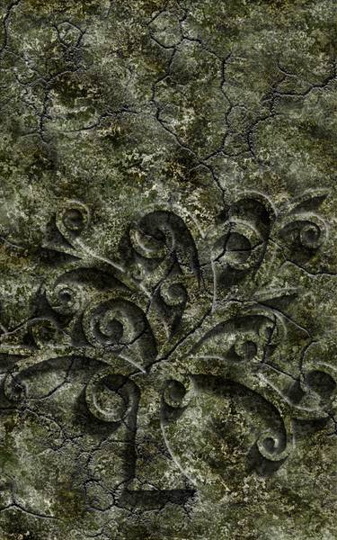
I've been playing around with creating my own cover, but it seems I'm not attracted to many traditional fantasy covers and all the concepts I've come up with have been shot down by my sister-in-law as not really seeming fantasy-ish enough, or aimed toward too young of an audience.

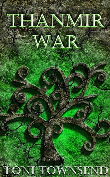
This is the first base image that I've gotten a response from her that says it's passable for fantasy. I'd like opinions if it does fit in with fantasy, and if not, would font face and color maybe sink it squarely in that corner? I'd also love general impressions such as tone impressions and interest.

stone-background-tree.jpg
 

ndmellen

Minstrel
It's cool looking, i'll give you that, but it doensn't really say anything "fantasy" to me. With out the title, it could easily be a carving. While I think it's great that you are breaking away from the norm, I personally look to the cover art to give me a general idea of what the story is about before picking it up and reading the blurb on the back (assuming it's an unknown author). A mixed race trio fleeing from a dragon in the background, good. A space marine on a pile of broken cyborgs, pass. After all, love at first sight is based on sight.
 

risu

Troubadour
After all, love at first sight is based on sight.

That I understand, and is also the reason why I flinch every time I look at any of the old style books that were hand drawn. I don't mind the newer styles, but unfortunately I don't have anything in my book that embodies traditional fantasy either. No dragons, no shadow-cloaked lurkers, no symbolic swords. I have elementals (such as the earth elemental who declares war and whose symbol is the tree). They appear similar to humans, but my graphic skills with people manipulation is rather lacking. And it seems any non-drawn person that isn't in a hood has been deemed YA by my sister-in-law. But if I did throw my main female character on the cover and throw a cloak and hood on her head with her elemental eyes, it might say fantasy, but then it'd also be cliche.

I like the new Terry Brook covers, but again, he has the benefit of dragon skulls.

Any suggestions to make this background more fantasy-ish? Think wispy strands of glowing green might help make it seem more magical?
 

ndmellen

Minstrel
I definitely agree about the hoods being everywhere. It seems like a huge trend since Brent Weeks wrote the way of shadows (don't get me wrong, I loved that series, and thought the cover art was great.) I'm new to the novel writing circuit, and couldn't begin to tell you the proven methods for cover art. Me, personally? I went to my tattoo artist. These guys are professional artists that are accustomed to giving life to the vaguest of descriptions. Generally, they can be very affordable, too. I sat down with my guy, explained the story, gave him an idea of what I wanted, then trusted him. He produced three character draw ups that I loved, and it only cost 100 bucks.

As far as cliches, I understand the wariness. In my mind though, there are a couple of subtle differences. A cliche in a story? Boring. But art, on the other hand...things become cliche because they work. From the brief description you gave me, your story doesn't sound generic, so I personally don't see the harm in taking a cliche concept with cover art and addapting it to suit your individual story.

Take your main character, looking off into the distance. Place the tree as a crest on her chest, or a sheild. Put some sort of elemental (fire, water, etc) wreathing her hand while a mountain is actively sundered in the background. I dunno; just a thought.
 

risu

Troubadour
Good thoughts, unfortunately the female isn't the main character. But she'd be the only one who would ever be wearing a hood. And the book starts out with her, but the hero is a modern guy from our world who winds up caught in the middle of another world's war (spawned by a decision made by the female). A modern guy isn't very symbolic of fantasy either. :(

The female is a water elemental, so she has silver-blue hair and eyes, and the eyes don't have pupils, which would make her appearance more appropriate for fantasy than the hero. Her crest is overlapping waves.

The one who is waging the war is an earth elemental and male. I had gone with the earth elemental crest and stone background because of my tagline: The earth province has declared war and a landscaper is at the dead center of it. (The landscaper is the hero.) But I can drop the tagline in favor for a better cover. I'm just not sure I can make a better cover, but I want to try and make my own before springing for a paid one.

I hadn't thought about tattoo artists, but that's a pretty good idea. I'm still hesitant about drawn images though.
 

tlbodine

Troubadour
My biggest problem with this isn't the imagery itself (I tend to prefer covers that *don't* try to illustrate the book, as they so often fail to reflect what's in my own head) but that I suspect the entire thing is going to be impossible to see at thumbnail size. It's already kind of challenging to make out the detail of the tree against the rock since there's all the colors and cracks competing for eye attention. I'm afraid this might look like a blue-green blob at 160 pixels.
 

risu

Troubadour
Excellent point!

I added a green glow to maybe make it look more fantastic and differentiate the tree. Any better?

stone.jpg


Thumbnail (160 px tall) size:
stone_thumb.jpg
 

tlbodine

Troubadour
Ahh! That looks so much better. (the title letters could use some work to help them stand out, but that's an irrelevant issue at this precise second). I actually really like the tree design. Here's my impression on looking at it, knowing nothing about the book: I'm imagining that this book will be more of an alternate-history type fantasy than an epic/high fantasy adventure. I'd expect the story to be a little dark and gritty. Basically, I'm imagining it would be in the same vein as Game of Thrones (probably because those covers get a similar-ish treatment).

If any of that is even remotely accurate, you're probably on the right track. If not, well....
 

Nihal

Vala
Actually, I think the title not being so readable is a pressing concern. Although having a pretty cover is important, it's main purpose is still to rely some information to the reader: Title and author.

Try to use a bolder font, without any effects, and preferentially a clean one (not that the one you picked is exaggerated). Your image is already full of details, textures, so you don't want to go too much over the top or it might look dated.

It also doesn't make me think of a dark and gritty story at all, I imagine elves, faeries, magic, prophecy. It's a neutral cover, so it doesn't really set the tone of the story.
 
Last edited:

risu

Troubadour
I haven't been able to decide on a font, so I just went with one of my old favorites, even though I knew it wasn't bold enough to stand out on this background. I'm still searching for a good (and free for commercial use) one. I was going to throw my name across the bottom, beneath the tree in the Castellar font (the one I used for the title) and use a bolder one for the title. Just have to find one now...

I was aiming for a darker, earthy feel. I'd be good with some taking it as dark and gritty, while others see it as neutral. :) It's about a war, but it isn't all about death.

I made another version, which had the cracks glowing green, but it didn't make the tree stand out any more than the original.
 

Nihal

Vala
Yeah, glowing cracks are cool, but would be too much information, distracting from the main elements.

What kind of font you want? Serif, sans-serif, classical...?
You can find some nice, professional and semi professional free (or not, you pay what you can) display fonts here: Lost Type Co-op. Those guys are really nice.
 

tlbodine

Troubadour
Actually, I think the title not being so readable is a pressing concern. Although having a pretty cover is important, it's main purpose is still to rely some information to the reader: Title and author.

Well, obviously. I just meant: If we're trying to decide whether the image works, let's not get sidelined picking out fonts.
 

risu

Troubadour
My sis-in-law tells me that it looks like the tree is giving off toxic fumes and my husband says the shadows beneath the tree are wrong now. *sigh* I'm not sure of a different/better way to make the tree stand out more.

I am looking for a Serif font, bold but not wide, something that says fantasy, but isn't dramatic or busy. Heh, not picky at all.
 

risu

Troubadour
I moved the glowing green aura down a couple of layers to show more of the stone texture and hopefully make it look more natural. Added a green glow to the text to help pronounce it more on the backdrop (still using Castellar). Also trailed the shadows the other direction as if the green glow was being cast by the tree. It helps in the thumbnail size, but not sure if it looks tacky at the larger size. My name is left without the glow for comparison.

stone_2.jpg


stone_2_thumb.jpg
 

Devor

Fiery Keeper of the Hat
Moderator
Sorry to just jump in here. I think the glow and the rock looks a lot better, but now something is making the tree itself look a little off. I think it's too dark now that the green frames it less. And it's more distracting that the lines run straight through the tree, which is an effect that was previously muted by the glow. Can you try brightening the tree and toning down the cracks on the tree itself, which I think were made more prominent with the second version....?

Also, as others have said, you should look at crisper fonts. The two-tone font affect that you're using isn't working at all.
 

risu

Troubadour
Meh? I added the drop shadow to the title to help differentiate it a little, still angled upwards.

stone_3.jpg
 

Devor

Fiery Keeper of the Hat
Moderator
Yeah, too much for some letters. And the double-R-curly drop looks awful. Keep trying.

The picture looks good now, I think.
 
Top