• Welcome to the Fantasy Writing Forums. Register Now to join us!

The start of a cover

rhd

Troubadour
I'm quite impressed you did this all on your own. I'd agree with green being a tad saturated, you can't tell perfectly how it looks to everyone else unless your screen is calibrated, you can always reduce the saturation a little, and take a couple of separate hard prints with variations to check, and I highly recommend that before you go for a final print. My colours don't always come out perfect so I always do that.
Are the sides of the tree deliberately cut off?
 

risu

Troubadour
Thank you!

The sides are cut off, mostly because I thought it looked better with the greater tree height. If I shrank it down to show the entire tree, I thought it might leave too much open space.

Are the glowing cracks the green you and others are talking about? I'm still not sure.
 

rhd

Troubadour
Are the glowing cracks the green you and others are talking about? I'm still not sure.

If your book is for a hard copy publication, you can take a trial print to see if the green is too saturated, on screen it certainly looks saturated.
I hope you don't mind, I reduced the saturation and made the green a little mossier to explain. The complimentary red in the background is enough to make the green stand out. Unless you're deliberately going for a paranormal green, then it's fine the way it is :p

Thanmir_War_Stone_Tree_zps236776cb.jpg
 
Last edited:

risu

Troubadour
I'll play with the shade of green. My sister-in-law thought it lent toward the fantasy feel where the tree and stone on its own weren't doing the job. (I'm thinking the paranormal green is what influenced her opinion)

I'm not a big fan of the washed out stone and the shade of green. It makes it look more like there's mold growing in the cracks rather than the cracks glowing. More feedback from a different friend said that the cracks around the title are pretty heavy, so I've been playing with removing some of them and cleaning up some of the more blurry sections of the cracks. I haven't adjusted the green saturation.

I'm still not certain if the "green" comments refer to just the cracks, or if they refer to the shade of stone itself too.

thanmir-war-reduced-cracks.jpg
 

rhd

Troubadour
Yes, the paranormal green definitely gives an emerging magic feel, and the mossy green looks like mould.
 

Evilyn

Scribe
I like it, has a very druidic feel, I prefer it now since you removed the strong green background as it initially reminded me of magic the gathering.
 
Last edited:

tlbodine

Troubadour
I love this newest iteration. The cracks are just small enough to really "sell" the "magic breaking through stone" effect to me, I think.
 

risu

Troubadour
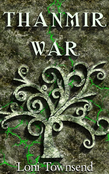
This is what I finally settled on. I had to remake it from scratch to increase the dpi from 96 to a printable 300, but I'm pleased with the outcome. This is the full cover, including back flap, so if you don't like to read book blurbs (I recall reading that some people don't), then please don't look at the left side.


If you're interested in how I made it, I wrote a blog post about it: The Cover.

Thank you all for your feedback, and I'm willing to accept more if you have some. These are just my five free copies from NaNoWriMo. I don't plan to self-publish until the fall.
 

Weaver

Sage
As a background, this works well. Title, with appropriate font, is needed to see if the cover works as a whole. Given how many covers for fantasy fiction these says are done like the paranormal romance kind even if for traditional epic sword-and-sorcery, I'd say that, in a bookstore, THIS cover would get my attention as a book at least worth taking a look at, because it DOESN'T scream 'I disrespect your genre and all that it stands for because all readers really want in a story is lots of smooching and they don't care if it's mundane or vampire-werewolf-rutabaga love triangle -- so there!!!'

Besides, I like the bas-relief carved stone effect.
 

Weaver

Sage
Should have read all the posts before replying...

Yes, with the title and such added, this definitely works as a cover. Looks professional, even. Good work.
 

Asterisk

Troubadour
I love it! The green light gives it an eerie pop (if that makes any sense). I would definitely pick this book if I saw it on a shelf!
 

shwabadi

Minstrel
Looks pretty outstanding! :D
I wasn't sure if it would work from some of the early images but you've definitely made it very fantasy, not to mention professional.
 

startist1

New Member
Hey there! Let me preface this by saying I am a professional illustrator and graphic designer with over 12 years of experience. My fiance' writes Fantasy fiction so I am getting to know the genre a bit and seeing what others are doing for cover art, before I delve into concepts for him. I love that you are steering away from 'traditional' fantasy covers. Although I read those religiously growing up, the hand drawn characters- elves, magi, knights etc. on the covers will forever make me thing of young adult fiction. You approach is much more sophisticated. My first impression of the top image was that it is very dark and a bit overly textured- the image is not discernable and lends itself to confusion. Once the Green glow is added the tree is instantly recognizable! I think with some tweaking it could be a viable and intriguing option. My first thought is the tree shape is a bit stiff, and ends abruptly at the bottom of the trunk. some tweaking of the tree shape to be a bit less stock may help. The texture is still very distracting, the color could be smoothed a bit and less mottled, the cracks are great but hard to see with all that color texture overwhelming it. You can find nice free grunge textures on line, some fading and manipulation can add interest without overwhelming your overall imagery. The green is very mystical, but perhaps sone gradation in the glow color could add some depth and realism. I think the idea with the cracks below the tree glowing is great, maybe try it again? If you lessen the spread of the green glow a bit, and add some glow inside the cracks immediately surrounding your tree shape it will appear to be exploding from or affecting the earth below it- very powerful imagery! It will add mysticism and intrigue. Font choice is SO so important, you are on the right path... simple, clean no more than 2 fonts and no more than two sizes. The smaller the font (author name) the SIMPLER the font should be. Strokes, serifs, drop shadows, glows - all will detract, look amateurish, and be less legible the smaller a font size is. Well that's my pro opinion- Good luck and great job!
 

Fyle

Inkling
I like the revised one... before I saw it I was gonna suggest putting the text right where you did.

My personal opinion is the font is not quite working and I would see if a yellow tone worked instead of the white, or perhaps intensify the white to push up the text.

But, I like it, I mean there are so many fonts to choose from... it's hard to settle on one that hits the mark exactly.
 

risu

Troubadour
Startist1, would you be referring to the first image or the final product?

Fyle, thank you! After pointing it out, I do notice the title is lacking. There is supposed to be a slight green tint to the font, but it's barely discernible at the smaller size. Fonts and I aren't good friends. There are so many to choose from.
 
Last edited:
Top