I like the picture, but I'm not a big fan of drop-shadow like what you've got on the text. Especially in the small text under the title it makes the text a bit blurry and hard to read.
This is a personal preference but I'd remove the drop-shadow completely.
I'd keep the face and the rugged background though. I like those.
I'm undecided about the lens flare up in the left corner. I'm not too fond of it, but I can't honestly say if I think it'd be better without it.
I'll agree with what others have said about the font and drop shadow I'll also say I'm not a big fan of the flare in the upper left corner. Since you mentioned it wasn't there initially I must ask if it in any way connects to the story. Or is it only there to fight the overall darkness of the image?
I agree with what the others have said about the drop shadow.
The flare, I don't mind, but I don't particularly like. It wouldn't change my view of the cover whether it's there or not, but that's just me.
I find the face very intriguing. I would definitely pick this book up from a shelf to, at the very least, read the blurb.
The drop-shadow will go.
The lens flare I really need to light up the cover. Besides, there are lots of lights and rays in the story.
I didn't go for any Mardi Gras theme, but there is an event in the book that is reminiscent of the Venetian Carnival (hence the Venetian mask).
 Scribe
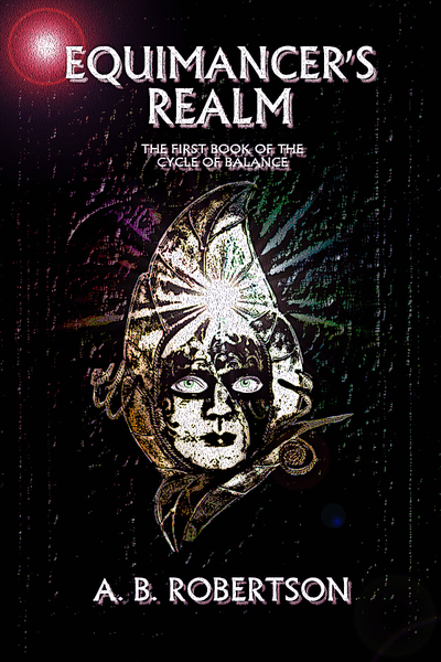

")