• Welcome to the Fantasy Writing Forums. Register Now to join us!

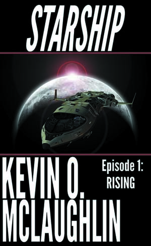
Opinions/thoughts welcome: new cover for SF serial episode

Made this last night. Interested in hearing thoughts on the overall design and appearance.
It's for an SF serial (not fantasy, but I write both and I know many of us read both!).

The follow-on episodes will keep the overall layout, with a new picture in the image section.

starship_1_ebooks_small.jpg
 

Xaysai

Inkling
I'm really no expert, Kevin, but 2 things came to mind.

The style of the word "Starship" is very similar to the style use on the front of the Starship Troopers movie.

Your names is REALLY BIG, and left me wondering if it should be larger than the title of the book.

I like the planet graphic, though.
 

Devor

Fiery Keeper of the Hat
Moderator
The first thing I saw when I looked at that cover was your name. I had to force my eyes to look at the rest before looking away. So, your name is definitely too big. You've also got balance issues, I think, besides the name, but fix that and those might be more clear.

Not crazy about the fonts. The ship is too dark to stand out as a thumbnail.

Episode 1: Rising should be above the name, I would say overlapping dead space on the picture instead of beside your name. Maybe try a different color.

Consider changing the name Starship, that tells me nothing that the picture doesn't already and is not compelling.
 
Thanks, guys! Making some changes based on your thoughts.

The author name *should* be large, should be one of the most visible elements. It's your brand - and you want to begin building it. But I think it was a little too large. Still want the image on the upper section of the cover, so looking at swapping the title and author placement, increasing the episode title size a little and placing it under the title, and making the ship "pop" a little more.
I just posted a thread about a blog I just finished reading. I've always assumed the branding thing as well, but unless you're doing a print version, it's unnecessary in ebooks. Wherever they are seeing your thumbnail will have your name and the title of the book as well. If you're releasing this in print, then by all means enlarge.
 
My feeling is that readers often have eyes drifting toward the images, scanning the images more than the titles and author names. I could be wrong, though. ;)

Wanted to thank everyone for the help! Made a bunch of changes based on various suggestions. The first episode should go live on various retailers from today (1/30) through Friday (2/2).
 
Top