Hey all.
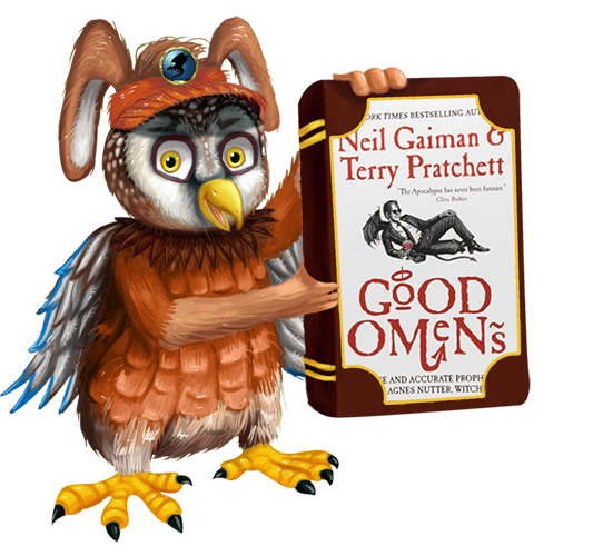
This is a piece of art that I had commissioned for the Reading Quest article series. The goal is to push people to read more by recommending books on a theme once in a while, and for the art, to swap the cover on the book with one of the regular recommended readings.
As you can probably see, there are a number of problems with this piece (some are my fault, and some are the artist's). I was hoping some of you could help me out a bit with it.
What do you think? What are your first impressions?
I haven't put together a background or the font with the series name yet. The final piece will go wide, with this guy on the left and the words "Reading Quest" stretching out to the right.