• Welcome to the Fantasy Writing Forums. Register Now to join us!

The start of a cover

Addison

Auror
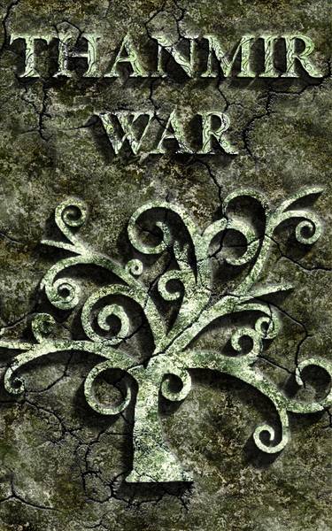
Might I suggest dialing down the "wow" of the color. It's great, it makes the tree pop, but it draws my eye to the color, not the tree. In the original cover it looked like the green was moss or something. Try giving the green a moss texture and a variety of bright, earthy green. Forest, emerald, and whatever green you're using now. It could hlep make it look like it's part of the tree.

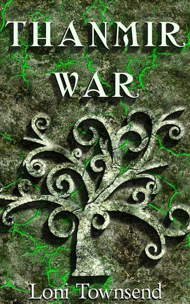
Love title, having it so deep in the rock, not so good. Maybe if you can make it look like cracks in the rock itself are writing the title. Or something that, you know, matches the art but still stands out.

You're definitely on the right track. :)
 

risu

Troubadour
Thank you. :)

I haven't tried engraving the title into the stone. I'll try playing with that. I've thought about using the cracks, and also about adding vines (unfortunately, I don't know how to make vines), and playing with those for the title. But black blends in, making it difficult to see, but maybe if I engrave it with white highlights, it might work.
 

Addison

Auror
I recently spotted a font that I think you might like for the title.
Have you heard of a book series called "Farworld"? The author's website uses a great font. It's in caps, its bold (not like ctrl+b), striking and has a fantasy-kick.
 
Hi,

I like the cover but it doesn't tell me a lot about the book - ie what it's about. I'd probably guess fantasy, maybe elves etc but even that is based in part on the title. Oh and I liked the raised stone lettering better than the white version which looked out of place.

Cheers, Greg.
 

Caged Maiden

Staff
Article Team
What about using celtic letters? I use them a lot when doing calligraphy and the great thing, is they're all caps.
 

risu

Troubadour
Had a wedding to go to in a different state so I couldn't play with my cover these past few days. :(

I like the FarWorld font, but it looks proprietary so likely I'll have to draw my own, similar, but not exactly the same. I've looked at some of the Celtic fonts, but most seem more than what I'm really looking for.

I've had one friend tell me the cover looks too grungy, grunge foreground with a grunge background. That makes me wonder that if people hadn't seen the original (like her) would they get the idea that the tree was carved from the stone? Do you think the green glow is removing the tree? (I've played with colors but haven't come up with a good mossy look yet.) Can anyone think of a different way to make the tree pop?
 

risu

Troubadour
I haven't had the opportunity for font design, but this one is Tribal Garamond, free for commercial use.

With the attempt to not disjoin the tree from the stone, I removed the green glow and instead tried manipulating the color to differentiate it. The sis-in-law says it looks more like scrubbed stone, but less like it's emanating toxic fumes now. At her suggestion, I tried doing a bit of the embossed stone look to the title as well. This version doesn't have my name on it though, since I'm not sure which font I want to use for it. Better? Worse?

scrubbed-stone.jpg
 

tlbodine

Troubadour
I really like the treatment of the tree on this. I like the font for the name, too, and the carved stone look feels right, but the texture feels a bit busy. How would it look with this same tree and the letters with drop shadows, but in a solid neutralish color (like the white-ish tone already in the letters now)?
 

risu

Troubadour
The issue I'm running into with the solid background is that it either looks super plain (if I remove the cracks as well):

just-tree-and-title.jpg


Or the cracks overpower the tree and lettering (if I leave them):

tree-and-title-w-cracks.jpg


I could try generating a different stone texture? Something with less texture?
 

TWErvin2

Auror
How will this look as a thumbnail? Many folks browsing will see it only as that untill they explore further, if they do.
Also there isn't an author's name on the cover. Is there room for it? Finally, if you ever want to have it in print, you'll want some extra space along the edges, more than there is now for the cover, especially if it's POD.
 

risu

Troubadour
Ah, I'll redo that for a solid font and return the background. A friend says that despite what I've found on fontspace, Tribal Garamond is apparently only for personal use, so I need to go font hunting again. :(

@TWErvin2 - I haven't shrank the latter ones to thumbnail size for forum view since I'm still figuring out something that works, but I do check it on my computer. The scrubbed tree on the dark background does allow it to still be visible and stand out.
 

Devor

Fiery Keeper of the Hat
Moderator
The thumb:
Thanmir_War_Stone_Tree_Thumb.jpg

I might be in the minority, but I don't really like it myself. I think the green cracks pull way too much attention into the background and makes the whole thing look very busy. I also feel the white tree and white font blend and are kind of everywhere so my eyes don't know what to do. I think you should go back to the image in post 18, radically rework the font, and then tone down the colors as appropriate from there.
 
Top