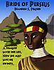
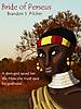
I have created two covers for my story Bride of Perseus. Both feature a drawing of the main character that I made myself, but the first one has a photographic background and the second has a background I drew myself. Which one do you like more?
from a technical perspective there is no white ink so flooding the page with dark ink is difficult to print especially if people download themselves
I question
what is the cover saying?
How is it selling the book?
What image is important to the story?
why will people understand the story by seeing this image
the text is also close to print edges
So far the consensus here has surprised me. On another forum where I posted this, everyone thought Cover 2 was better since I drew the background myself and the font was bolder and more interesting.
I think the second one looks kind of bad. The outline-font is not attractive, the quote looks clunky on the page, the color contrast feels weird, and the shapes of the mountains and trees do not look natural. There's far too many colors. Godhood even reads better than divinity.
The first one is just more elegant and catching, even down to the balance between the white quote and the white necklace. You could tinker with the title font a little bit, and maybe give the picture a little more pop to it, but by and by I think it's a much better choice.
In all honesty, after further reflection I think I should entrust the cover design to a more skilled artist than myself. I know some superior artists on DeviantArt who could design great covers. Besides, my story's supposed to be action-packed, so the heroine's passive portrait doesn't really do it justice.
That said, Devor, I could tell my illustrator to use the color palette in my cover 1.
I'm kind of caught. I agree with most of what's being said about cover 1, but... idk... the drawn/cartoon image looks out of place against the photo background. Maybe if you made a drawn version of that background or found a stock image of a woman to use in place of the drawn image?