• Welcome to the Fantasy Writing Forums. Register Now to join us!

Does This Cover Convey Frustration?

Hi guys,

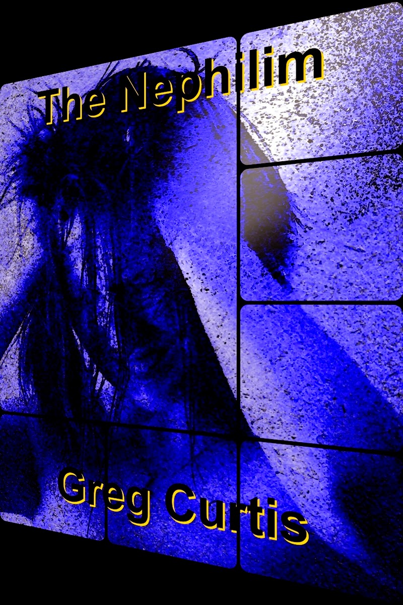
I'm in an argument with my editor (also my sister) at the moment about the cover for The Nephilim. An while she's right that it is slightly off topic, my view is that the image itself is less important than the emotion it conveys. All I really want it to convey to the reader is frustration.

What do you think?

Cheers, Greg.

TheNephilimCover2Blog.jpg
 

teacup

Auror
You asked if it conveys frustration, so when I first saw the image I already had the idea of frustration in my head, so I can't say whether frustration would be what I would have seen first.

But it can be seen to convey frustration, as well as other things. Anger, stress, despair (it's an unclear picture so she could be crying for all I know.) It could even be headaches or voices in her head I guess :p

You may be better off showing it to others and just asking "what emotion does this convey?" so that "frustration" isn't already planted in their heads, so that they can give a better answer.
 

Ireth

Myth Weaver
It took me a little while to figure out what the image even is. That might be an issue.
 

TWErvin2

Auror
I am not so sure the image works. It is not clear what it is. And the title, is it a reference to a giant or son of a god/giant of some sort?

If the potential reader cannot make a quick connection via either the title or the cover image, or some combination that complements each other, I think it will not help entice a reader to look further.

The only thing that is left is the author's name, which your name is not one well known, and thus, won't draw readers in.

If this were in a line of other thumbnail pics, I wouldn't be tempted to click to seek further, which is a major measure of the cover. But that's just me. Could be very effective for others and I'd be a minority in that respect.
 

Addison

Auror
I'm with Ireth. When I saw your cover, my emotional response was more like "WTF??" And at second glance I felt a little wonder and it reminded me of the Twilight Zone theme song. I can kinda see how you planned on the frustration, the thing in the screens looked angry and haphazard, but it was the colors and design that didn't convey frustration. Reds and oranges are the best colors and you'd, I think, be better with vertical lines (if you want it clean) or zig-zags/ tiger stripe lines.

That's just my opinion. Hope it helps. :)
 

Caged Maiden

Staff
Article Team
to me, it looks like a man in pain. I didn't want to comment earlier when I saw it because my assessment isn't a positive answer for you, but I have to concur that for me, this looks like a mixed message and it isn't effective for me as a reader to want to open it. If I saw this cover, I would think it's about a person who has a war going on in their mind. If that's what you're going for, I would fix up the colors so it isn't so hard to decipher.
 

Philip Overby

Staff
Article Team
I agree with Ireth also. It took me several seconds to process what I was looking at. I thought it was paint splattered against a wall at first. Then I saw the image pop out and said, "Oh!"
 
Last edited:

startist1

New Member
Hey there, Let me preface this by saying I am a professional illustrator and graphic designer with over 12 years of experience. My fiance' writes Fantasy fiction and is self publishing so I am getting to know the genre a bit and seeing what others are doing for cover art, before I delve into concepts for him.

I am not sure if you are still working on this concept but I agree it is working against your theme. The colors are cool, generally used to convey, calm or even depression. This would lend me to think your character there is maybe grieving or distraght more than frustrated and angered. I did not see the person immediately either, not sure if that was intentional. Also the angle and the font do need to be revised. I cannot express enough HOW important font choice, style, size and placement is for a book cover. I can pick out an amateur book cover a mile away on fonts alone. Some ground rules- simple is good, classic and modern are better, stay away from Comic Sans, Arial, Mistral, and Papyrus. Dafont.com has beautiful and royalty free fonts. Look under the sans serif and serif categories. You can go for stylized fonts they can work for the right story- for example Harry Potter type illustrated fonts. Get a professional opinion or help in execution of these types of font styles. Things to avoid or proceed with caution: drop shadows, black type on dark backgrounds, NEVER use yellow for lettering (sorry its the most illegible color for print and media), strokes, and embossing of letters. All very amateurish and will not give you that polished look. Use no more than two font styles and two font sizes.
People read in a direction similar to a 'Z' - across the top, down to the bottom left corner and out to the right- compose your layout composition in this manner and better balance will be achieved. Good Luck!
 
I don't mind the image that much, I saw the girl right away, I like the dimensionality of the image and how the franticness of her hair works against the blocks comprising the image. But the fonts are not working (I'm in absolute agreement with startist1), as is their placement, and there's something very '80s about the colors and the girl's styling. For colors you might try something you normally shouldn't do: use colors that vibrate together, such as orange and yellow (see the hardcover of Dean Koontz's Intensity) or blue and red. Also, check out Chip Kidd's archive: The Book Cover Archive : Chip Kidd┞¢. His covers for Ring and Winter Sleep might give you some ideas. The links to other designers at the bottom are also worth investigating.
 

Fyle

Inkling
It took me a little while to figure out what the image even is. That might be an issue.

I must agree here as well. However ... when I realized what it was, I didn't feel frustration but I could see that the person pulling his/her hair out is frustrated ...
 

N.T.D

Dreamer
Hi,
In a way, once you realize what the picture is. but i would take sometime to come up with something more appeasing to the eye and easily identified. just think of a point where you were working on a project, on your desk maybe and you hit a block. how would you look to someone observing you at that moment of utter frustration? maybe try to capture that image and make fit the material in the writing.
 
Top