• Welcome to the Fantasy Writing Forums. Register Now to join us!

Need Comments on my cover proof

BWFoster78

Myth Weaver
Hi all,

Long time, no see. Though I haven't been around here for a while, I have been working hard on my writing, and I think I'm almost ready to finally publish my novel. The plan is to complete the rewrite sometime in June and send in for a second round of editing. If all goes well, I could be on Amazon before the end of the year.

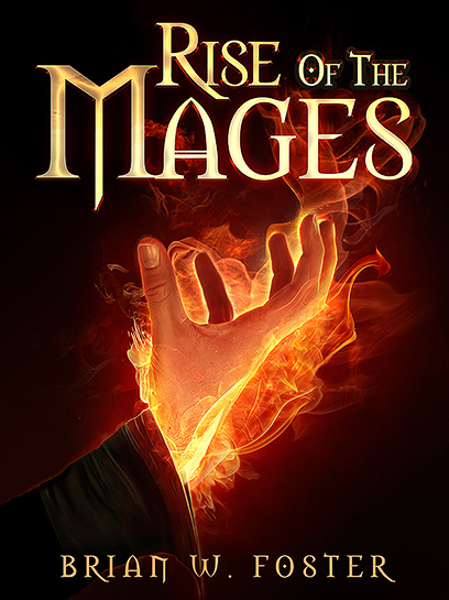
As a reward for all the hard work I've done lately editing, I allowed myself to do something "fun" and hire an artist for the cover. Comments/critique would be greatly appreciated!

This (assuming I don't screw up the linking) is the first version of the proof she sent me:

1.png


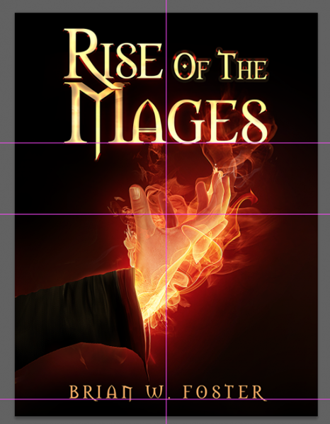
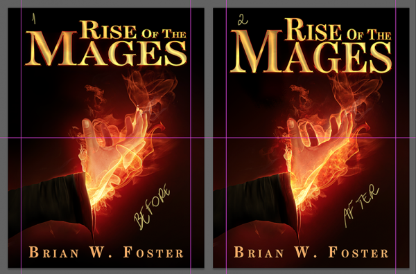
I didn't like some stuff about the hand, so I had her make some changes. She also tried a different font.

Block_Sample_with_New_Hand.png


I think I like the first font (modified to make it a bit bigger and so that "Mages" is a bit more readable) with the new hand.

Any comments/thoughts?

Thanks.

Brian

PS Longtime forum members may remember my novel being titled "Power of the Mages." Same book, new name.
 

Svrtnsse

Staff
Article Team
Spontaneously I liked the top version best.
However, I didn't realize there were two other versions until after I scrolled down a bit, so I spent some time looking at it.

Would you have the second set of images in the same size/scale as the top one. I think the scale might make a difference as it was (for me) easier to make out the details of the hand in the first, bigger, one.
Of the updated version I like the font better in the second one, but the wrist of the hand feels a bit thin in that version compared to the first (though that might be the light).

PS Longtime forum members may remember my novel being titled "Power of the Mages." Same book, new name.

That's the one that begins with the sleepy apothecary, right? Good to hear from you again (no, I still haven't figured out this whole tension mumbo jumbo you used to go on about :p).
 

Caged Maiden

Staff
Article Team
For what it's worth, I liked the font in the first (because the fonts of your name in the other two examples is rather plain), and I liked the hand best in the edited version. In the first two images, the hand/ fire combo was too overlapping and confusing, I'd think for a thumbnail especially. I like the simple, yet intriguing cover. Good job.
 

BWFoster78

Myth Weaver
That's the one that begins with the sleepy apothecary, right? Good to hear from you again (no, I still haven't figured out this whole tension mumbo jumbo you used to go on about :p).

I'm not quite sure I've completely figured it out yet, either, though I think I'm getting closer!

Thanks for the comments.
 

Tom

Istar
I like the new font and the layout! Covers like this always stand out to me. A bright image on a dark background has a lot of impact. People are more likely to notice it.

I have to be honest, though--the hand kind of freaks me out. The extreme angle the wrist is bent at, while not impossible to achieve, looks really unnatural. And I can't help but feel like it would have greater impact drawn from a different angle--maybe having the outer edge of the hand in front, instead of the inner. It's not a mistake, but I dunno--the thumb in front just doesn't look right to me. I'd prefer it if the hand looked a little like this:

outstretched_hand.jpg


The angle, plus the folding of the fingers and the subtle twist to the wrist, makes it a much more visually interesting and anatomically sound position.
 

BWFoster78

Myth Weaver
Tom,

I don't disagree about the wrist at all; it was one of my initial concerns about the image she started with.

I like the hand, though. The purpose is to symbolize "rising up," which the cover does better, I think, than your image. Also, I think that the hand in the cover, overall, is tense and symbolizes conflict whereas your picture looks calm and peaceful. I'm really want my cover to make the person looking at it think, "Conflict!"

Any thoughts on how to modify the wrist to make it not look so off?

Thanks.

Brian
 

Devor

Fiery Keeper of the Hat
Moderator
Hey BW! I'm glad to see you're still at it!

A few things about your cover:

- I like the font in the one marked "Before." BUT I think "Rise of the" should be in one font size, whatever size stretches it to the end of Mages.

- I agree with Tom about the angle of the hand. But you can probably fix it just in photoshop. Separate the hand and the sleeve, rotate them slightly away from each other, and if there's a weird looking gap, cover it with a little more fire.

- Are you familiar with the rule of thirds? Google it really quick because for whatever reason it really works. Your fireball hand would look a lot cooler if it was a little to the left and the fire stretched a little further to the top right. Happily enough, that should be easy enough to do at the same time as the step above this one.
 

BWFoster78

Myth Weaver
Hey BW! I'm glad to see you're still at it!

A few things about your cover:

- I like the font in the one marked "Before." BUT I think "Rise of the" should be in one font size, whatever size stretches it to the end of Mages.

- I agree with Tom about the angle of the hand. But you can probably fix it just in photoshop. Separate the hand and the sleeve, rotate them slightly away from each other, and if there's a weird looking gap, cover it with a little more fire.

- Are you familiar with the rule of thirds? Google it really quick because for whatever reason it really works. Your fireball hand would look a lot cooler if it was a little to the left and the fire stretched a little further to the top right. Happily enough, that should be easy enough to do at the same time as the step above this one.

Devor,

I'll pass along your comments directly to my artist.

Thanks!

Brian

PS. Good to be back talking to y'all. I took a break from writing for a while after Annabeth was born, but I'm in a really good place with my writing at the moment. I'm not nearly where I want to be as far as my knowledge (I don't think there's any way my first book can be as good as my tenth!), but I think I've found a style that works for what I want to accomplish.
 

Tom

Istar
Tom,

I don't disagree about the wrist at all; it was one of my initial concerns about the image she started with.

I like the hand, though. The purpose is to symbolize "rising up," which the cover does better, I think, than your image. Also, I think that the hand in the cover, overall, is tense and symbolizes conflict whereas your picture looks calm and peaceful. I'm really want my cover to make the person looking at it think, "Conflict!"

Any thoughts on how to modify the wrist to make it not look so off?

Thanks.

Brian

Yeah, the image I pulled up was the only one that really conveyed the angle I wanted...the mood, not so much.

I think the problem with the hand is mostly in the position of the wrist and forearm. They're nearly at a 90-degree angle, and the human wrist just does not bend like that--unless it's broken. The hand still looks good, and you can fix the forearm by positioning it closer to a vertical angle, so that the line of the whole arm starts in the lower left corner and ends in the center of the cover at the fingertips.

Hope that helps.
 
Last edited:

Tom

Istar
Yes! That looks amazing! I like the hand so much better now--what a difference just changing the angle can make, eh?
 

BWFoster78

Myth Weaver
Yes! That looks amazing! I like the hand so much better now--what a difference just changing the angle can make, eh?

No joke. Enlarging it per Devor's suggestion helped a bunch as well.

Thanks again for the comments. I'm pretty happy with the results.
 

Legendary Sidekick

The HAM'ster
Moderator
Welcome back.

I'm late to the party, so I'll just add: yes, cover problems are all fixed. I even like that in the final version it's the original font but the letter S's are fixed. That was the only comment in my mind that didn't come up. The S's looked half-S/half-8 in the original post.
 

BWFoster78

Myth Weaver
Welcome back.

I'm late to the party, so I'll just add: yes, cover problems are all fixed. I even like that in the final version it's the original font but the letter S's are fixed. That was the only comment in my mind that didn't come up. The S's looked half-S/half-8 in the original post.

I think I could have tweaked this thing forever (much like my novel :) ), but I really like the final result (hopefully like my novel :) ).

I find myself just staring at it. Coolness. Really, really like the concept. Really, really glad I didn't try to do the artwork myself.
 

teacup

Auror
I was wondering where you went, good to have you back :D

Looks like you've already got the cover sorted now but I'd just like to say that I love it. I'd definitely pick this up to find out a little more if I just saw the cover, and I can't think of anything to improve it. Looks great.
 

Addison

Auror
The last cover you posted is definitely better. The fonts and size are better and with the flames reaching the title it carries the eye from the flaming hand to the title and back. Definitely the last one posted.
 
Top