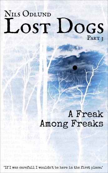
• Welcome to the Fantasy Writing Forums. Register Now to join us!

Cover Feedback: Lost Dogs 2

Svrtnsse

Staff
Article Team
So...
My cover artist cancelled on me last night, and I had until midnight tonight (about two more hours) to put together a cover for my new book before Amazon locks it down for release.

This is what I cam up with:
ld2-skullv2.jpg

When I went to upload the image to KDP I noticed I had 1 day and 3 hours left, so I must have misread something somewhere. As such, I'll share this here to ask if there's something immediately obvious that you feel I ought to change.

The drawing is part of the cover for Part #1, and it's used with the permission of the artist.

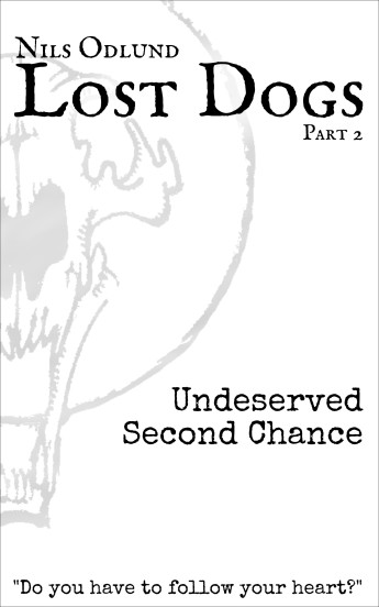
For reference, this was my other attempt I made yesterday.
ld2-blue.jpg
 
Last edited:

Devor

Fiery Keeper of the Hat
Moderator
About the first one: It's not great. But for what it is, I think it cuts through the "O" in Lost in a way that I find a little distracting. Pushing it up or down the tiniest amount would resolve that. Also, the tagline at the bottom is too strong to fade it out that way. I would suggest making it black, and moving it up a little (and if you move it up, move up "Undeserved..." about the same amount). EDIT: I would suggest the tagline should have the same space below it as there is above the N in Nils.

The bottom one has a lot more potential, but the watermark needs to be run through some filters that may be hard to get right. Maybe a yellow inner glow and a white outer glow? I don't know, it's one of those things that I could personally fiddle with for hours and not figure out, with a 20% chance it eventually comes together.
 

Svrtnsse

Staff
Article Team
About the first one: It's not great. But for what it is, I think it cuts through the "O" in Lost in a way that I find a little distracting. Pushing it up or down the tiniest amount would resolve that. Also, the tagline at the bottom is too strong to fade it out that way. I would suggest making it black, and moving it up a little (and if you move it up, move up "Undeserved..." about the same amount).
Thank you. This is feedback I can work with. I'll have time to fiddler around with this once I get home from work.

The bottom one has a lot more potential, but the watermark needs to be run through some filters that may be hard to get right. Maybe a yellow inner glow and a white outer glow? I don't know, it's one of those things that I could personally fiddle with for hours and not figure out, with a 20% chance it eventually comes together.
I know what you mean, and it's indeed the kind of thing I can tinker around with for ages without getting right. For the sake of my own peace of mind I'll go with tweaking the top version.

Thanks again.
 

Laurence

Inkling
If you were to consider the second cover, I’d consider going white on your main title and the less visible blue / blue gradient on the smaller text.

I think you should consider bringing forward or knocking back certain elements.The moon, the skyline and the mark all pull he focus an equal amount at the moment.
 

Svrtnsse

Staff
Article Team
If you were to consider the second cover, I’d consider going white on your main title and the less visible blue / blue gradient on the smaller text.

I think you should consider bringing forward or knocking back certain elements.The moon, the skyline and the mark all pull he focus an equal amount at the moment.
I don't have the skills/confidence to start tinkering with the blue version yet, but I've made some changes to the top one and it feels better now.

The feedback on the blue one is good though, more visible text is surely better. I also had a different version I toyed around with where the circle of the watermark cut through the moon which was pretty cool. :)
 

Chessie2

Staff
Article Team
Svrt, I don't think these covers are doing you any favors. They don't speak to genre or story. Not what I would expect for a werewolf urban fantasy. Have you considered looking at premades? Forgive me if there is a cost issue going on.
 

Svrtnsse

Staff
Article Team
Svrt, I don't think these covers are doing you any favors. They don't speak to genre or story. Not what I would expect for a werewolf urban fantasy. Have you considered looking at premades? Forgive me if there is a cost issue going on.
This time around it's most of all a matter of stress and limited time. I didn't have much time to produce a cover and went with doing it myself. In this way, the two of them will at least look like they're part of a series.

Money isn't a major issue, but it's a concern. I'm looking into various options at the moment to see what way to go before I start spending anything.

While going over my options the other day I browsed a few sites with pre-made covers, but everything that was on offer felt cheap and tacky, which was really off-putting. There also wasn't anything that I felt matched the vibe/feel of the story. That said, I could have been looking on the wrong sites, and there may be better options out there.

This thread was mainly to get feedback on the layout/design of the attempt at a cover I'd made, not on the visual profile of the series as a whole. That's something that'll need a bit more time to figure out.

But, yes, I do agree that the covers don't exactly check all the marks for werewolf urban fantasy. ;)
 

Svrtnsse

Staff
Article Team
I'm sorry that your cover artist cancelled on you. That sucks majorly and I hope you get it all sorted.
It's a bit of a shitty situation, but it does put pressure on me to work something else out, which may not be such a bad thing. ;)
 

Ban

Troglodytic Trouvère
Article Team
You know the quick one I send you. I like the simple coloring of your first option, but I feel it is a bit bland with only the logo. I think I would like the second one if you ran it through a filter and replaced the blue with white so it fits your original book design.

QuickWorkSvrtCover.jpg
 

Svrtnsse

Staff
Article Team
You know the quick one I send you. I like the simple coloring of your first option, but I feel it is a bit bland with only the logo. I think I would like the second one if you ran it through a filter and replaced the blue with white so it fits your original book design.
This was the one that gave me the idea of using the logo, which was originally just a part of the cover for book 1. It also gave me a few other ideas that will need to be explored in more detail. :)
 

Svrtnsse

Staff
Article Team
I used Ban's idea for the current temp cover for book three, and it turned out like this. This one's not releasing for six weeks yet though, so hopefully I'll have something else sorted by then.
ld3-cover-1.jpg
 
Top