• Welcome to the Fantasy Writing Forums. Register Now to join us!

Cover Criticism Needed!

Helleaven

Minstrel
Hi Everyone. I am pretty much new to this site but I found it useful than I expected.

Like many in this site, I'm writing a fantasy novel and my first volume will be finished soon.

Since I don't have any money (I've just graduated from university), I am trying to make a "not-so-terrible" looking book cover to send it to the publishers along with my manuscript.

I would like to read your opinions about the cover and what it needs to be better.

I know it's such an amateur work, I know it even may look terrible, but that's the point of opening this thread :)

The cover title is Turkish.

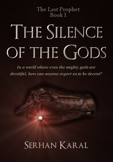
"Tanrıların Sessizliği" means "The Silence of the Gods".

"Darion Elderia" is my protagonist.

There is a gauntlet on the cover, which is important for the story.

I want it to plain and simple but attractive at the same time, the use of gauntlet is important, so with this guide lines, what kind of a cover would you suggest for me to use? What would you do if this was your cover? Make it more colourful or make it a little busier?

Ask any questions you got and they shall be answered :)

Thanks in advance


FINAL EDIT:

Update: Fixed the grammar issue

And yes! Finally I have finished fixing it. Please tell me your opinions about this one, for the first time I think I really like it!

I made an English Book Cover, for you to exemine better, without any foreign language distraction.

What do you say? How is it?


Darion_Elderia_bcf.jpg
 
Last edited:

kennyc

Inkling
Is the book written in Turkish? The cover is okay, but the title is totally pushing me away...
 

Devor

Fiery Keeper of the Hat
Moderator
The art looks nice, but I agree that the title is just a little too weird for English speakers. Also, I think it's weird to have your protagonist's name on the cover, unless it's clearly part of the title, like "Harry Potter and the Deathly Hallows."
 

Cinder

Scribe
I agree with everything said before. Also, remember not to worry too much about a cover, because if the publishers like it, they'll make it themselves anyway.
 
If the protagonist's name is going to be the name of the series as well or something then that's fine, otherwise I agree with Devor that its a bit strange to have the name on the cover. The cover itself is good in my opinion, but I wonder if you need that sunburst of light behind the title, because it seems a bit unecersarry and I think the gauntlet image would be fine on its own.
 

Helleaven

Minstrel
Wow thanks for the comments everybody :) They're all good points and I am glad that I posted this thread. I will try to give you some anwers for the questions.

1-) Don't worry about the name itself, it is Turkish and the book is written in Turkish too. I will try to get published in my country, and except Orhan Pamuk (who had won a nobel prize) our books are translated to English or other languages very rarely. It would be something only the greatest writers can achieve, I wish my English was good enough to translate it to English by myself but anyway this will do for now :)

2-) The protagonist's name is on the cover, but I wasn't sure about it, too. This is going to be a series, consisting of four or five volumes. I wanted every book to has a common signature which shows that they're part of the same series. I think I have to find a better way to show that common feature, or may be I just write something like "The XXXX Series"

Thanks for pointing that out :)


3-) My brother has irritated by that light effect behind the title, too. I think I'm gonna erase that too. Actually it wasn't ment to be on the cover at first, but then the cover seemed a bit empty, something must have filled that feeling of emptiness. I just wish that I didn't erase the raw files, in order to delete only the light effect. :)
 
Last edited:
Wow thanks for the comments everybody :) They're all good points and I am glad that I posted this thread. I will try to give you some anwers for the questions.

1-) Don't worry about the name itself, it is Turkish and the book is written in Turkish too. I will try to get published in my country, and except Orhan Pamuk (who had won a nobel prize) our books are translated to English or other languages very rarely. It would be something only the greatest writers can achieve, I wish my English was good enough to translate it to English by myself but anyway this will do for now :)

2-) The protagonist's name is on the cover, but I wasn't sure about it, too. This is going to be a series, consisting of four or five volumes. I wanted every book to has a common signature which shows that they're part of the same series. I think I have to find a better way to show that common feature, or may be I just write something like "The XXXX Series"

Thanks for pointing that out :)


3-) My brother has irritated by that light effect behind the title, too. I think I'm gonna erase that too. Actually it wasn't ment to be on the cover at first, but then the cover seemed a bit empty, something must have filled that feeling of emptiness. I just wish that I didn't erase the raw files, in order to delete only the light effect. :)

Yes, I thought you might have added the extra light effect to fill the page a bit, to be honest I think it would look fine with just the gauntlet image, but if you feel you need to add something more you could change the font or something.
 

TWErvin2

Auror
The gauntlet has little contrast with the darkness of the cover. It's hardly noticeable. While that's okay with a larger cover, if it's going to be looked at as a thumbnail, that could be a problem.

A first name of a character for the title? I don't see a problem with it.
 

Agran Velion

Minstrel
I LOVE the second one. The picture is nice, the title draws me in, but it's the quote that really does it for me (I'm a huge fan of them). I'd definitively pick it up in a bookstore if I saw it.
 

Ireth

Myth Weaver
I like the second one much better than the first. I did notice a grammatical error in the quote, though. It should read "In a world where..." etc. "Whence" means "from where", which doesn't make sense here, and the comma you used is unnecessary.
 

Helleaven

Minstrel
Agran Velion:

Thank you for kind words! You have lifted my hopes up high again! :)

Ireth:

I noticed that now. It's 6 a.m. here and I didn't want to go sleep before finishing it. It can be changed easily, thanks for the warning. But you do understand it and that's the important thing. :) And about the comma, I totally suck when it comes to "where should I put a comma!" thing. English is confusing for me in that way, because Turkish has a very different using of commas. Thank you so much for making me realize them. :)

TWErvin2

Actually it was intentionally made that way. I don't want to get too much attention to the gauntlet, it must be there as if it was only an ornament :)
 
Last edited:

Telcontar

Staff
Moderator
I find the image and the words enticing. I would give another look/download a sample of the book based on this cover. I can't say if it would sway publishers or agents, but it can't hurt to try.
 
I like the second one a lot better. I wouldn't say I love it; it's obviously not professional-quality, but then you're admittedly an amateur. It's pretty good for an amateur. :)

My only particular suggestion is about the "The Last Prophet I" thing. If that's supposed to mean "The Last Prophet, Book I" then I would say that in particular. The "I" by itself on a line just looks weird.
 

Helleaven

Minstrel
Telcontar:

Thanks, even the second look of yours is a big step for me, yep, I know the publishers can get a little picky, but for them it is their job after all. They have to earn money from these books. On the other hand. I'm not a professional writer, not a professional designer, I just love to do things like that. Maybe one day I become a real writer who has created something that will last decades. But until then, I love to write, I love to create and that's all. I don't mind actually getting published or not, I'll keep writing for myself :)

Benjamin Clayborne:

Thanks a lot for the comment and compliment :) I've added the word "book" on the cover now. "I" alone definitely works in here, but this is an English cover so it must be like a real one! Thanks for pointing that out :)

T.Allen.Smith:

The grammar problem is fixed. Thanks for laying another brick on the wall that's being constructed. (I don't even know if there is a saying like this in english, I translated it directly, but I guess you got the idea :) )
 
Last edited:
Top