• Welcome to the Fantasy Writing Forums. Register Now to join us!

Cover Art for Repulsive

BWFoster78

Myth Weaver
Does the MC wear loose, flowing robes? If not, you could give the superhero vibe by putting him in a superhero-type suit but leave the hood as is. I think him wearing monk robes is weird. He may look repulsive but why do his clothes have to hang like bags? It just gives a villain feeling.

Sent from my LG-H631 using Tapatalk

He wears loose, flowing robes.
 

Nimue

Auror
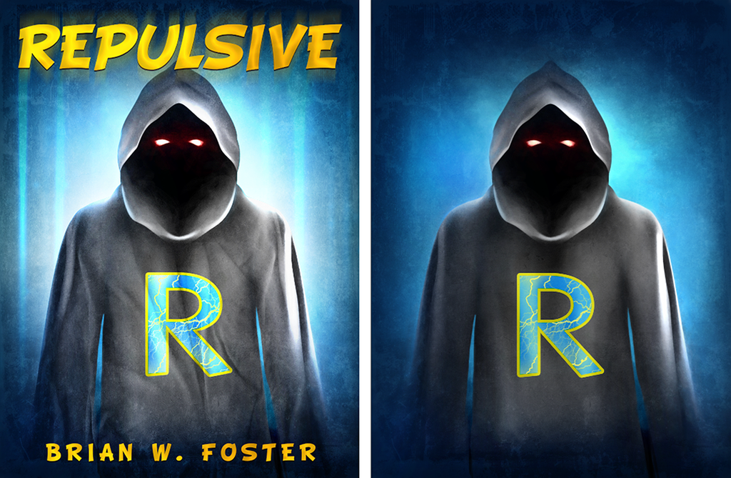
Alright, after another couple of rounds of revisions ...


Main issues:

1. How do I make the "R" logo say superhero?

2. The image overall looks too cartoonish. How do we make it more real?

Thanks!

Brian

To be completely honest, the previous cover attempt looked much better than this one. It's clear that the artist is either not using stock art for this, or is using non-photo stock. What was the reason for switching approaches? If the character needs to be in robes and not modern clothing for the cover, then I don't see any problem with the previous photo stock.

The R would look more "superhero" if it were more stylized, rounded or distorted a la Superman's S or embellished like a logo, higher up on the chest, and a little smaller. Right now it looks like a t-shirt design, and could benefit from rippling with the front of the robe.

Couple other things: I'm not sure the eyes are working, because while they've been tilted to seem more sympathetic, they still don't look human. It would help to round them out a bit and make the lower lid straighter and less tilted. Right now, I wouldn't imagine a human somebody with glowing eyes under the hood, I'd imagine some sort of sad phantom/jawa? Also, I like the idea of the bullets from your previous post but it was pretty difficult to tell what they were at that angle. I'd suggest moving them up to head-height and having them come from the left and the right, deflecting off his hood or from the space around him.
 

BWFoster78

Myth Weaver
Nimue,

That's a huge help. Based on that and other feedback, I may just go in a completely different direction. Overall, the image just is not strong enough!
 
Hi,

I'm going to go a little backwards to everyone else on this. I liked the first image - without the star. It said super-hero genre to me and YA comic reader, so if this is what you were aiming for, that was a win. And I liked the original eyes even though they screamed super villain at me. That's not such a bad thing as it brings in interest even if it sort of misrepresents the plot. Remember a cover is there to draw the interest - and either villains or heroes are interesting. It would have just meant that your blurb would have had to be strong to set up the contrast - looks like a vallain but is a hero.

I would have stayed with that but perhaps added a crest - an "R" done up like superman's "S" perhaps, changed the blue for a more comic book royal blue sort of shade - and hopefully the crest and the eyes would have confused things for the viewer as they wondered if he was villain or hero. I might also have posterised the grey robe a bit more to give it more of a comic vibe.

Last the font. Have you considered one of those curvy set ups where the big letters are on the left and the small ones on the right or vice versa and the whole thing leaps out of the page at the viewer? Perhaps with a massive exclamation mark?

Cheers, Greg.

Cheers, Greg.
 

BWFoster78

Myth Weaver
Hi,

I'm going to go a little backwards to everyone else on this. I liked the first image - without the star. It said super-hero genre to me and YA comic reader, so if this is what you were aiming for, that was a win. And I liked the original eyes even though they screamed super villain at me. That's not such a bad thing as it brings in interest even if it sort of misrepresents the plot. Remember a cover is there to draw the interest - and either villains or heroes are interesting. It would have just meant that your blurb would have had to be strong to set up the contrast - looks like a vallain but is a hero.

I would have stayed with that but perhaps added a crest - an "R" done up like superman's "S" perhaps, changed the blue for a more comic book royal blue sort of shade - and hopefully the crest and the eyes would have confused things for the viewer as they wondered if he was villain or hero. I might also have posterised the grey robe a bit more to give it more of a comic vibe.

Last the font. Have you considered one of those curvy set ups where the big letters are on the left and the small ones on the right or vice versa and the whole thing leaps out of the page at the viewer? Perhaps with a massive exclamation mark?

Cheers, Greg.

Cheers, Greg.

Greg,

At this point, I'm pretty much going back to the drawing board. An artist on kboards put together something that I liked lightyears better than this one, so I forwarded that to my artist.

Thanks for the input, though.

Cover art is so ridiculously important, and overall, I feel way far out of my element with it.

Very frustrating trying to get it right.

Brian

Update: I just got an email from my artist. She doesn't think she can provide me what I want, so she's withdrawing from the project. She recommended a friend of hers to do the job instead, but I'm going to check on someone from kboards first.
 
Last edited:

ThinkerX

Myth Weaver
'Repulse' = 'go away' = 'blue shift' in physics.

Suggestion. Go with a very dark blue or violet inside the hood instead of black. Still featureless.

Assuming an urban setting, have a cityscape outlined in the background, maybe one with obvious problems - like something exploding, on fire, or collapsing.
 

BWFoster78

Myth Weaver
'Repulse' = 'go away' = 'blue shift' in physics.

Suggestion. Go with a very dark blue or violet inside the hood instead of black. Still featureless.

Assuming an urban setting, have a cityscape outlined in the background, maybe one with obvious problems - like something exploding, on fire, or collapsing.

The new concept is completely different than the one I posted. The artist is still working on revisions. Hope to put something up soon ...
 

BWFoster78

Myth Weaver
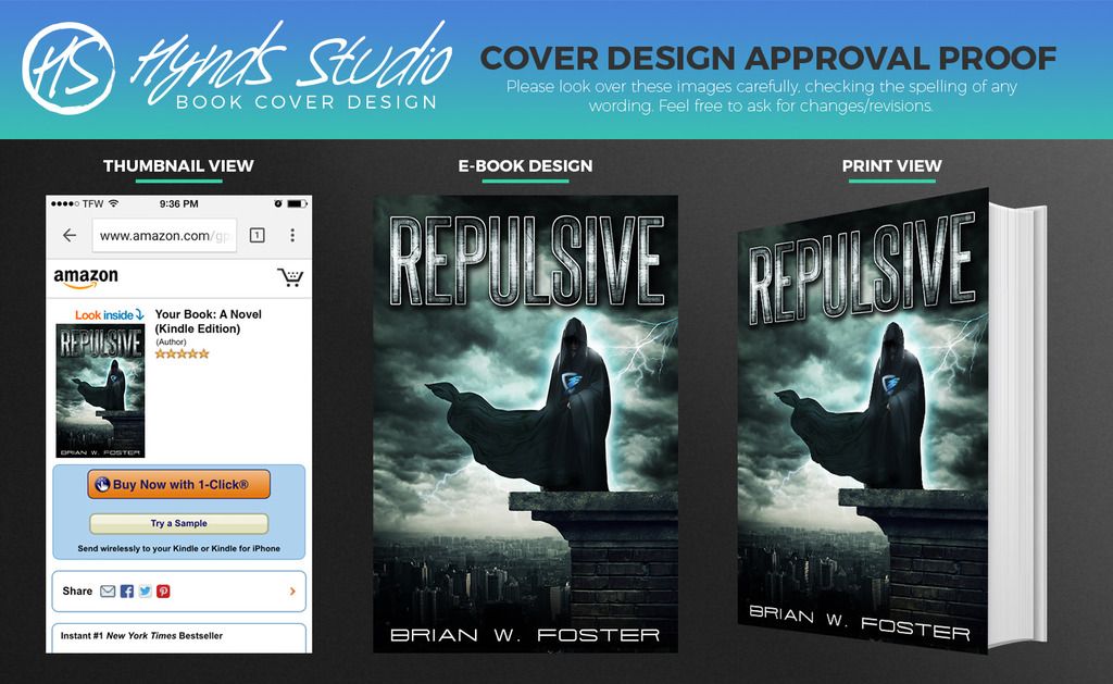
Okay, here's the completely new cover art after 7 revisions. I'm pretty happy with it. Any last minute tweaks you see that could help?

 
  • Like
Reactions: Tom

Nimue

Auror
It's a very good-looking, professional cover, but I feel like it's advertising something a lot darker and grimmer than the young-adult story inside, based on the premise and the excerpt you've shared? Like I'd expect a gritty Batman-esque antihero or even villain story.

If you're interested in changing it, I think it'd make a huge difference to change the title back to the brighter, more comicky style you were using before. Lightening up the sky so it's not so stormy and foreboding would also make a difference in the atmosphere. If you don't want to make changes that's probably cool, people would be attracted to a cover as well-designed as this, and a hell of a lot of covers don't perfectly match the books they're on. It's just that I don't think this cover really goes with a story about a hapless kid called Zack Zakowski...
 

BWFoster78

Myth Weaver
Nimue,

I was thinking that the cover really matches his emotional state. All he wants in the world is for this one girl to like him, and if he could just become a superhero, he'd have a shot at her.

He gets his wish. Instead of looking like a classic hero, though, he looks like some kind of villianous demon. Not only that, the girl literally throws up at the sight of him.

I like the undercurrent of emotion and conflict that the cover conveys a lot more than the comic book like feel.
 

Nimue

Auror
Okay, that's just a lot more of a...subtle? tangential? message than the things cover art is usually responsible for: representing genre, tone, and characters/setting so people can guess at a glance if this might be something they'll like. I think you may be reaching to make it fit...

I still genuinely like the first cover the most, for your story, even if this one is technically prettier.
 

Heliotrope

Staff
Article Team
I sort of agree with Nimue. If I bought this book from your description and this new cover, then I opened it to find Zack clumsily throwing a grapple (which he doesn't even know the name of) over a fence to climb a tower to find a girl I would probably think there was a mistake and I bought the wrong book.
 

BWFoster78

Myth Weaver
To be completely honest, I just think it is so important to be eye catching, and this cover achieves that. This cover will definitely draw people to my book.

Beyond that, I do think it represents my story.

Let me ask both of you: do you read in the superhero genre? I guess I feel that neither the cover or the associated story breaks far from genre expectations.
 

Heliotrope

Staff
Article Team
I think that is true. I don't think it breaks from genre expectations, I think it just might be misrepresenting the mood and tone, like Nimue pointed out. I haven't read your entire story, only the little bit you posted a few weeks ago (the beginning?) but based on your tone and your style of writing I'm not sure this dark cover fits. To me, your style reads very sparse. Quick pace and very little description. I found the stuff you submitted to be light and funny (I'm not sure if that is what you intended?) I let my husband read it, and at "Hailey might die!" he started laughing at the absurdness of it… again, maybe that was not your intention? When I see this new cover I think dark and gritty. I think detailed description and moody tone. I think angst and introspection and deep inner conflict… I'm just not sure it fits the tone and style of your writing (again, from what I have read.) I think it might be misleading the reader into thinking they are getting something different than what you are offering.

Like Nimue said, I felt your story was more "Kick Ass" than "Batman"

But hey, if you love it and think it works (It IS a very cool looking cover) then go for it.
 
Last edited:

Nimue

Auror
It is eye-catching, and might get a click or an impulse buy from someone looking for grimdark superhero fantasy, but don't you want to catch the eye of someone who would love the story that's inside the cover specifically, who will sign up for the mailing list and want to buy the sequels? Why would that person, looking for something along the lines of a serious-but-silly underdog YA superhero story, click on this cover?

It's absolutely your choice, but you're having this custom-done--I can't understand why you'd settle for anything less than a great fit for your story.
 

BWFoster78

Myth Weaver
It is eye-catching, and might get a click or an impulse buy from someone looking for grimdark superhero fantasy, but don't you want to catch the eye of someone who would love the story that's inside the cover specifically, who will sign up for the mailing list and want to buy the sequels? Why would that person, looking for something along the lines of a serious-but-silly underdog YA superhero story, click on this cover?

It's absolutely your choice, but you're having this custom-done--I can't understand why you'd settle for anything less than a great fit for your story.

But that's the thing: I don't see the disconnect that you do. Where you're getting grimdark, I'm getting sadness, which is what I wanted to portray.
 
Top