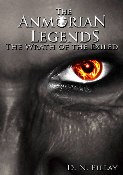
Thanks Acapes, as a thumbnail the eye stands out, the text does get a little lost but the previous version with a darker face made it look almost black and the facial features were lost.
I like the graphic with the fire eye. It's eye catching! For me though the text doesn't pop. It needs to maybe have some colour so that it stands out more from the black and white. Also the iris isn't quite circular and the flame in the middle of the pupil doesn't look quite right.
Also I'd suggest prunning the titles. The "The" in both cases could be removed without detracting from them and it would in my view make them stronger.
I really like the colors and the gray-tone. I would however trim the second "the". I like the first one, though. But IMHO,the second one is redundant, which reads as less professional, like if I open the story, I might be bombarded with redundant sentence structure/ wording. Just my opinion, though.
")