-
Welcome to the Fantasy Writing Forums. Register Now to join us!
You are using an out of date browser. It may not display this or other websites correctly.
You should upgrade or use an alternative browser.
You should upgrade or use an alternative browser.
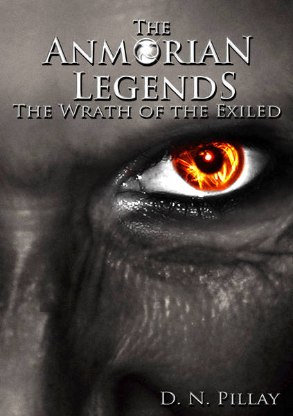
Cover design for my upcoming novel
- Thread starter The Maven
- Start date
Fyle
 Inkling
Looks fine.
I mean, its a face. Doesnt really do anything for my imagination, but, its not bad.
6/10
I mean, its a face. Doesnt really do anything for my imagination, but, its not bad.
6/10
Maybe if you try adding some blur and fade effects over the face, except for the eye, to help it pop?
- Thread starter
- #4
acapes
 Sage
Sage
I like it - strikes me here in the forum for sure, love the blast of colour in the eye.
How does it look as a thumbnail?
How does it look as a thumbnail?
- Thread starter
- #6
teacup
 Auror
Auror
I really like this cover, definitely catches my attention. I would at least read the back if I saw this in a bookstore.
- Thread starter
- #8
psychotick
 Auror
Auror
Hi,
I like the graphic with the fire eye. It's eye catching! For me though the text doesn't pop. It needs to maybe have some colour so that it stands out more from the black and white. Also the iris isn't quite circular and the flame in the middle of the pupil doesn't look quite right.
Also I'd suggest prunning the titles. The "The" in both cases could be removed without detracting from them and it would in my view make them stronger.
Cheers, Greg.
Last edited:
Fyle
 Inkling
Good call phycotick the word "the" should go.
That would make this cover better in my humble opinion.
That would make this cover better in my humble opinion.
- Thread starter
- #11
I really like the colors and the gray-tone. I would however trim the second "the". I like the first one, though. But IMHO,the second one is redundant, which reads as less professional, like if I open the story, I might be bombarded with redundant sentence structure/ wording. Just my opinion, though.
Similar threads
- Replies
- 34
- Views
- 6K

 Scribe
