• Welcome to the Fantasy Writing Forums. Register Now to join us!

Cover Tryout for W.I.P.

Graylorne

Archmage
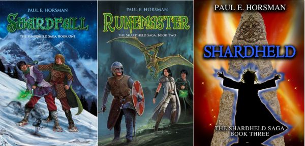
Up to now I've spent lavishly on my books, but one has to be realistic and to continue spending big money on covers isn't economically viable. For my present w.i.p. I'm looking for a custom-made cover. These cost me about $70 apiece, that's 10% of my earlier covers...

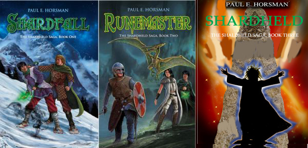
Still, I'm not certain. I found three different covers and I post them here to ask your opinions.

The first one could symbolize a book that's important in the story, the second either the young Warlocky or his opponent, the third is just an image. A, B, or C, which one should it be?

NB The choice of fonts is rather meager; the first two are chelsea, the third is palomino. Colors go by hex code.

Thanks for your input!


COVER_TRYOUT.jpg
 

CupofJoe

Myth Weaver
C is the Biohazard symbol. When I see it in fiction I usually assume it usually means Zombies ahead....
Of the other two... I think A looks better. Can't give an argued reason as to why, just I like it more than B [I feel I've seen that or something similar before].
 

Graylorne

Archmage
C is the Biohazard symbol. When I see it in fiction I usually assume it usually means Zombies ahead....
Of the other two... I think A looks better. Can't give an argued reason as to why, just I like it more than B [I feel I've seen that or something similar before].

Zombies! Yech, no. C 's out, then. I didn't even know that, having avoided zombies like the plague :) Revenants and wedergänger are another thing, of course. Thanks for the warning.
 
B is more instantly eye catching (I often prefer books with character images), but as you said, A might be a nice reflection of a story object. Needless to say, zombies are out. Go with your instinct, I slightly prefer B simply because its character based and contemplative, but they're both good.
 

Asterisk

Troubadour
C really caught my eye first... that's the kind of cover that I couldn't just walk past. I would stop to pick it up.
But zombies aren't my thing either. :D

So my second choice would be B. They are all fantastic, though!
 

Caged Maiden

Staff
Article Team
Okay... I'll tell you what I think on all three.

A, is sort of intriguing because it looks like a spellbook, but not specifically a Book of Shadows, so I'd imagine it's a story about a young wizard, maybe an apprentice, who is going to grow through the (heavily focused on magic) story.

B, looks like a story about wizards, probably powerful and wrapped up in a tale about the world because it looks like a ruin in the background. I'd expect to see a quest and maybe the revelation of some sort of dark secret for which the wizard had to quest?

C, is very eye-catching, but yeah, it's a modern symbol. HOWEVER, if you could change that symbol to maybe a rune, rather than the Biohazard symbol? It would tell me the book is about maybe an an ancient arcane power. Perhaps a young wizard stumbles on an ancient secret, or for whatever reason, some mysterious power is released.

Okay, so rather than telling you which I liked best, I tried to help you make a decision based on the impressions they left me with. I'd want my cover to give a potential reader a hint of what the book is about.

I'm struggling with this myself, right now, and while I'm talented enough to paint a cover myself, I'm not really sure which direction to go in. I certainly hope my impressions have helped you make the decision.
 
Last edited:

Graylorne

Archmage
I think, reading all your reactions, I'm beginning to see my way.

CM, your way of looking at it is very helpful. C. is out; these are ready-made covers, so nothing can be changed.
B. A conflict between mages is very much in line with the story. A. It Could be a spellbook, containing a spell my warlocky desperately needs.

All your kind reactions lessened my fear that these designs weren't good enough. So I can use them both.
B. for Warlocky, because it fits the story best.
A. for Grimoires, which is the 4th book in my Revenaunt-series. (It's about a mage who has to recover several dangerous spellbooks that were lost). That will be a breach of style with my earlier covers, but that can't be helped.
 

Graylorne

Archmage
Well, I've made a definite choice re. the images. The colors and dimensions can be changed.
I chose blue and white, because that's conversally the same as the lettering of my first three Revenaunt colors.
The Warlocky coloring is purposedly different.

Would this be acceptable, clear enough, professional enough, etc?

Personally, I don't find the images bad at all. They're from the site of SelfPubBookCovers, who have a large stock, Only their layout-program is still in beta and it doesn't work well. I made the text of two Revenaunt covers in Photoshop.


cover3.JPG
 
Last edited:

Graylorne

Archmage
I have here a fourth design, adapted to suit the third Shardfall book. It is totally different from the first two covers.

Personally, I'd put the main title in line with the other books. I can imagine the artist didn't, as he added the design on the stone on request, but it would make a big difference.

I'd very much appreciate some comments!


Shardheld_cover1.jpg


cover_series.jpg
 

Svrtnsse

Staff
Article Team
I'd change the text on the new design to match that of the first two books. It feels weird that you have such similar designs of the first two while the third one is completely different. If it hadn't actually said "book three" at the bottom I wouldn't have thought it was the same series.
If it's an option I would change the image to something in the style of the first two books as well. Is there a reason you've chosen to go with such a different design for the third part or am I missing something?
 

Graylorne

Archmage
The most mundane reason of all, I'm afraid. Cost.
I've been spending like mad on the first four books, but to be able to keep on publishing I must lower my ambition.

Pity, the image itself depicts what I want. Firy cave, standing stone, mage, blue power. But the difference is pretty big, in this case.

With the Revenaunt books (the earlier images) that doesn't matter, because I'm writing Vavaun and Grimoires both as semi-standalones. But Shardheld is the final part of a trilogy.

I had thought to do the 'Shardheld' font in green. The designer made it blue, but I can change that back.

If that doesn't work, I have no alternative but to have my Dutch artist make the third cover after all.
 

Svrtnsse

Staff
Article Team
Cost is a valid reason. I can't argue that (and I don't even know the sums you've spent). The first two covers really are significantly better than the third one though.
If nothing else, I would recommend you go with the same font and text layout as the two original books. That way you will at least keep a visual link to the previous two books. Ideally I would say go with the old artist and save on future covers, but I guess you've already considered that and decided against it or it wouldn't be an issue.

It's a tough decision to make and I don't envy you having to make it. Make sure to wait a bit for the feedback of others as well.
 

TWErvin2

Auror
I agree with Svrtnsse that at least keeping the font, and as much of the layout as possible the same will benefit in linking the novels together as a series.
 

Graylorne

Archmage
TW and Svertnsse:

I can't do that myself; no idea what font it is. But I haven't ok'd the image, so I'll ask the SelfPubBookCover-gentleman how it should look like. I didn't do that at first, from fear this would be an infringement of copyright, or something like that.

A rough photoshop would give an impression:

cover_serieskopie.jpg
 

Svrtnsse

Staff
Article Team
There are two options for the font. Try Identifont - Identify fonts by appearance, find fonts by name and see if you can find it there. They have a tool that lets you identify a font based on questions about how the individual letters look.
The other option is to copy the letters one by one from the two first books. All of the letters in Shardheld appear in either Shardfall or Runemaster.

You do bring up an important issue with the copyright though. It may be that there are issues there that need to be considered, so it may be worth asking first.
 
I agree that it makes better sense to have the fonts and colors match through the third book. I like the yellow lined green of Runemaster better than the more "shimmery" of the first book.
If possible, ask if the artist can "zoom out" or slide the picture for Shardheld a bit, letting the fire fade into black near the top. Then you should be able to put your name in white without the textshadow effect. It would also push the design on the stone below the title a bit, both letting it be more visible and not interfering with the title itself.
 

TWErvin2

Auror
You would want some room (bleed?) between your name and the top of the cover if you're going to release this title in print format. If you have the lettering right up to the edge (side, top or bottom) there is a chance it could get clipped slightly.
 

Graylorne

Archmage
I just got the last adaption back.

Not the same font for the main title; I do think that could be problematic. And as the first two were made by my Dutch editor, I don't want bad blood. Besides, the font of the first two book will be tightened a bit, to make them better readable in thumbnails.

The whole is less fiery, but I can adapt that in the story. This is definitely better.

I'd like the text lines a bit lower, but I can do that myself.

What's your opinion?


cover_serieskopiekopie.jpg
 
Top