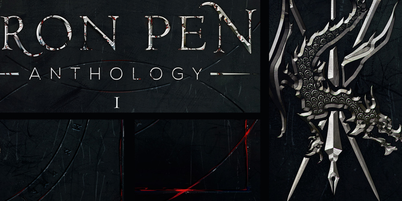
Since we're doing covers lately, I'd thought I share with you a cover for an upcoming anthology. What do you guys think? It was done by our very own Nihal.
My only comment would be that there's a lot of texture on that font, and it's a texture that fades into the background. It's passable the way it is, but I think some contrast or thicker lines or a minor background effect on the font might improve it a little.
((edit))
Ahh buggard, it's the angle of my laptop screen making it look so dark. It's still a lot of texture, but it's better than "passable."
It was challenging to create a texture for the dragon symbol that would look interesting higher resolutions but still readable in smaller ones. You might like to see some close ups:
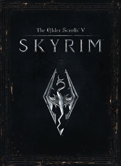
The idea was not only to make a nice cover but to create a visual identity for the series: a background mimicking some sort of material + logo in another finish. This design solution has been used countless times over the last decades, but Skyrim was pretty much an inspiration when it comes to the finishing. They did a really fine job on their textures, but they never went over the top and kept the designs simple.
When I picked the materials for this cover I tried to steer away from the obvious polished metal solution; I kept a particular type of iron ore in mind instead. Isn't it pretty?
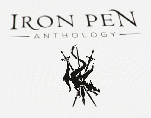
The symbol and the title are a true logotype. They work on flat colors and are vectors, for consistency in future uses.
The cover was entirely created on Photoshop, through a mix of textures, filters "bases" and lots of handpainted details.