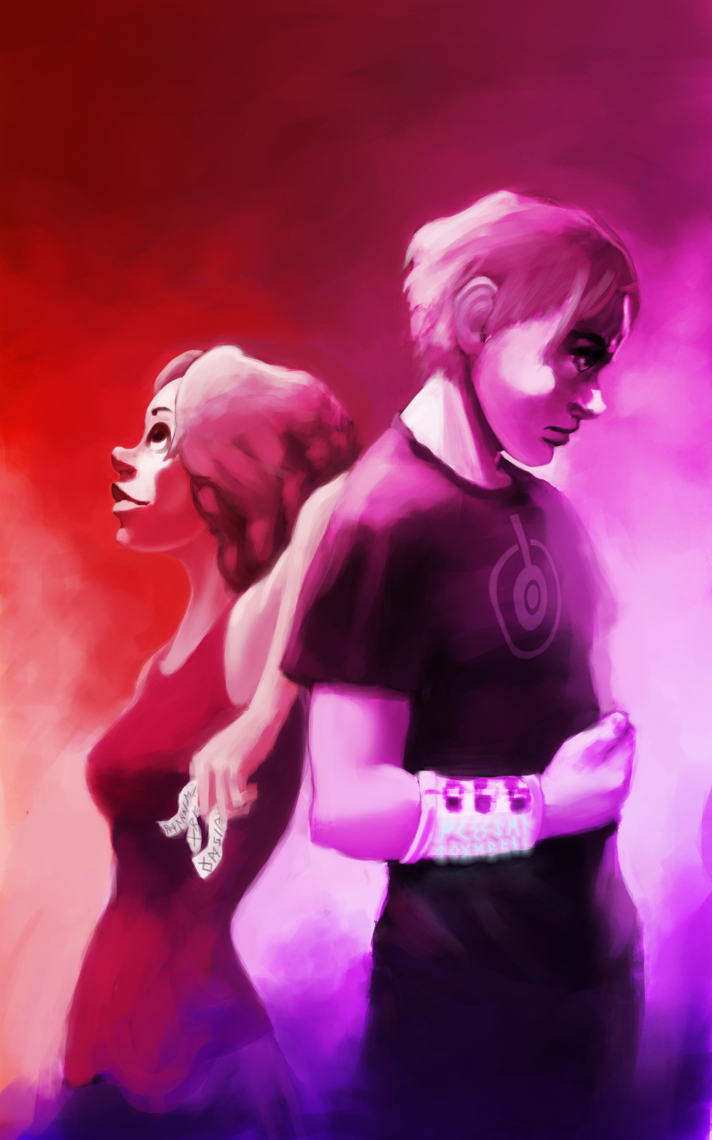
I like it. The coloring is nice, and I like the texture of the art. The runes are intriguing as well, so that raises some questions in my mind (also a good thing).
I like it. The coloring is nice, and I like the texture of the art. The runes are intriguing as well, so that raises some questions in my mind (also a good thing).
I like it. Interesting contrasts. It shows that these two characters have some kind of relationship (they look like siblings), and clearly different moods/personalities (the girl is smiling upward, the guy is brooding downward).
I like the color scheme, and the details like the runes on the girl's scraps of paper are intriguing. Something about the girl seems out of place, though. The boy seems to be drawn in a more realistic style, while the girl looks a lot more "cartoony" -- I think it's the shape of her nose most of all. They look like characters from two different stories. This is rather jarring in an otherwise very appealing cover.
I think it's interesting, and I love the colors. I agree about the girl's nose, but the boy's nose is also odd. Neither of them looks realistic. It looks intentional to me, so it's fine.
However, if I resize the picture smaller, I can't tell how the girl's head is attached to her body. The shadowing on both her cheek and neck is almost the same color as the background, so there isn't enough contrast at a smaller size. Depending on how small you make the thumbnail, it looks like she has wacky fingers instead of a piece of paper.
I like that it's a different style from most books, especially if it's for YA or MG.
Love the colours, very eye catching. The lighting and shading draws the observer directly to the two figures in the art, I think that was very well done. The style is easy on the eye too, the soft lines and shapes allows the obvserver to catch the light and colours with ease and directiveness
Speaking as a professional artist who specialises in portraits and figurative work, the overall design is good, there is a nice use of colour and a good composition.
But, the girls face doesn't look quite right, the nose looks a bit Pinochio like, mostly because of the way it hooks up at the end. and the mouth is too wide, if you knock a bit off the end it will look a bit better. Also if you lighten the highlights under the chin and the neckline you will get a better separation from the background, which is so close in colour and tone that it becomes difficult to see the shape of the face in places.
I hope you don't mind, but its easier for me to show what I mean than to explain, so I've taken the liberty of making some modifications to illustrate what I mean. Feel free to ignore me if you disagree though
As above. It looks great, but some technical considerations like thumbnails might be a drawback. Too, it probably won't look great in greyscale (for Kindle and Nook simple version, which do not have color). Needs more contrast.
 Scribe