• Welcome to the Fantasy Writing Forums. Register Now to join us!

Anybody care to share their map?

Johnny Cosmo

Inkling
I'm not sure why Flickr doesn't work for you, that's pretty popular. The size looks fine. I think it's mostly the shade of red. If it was brighter it would contrast with the browns and dark greens better.
 

Centerfield97

Troubadour
6269551552


My rough draft for a map...it's an update of an older map I made a few months ago. I'm still considering changing it to be completely different but i like to play around with things like this!
 

Johnny Cosmo

Inkling
The land below the Crow's Beak looks a bit odd to me, but it's probably fine. All in all, I'm a fan of interesting shapes, so nice work. Hope to see a more developed version soon!

I've just completely redesigned my map. I kept a lot of features, but the shape is more realistic and I've altered it to help the pacing of the story (I have four planned POV characters, and I wanted their journey's to align somewhat). I might eventually get around to posting a version of my map here. Eventually.
 

Centerfield97

Troubadour
The land below the Crow's Beak looks a bit odd to me, but it's probably fine. All in all, I'm a fan of interesting shapes, so nice work. Hope to see a more developed version soon!

I've just completely redesigned my map. I kept a lot of features, but the shape is more realistic and I've altered it to help the pacing of the story (I have four planned POV characters, and I wanted their journey's to align somewhat). I might eventually get around to posting a version of my map here. Eventually.

The land below Crow's Beak is called the Sinking Isles, sea level is rising and that portion of the continent is slowly going underwater, hence the odd shape.
 

Johnny Cosmo

Inkling
@Centerfield97: I guess that makes sense.

@MichaelSullivan: That's a very stylish map, though it's a little hard to read in places. Is the climate cold and the map white due to ice and snow, or is it just the style of map?
 

Johnny Cosmo

Inkling
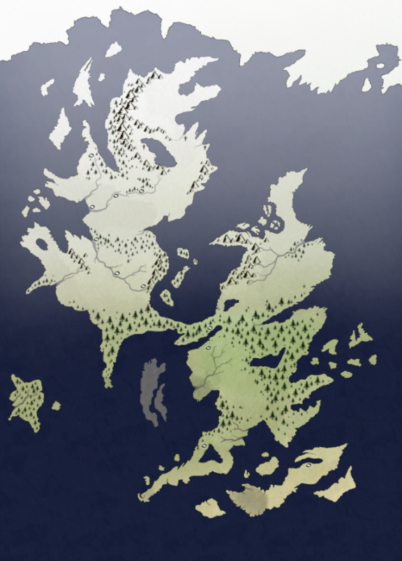
It'd be a shame to let this topic get pushed onto the second page and forgotten, because I really enjoy seeing all your maps. So, I think it's about time I shared the latest version of my map. I've taken off all the names because I've grown paranoid about revealing them after spending so long constructing them, so my map looks a little empty. I've also resized it so I can link display the image on the forums, rather than linking.

kauv2.png
 

Devor

Fiery Keeper of the Hat
Moderator
That's pretty, Johnny Cosmo. I'm glad you shared that.

How many countries are on each continent? It helps give an idea of the scale of the thing.
 

Johnny Cosmo

Inkling
At the time of my story the two continents are considered two countries. The left is home to one kingdom, and could previously have been referred to as three separate countries, but now they're called regions of the same large country. The right is home to four city-states that used to be part of another kingdom, each controlling a region. I've still not worked out all the details.

The whole thing is about the size of Europe (or perhaps a little bit smaller), but arranged differently.
 
Last edited:

Devor

Fiery Keeper of the Hat
Moderator
I've been trying to build up the courage to post this for a few days now.

I originally made my map a long time ago in the map editor of an old video game called Lords of Magic. It worked for the scale I was going for. But picking up the project lately with a great deal more seriousness, there's just no way that old map editor could do the trick.

Here's the map. The compass points have been rotated. On the world map, which has very little detail, the peninsula doesn't point straight up.

This is the map of one very small country, and I'm pretty sure almost all of it will prove necessary or at least useful for the story I'm hoping to tell. Yellow indicates farmland. Any shields are fortified military locations, some of them very small. There is a city on the large island but it's shaded to stand out over the water. The country claims the entire peninsula and the islands, but the right-half is extremely dangerous. You need an armed escort to get safely from "C," Chasm Edge Point, to the two "W"s, Wayhaven Points, to the sparsely populated town on the bottom.

I think it looks a little mushroomy myself, but I'm not going to worry about that right now. I think that if I gave it to an artist that could be fixed without significant changes to the content.
 

Jabrosky

Banned
the_world_of_gorrinth_map_by_jabrosky-d4f90r6.png


This is a crude, unlabeled, tentative Paint sketch of my conword Gorrinth. As you can see, its geography was heavily inspired by our Earth's Old World. The brown streaks represent mountain ranges.
 

Johnny Cosmo

Inkling
I've been trying to build up the courage to post this for a few days now.

Don't worry about that, it took me about two weeks!

I think it looks a little mushroomy myself, but I'm not going to worry about that right now. I think that if I gave it to an artist that could be fixed without significant changes to the content.

I think some reshaping would be beneficial, but the features (bodies of water, mountains, et cetera) are good as obstacles. I started with a map that was little more than a blob with a bit of a shaping, and developed it to become more memorable (I think), so it just takes time. It can be hard to let go and redesign though.
 

Johnny Cosmo

Inkling
@Jabrowsky: It looks very inspired by the real world. Have you considered flipping the whole thing horizontally? That would really distinguish it from the real-world Eurasia and Africa look. Unless you're completely happy with it, in which case - leave it be!

Paint has given you a clean, bold look, and it seems as functional as it needs to be. Nice work.
 

Jabrosky

Banned
@Jabrowsky: It looks very inspired by the real world. Have you considered flipping the whole thing horizontally? That would really distinguish it from the real-world Eurasia and Africa look.

Although my world is meant to be based on our own world's antiquity, I'll do that.
 

Johnny Cosmo

Inkling
It was just a suggestion to distance it from our world, but if it makes sense the way it is then perhaps you should keep it. Though, flipping the map wouldn't necessarily sever the tie with our own classical and middle age cultures, so it's not like it would be wrong if you flipped the map and the ethnic groups went with it.
 

Johnny Cosmo

Inkling
Ahh, I was imagining it horizontally flipped rather than vertically, but I guess it doesn't really matter. Nice to see some labels, I find they make a map look much better.
 
Top