• Welcome to the Fantasy Writing Forums. Register Now to join us!

Cover for my WIP, wondering if the design is too simplistic

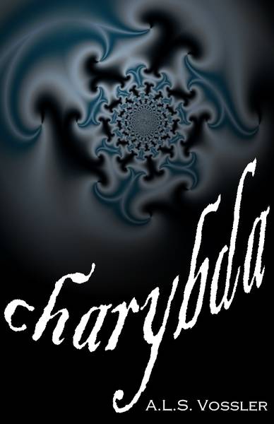
What do you think of this cover? In the story, Charybda are tears in the boundary between two universes, much like a whirlpool. The only person who can see them is blind, but perceives them a bluish swirls of light.

If you saw this on a website or bookshelf, would the design make you stop and look?

showfull.php
 

Ireth

Myth Weaver
I like it, though I can see why others might not. There's no indication of the characters or the setting until one reads the back cover (I assume the blue swirls are explained in the blurb).
 
I like it, though I can see why others might not. There's no indication of the characters or the setting until one reads the back cover (I assume the blue swirls are explained in the blurb).

Surrrrre.....we'll go with that. :) I haven't written the blurb yet. This is something I threw together when I was procrastinating the actual editing.
 

teacup

Auror
It wouldn't make me stop and look, to be honest. At first glance without the knowledge of the tears between the universes, all I'd see is a pattern which does not interest me. Also, I think the title could have been done better, perhaps in a different font/colour?
Just my opinion.
 

Philip Overby

Staff
Article Team
I agree on the title. I like the kind of swirling imagery, but it's a little hard to read. I'd think it was even harder to read in a thumbnail. If I was browsing through a bunch of books and I stopped on this one, I probably wouldn't give it a look just because it's kind of non-descript. I wouldn't even have an inkling what it's about. The only thing I could imagine is Charybdis (sp?) from Greek mythology that was a giant whirlpool monster thing. If that's what the story is loosely about, then maybe put the giant whirlpool monster thing on the cover. I'd probably check that out then.

Edit: OK, I missed your description. So a giant whirlpool monster wouldn't work. Maybe like a picture of a character with the blue swirls around them?
 
Last edited:

Svrtnsse

Staff
Article Team
I like the idea with the title, to have it bent like that, but I think at the end the b and the d become too tall and it becomes a little difficult to read.

I don't like the background image. It feels a bit flat and plain. Again, you could still use the idea of having the fractals in, but you should probably add some more to it, some kind of background (maybe stars) to add a little bit of depth to it.
 

Nihal

Vala
Honestly? This typography isn't working and I don't like the fractals either. I wouldn't give the book a second glance.

With this noted, the play with the title might work, it has potential. After trying another font families I would centralize the author's name at the top, it seems lost where it's placed and is actually working against the title, diverging the attention and breaking the movement. I would invest in a whirlpool that doesn't look that much like this style of fractal, because this one makes your book look dated.

Don't worry about simplicity, a simple but beautiful cover worths more than a busy and ugly/amateurish cover.

Some examples to get you inspired:
Box set of the brazilian pocketbook version of A Game of Thrones. The most complex part of this design is the golden banner at the center. Everything else is simply text placement and a quick texture work.

195812-970x600-1.png


The Millenium trilogy... The dragon is tricky, but besides that it's just fire and cut-out letters.
Blog_Beiramar_Shopping_Stieg_Larsson.jpg


Letters and shapes, that's all. Pretty, a bit tricky to read but is more readable in thumb size than I would expect.
34-typographic-book-covers.jpg
 

Addison

Auror
The cover made me jump. It was like "Ta-Da!". But it's a swirl of colors with a name under it. Not something that makes someone take the book off the shelf to learn more. If you like the swirls then may I suggest blending the shape of heads or monsters or parts of the story into the swirls? Perhaps the swirling pictures continue to the back which will not only have the reader pick up the book but also read the book. I found a book a while ago that did something like this. The cover had a compass and a sunset on the cover and a tail. Anyone could tell it wasn't a normal tail. Following it to the other end, a monster with it's mouth wide open, lead me to the blurb.

This is just a suggestion. Good luck and happy writing, and drawing. :D
 

Zweee

Acolyte
I actually had a hard time reading the title. I think if I came across it I'd think that it was one of those intellectual books that's too 'smart' for me. And only because it took me three tries to figure out the title.
 
Hi,

I find the fractal interesting but it's let down by the title. It looks messy. You need to use a nice clean font with straight lines and then bend it around your image.

However the biggest problem you face is that the cover tells me nothing about the book. Your title means nothing to me since I've never heard of charybda. The image tells me nothing about tears in universes. The only way I know either of these things is from what you've written as your explanation. So why would I as a reader pick this book up if I have no idea what it's about? Now if youchanged the title to something about a tear in the universe, I might understand something. Or if you showed two universes but kept the title as it is I would understand a little more. But as it is it's just an interesting geometric.

Cheers, Greg.
 

TWErvin2

Auror
I think much of the swirl effect will be lost when the cover is shrunk to a thumbnail size, which is the way many potential readers may come across it. It will probably be both difficult to read and appear unremarkable to most that have the opportunity to see it and click on it to find out more.
 
First glance: If it were a physical cover, or a larger image I'd stop and check it out. If it were just a thumbnail, Prolly not, because the interesting detail would be lost. I do like the font. In a thumbnail again, it would maybe be hard to read?
But it is a moot point for me because I don't do ebooks, in part, for these vary reasons.

Second look: The last letter is a bit tall, and I'd consider upping the fill light a little bit to make it less dense feeling. I do highly appreciate that it does not look like a stupid cartoon. I really hate those types of covers. So you get brownie points from me there. Perhaps consider putting something related to the characters of your book in the center, maybe the blind guy with his white cane walking out of the center rather than the odd, less interesting graphic that is there currently?
 
Last edited:
A fantasy novel where none of the words in the title are English words I recognize, A BIG turn off for me. I need something familiar to earn that first click/ glance on internet or store.

I might try to put the fuzzy outline of a monster, as if coming through the spiral. That way, you can just add an new layer of art on top of your existing work.
 

startist1

New Member
HEy there, Let me preface this by saying I am a professional illustrator and graphic designer with over 12 years of experience. My fiance' writes Fantasy fiction so I am getting to know the genre a bit and seeing what others are doing for cover art. I really like the concept of the Charybda and it being seen by someone who cannot see. This cover does not express that in any way. The graphic is dated and will work against you, and the font is unreadable. The best idea to keep in mind is that illustration is meant to tell a story without words. I will give an idea- just off the top of my head... use or don't I don't mind, just meant as an imaginative exercise :)....Say for instance, you had a close up of a person, your blind character with their eyes open in an unseeing stare, perhaps their eyes are whitish from cataracts or the irises are clouded- basically give the notion of blindness, the close up creates intimacy and tension. Overlay this with a more contemporary image representing the swirling tears, semi transparent over the face. Now you get the idea that these two things are connected, Do they SEE this swirling object? What IS it? Why do they look this way?- It makes questions arise and thereby gives interest and intrigue to your cover. This is what makes a reader pick it up and flip it over to read the back. Also I cannot express enough that font selection, color, size and placement are VERY important. It should be readable, not overly stylized and in 1 to 2 colors, no more than 2 sizes as well. I can pick out an amateur book cover a mile away, even if the artwork or illustration is stellar, poor font choice or layout design will kill a cover in a second. Hope this helps!
 

Feverfew

Acolyte
I really like your idea- sounds like a tear in the universe could be a foundation for some cool stuff happening.
Unfortunately, I don't think this really helps your story. Possibly making your title a bit more descriptive might help to grab attention. Like other people have stated, there are so many books out there, its hard to take a risk on something very ambiguous unless it has some credentials behind it like a best selling author or an award. Fractals are a bit overused in my opinion, I think if you found someone with an artistic streak you might come up with something more emotive and expressive using paint.
 

Fyle

Inkling
I'm not gonna offer an opinion on the cover, but as for your question, I personally like simplistic covers.

Less says more. The cover has to stand out, not win first prize in an art contest. I personally don't like photo realistic covers because they put a solid image in my head of what the author thinks a character(s) should look like and hinders my imagination from the get go.
 

FatCat

Maester
Okay. Let's try this again.

bookcover.jpg

I wouldn't buy a book with this cover. It's too conventional and vague, it represents nothing of what I'm about to read. You tried a simplistic design, but now refine simplicity. Stock images are stock stories.
 

Mythopoet

Auror
I wouldn't buy a book with this cover. It's too conventional and vague, it represents nothing of what I'm about to read.

Agree with this. A cover really needs to tell potential readers something about the book and particularly what genre it is. That cover tells me nothing.
 
Top