• Welcome to the Fantasy Writing Forums. Register Now to join us!

Cover Art For A Short Story/Novelette

Ankari

Hero Breaker
Moderator
Hello folks,

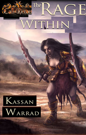
I'm going to put this story through another editing cycle before I release it. Here is a repurposed image I'm using as a cover. What do you think? My artist is willing to make any changes.

2013-02-25
 

T.Allen.Smith

Staff
Moderator
Those swords look too large and heavy for dual wielding.

What type of creature is this? At first glance I took it to be a dark elf. After awhile, I thought it may be some sort of undead creature. So, the art confuses me a bit between the oversized swords & the character that could be one of two things (or both I suppose) in my view.
 

Ankari

Hero Breaker
Moderator
Thanks TAS,

No, it's not a dark elf or an undead. Her people are called Dagorans, and they suffer from an innate rage. That is where all her strength comes from, and why you would think she looks a bit like an undead (I guess she does look a bit zombie-ish).

So, the lettering and font is OK? Overall design?
 

T.Allen.Smith

Staff
Moderator
Admittedly, I'm not the best voice to heed when discussing fonts and layouts. I can only offer my opinion. This has a certain retro feel to it with the picture centered and the text over the top and bottom margins.

I prefer images that wrap the cover, as I feel they look more modern, along with font that plays off the picture itself. I guess that's why it has that retro sense in my eye.
 

Nihal

Vala
Ok, I'm a bit picky when it comes to visuals, but it can't be helped, it's my work. ^^'

Text and composition

The dated feeling isn't only due the black bars cutting out the artwork, but the font family itself, it's color and the emboss effect. When in doubt, less is more. A simple, elegant font presented in solid color and without effects is never going to look retro. If you want to play with something play with the font size, the text placement, all-caps text, this kind of thing. It's safer, being almost ageless, and looks good when done right.

Also, there is no hierarchy in there. Your name and the title are practically of the same size, fighting for attention. Pick one and make it bigger - I would say the title. If your Call of Heroes has an image-only logo you could try to use this version on the cover and add an internal page (I don't know the right name), where you're present more details about the book and the series, with the full logo.


Artwork

About the artwork itself... her left arm is also too big and I can't really see her raging. There isn't a single strand of hair out of place - like if her hair was fixed with a good hairspray -, her mouth is wide open but she's almost expressionless, her pose is perfectly balanced and grounded, without the dynamic of movement.

She reminds me of one of those pretty vampires who almost dislocate their jaw without moving a facial muscle.

This is a rage face:
laura_by_kuroitora-d4fjgxd.jpg

E.g. (It's a classical statue, but is some mod finds it inappropriate please edit my post to remove it)
His pose is fairly dynamic because his muscles are strained and he's carrying a good weight, almost out of balance.
Her pose is completely dynamic, you can almost see her struggling and maybe falling, because she would fall in inclined like this without anyone holding her.
rapeproserpine.jpg

I am also picky when it comes to colors, but this is a techinical aspect. All the shadows here are almost perfectly base tone + black + purple and it's not how shadows works. It makes them look dull, and the skin, dead.

(And her cleavage looks strange ;x)
 
Last edited:

Devor

Fiery Keeper of the Hat
Moderator
I'm not feeling it.

- Your logo looks lonely in the middle at the top
- Black for the bars don't work with that image, they add to the feeling of . . . dreary.
- The bars either need to be bigger (with a higher contrast, and possibly some texture), or they need to be cut all together. As it is, the picture wants to subsume them.
- There's no transition/blend/contrast between the top bar and the artwork.
- Your name mostly looks awkward. You need a font hierarchy, as Nihal said, but also, again, the black bars.
- I have no comment on the actual artwork, sometimes you've got to use what you've got.
 

Steerpike

Felis amatus
Moderator
I like it well enough in general. It has an RPG vibe to it, in my view. I do think you need to enlarge the logo at the top, which I assume will be a consistent branding element across your works, web site, etc.
 
Much of what I think has already been said, but my main concern is that the title ("Collector's Truth") doesn't really seem to have anything to do with the picture (some kind of sword-wielding monster).
 

Ankari

Hero Breaker
Moderator
Thanks for the feedback, everyone. Especially Nihal. The artist I work with valued your comments. He addressed the font issue. In the next revision, he will address your (Nihal's) comments about the female specifically. Do you agree that the font is better?

Novelette-Cover-preview5.jpg
 
Last edited:

BWFoster78

Myth Weaver
Much of what I think has already been said, but my main concern is that the title ("Collector's Truth") doesn't really seem to have anything to do with the picture (some kind of sword-wielding monster).

Ankari,

Is this the same story as "The Rage Within?" If so, why the title change?

Also, can this be posted at thumbnail size? It seems to me that evaluating any cover that may end up on Amazon at that size is at least as important as the full size image.
 

Ankari

Hero Breaker
Moderator
I'm trying to shift focus to the decisions a general must make concerning his soldiers. Since this is told from the POV of a character that doesn't suffer from the rage, I thought the title change would make sense.
 

BWFoster78

Myth Weaver
Gotcha. I haven't seen those revisions. Personally, though, I think the original title is stronger.

A collector could be an old guy who likes comic books.
 

Ankari

Hero Breaker
Moderator
OK, here are two cover options with changes addressing feedback on the actual character.

Option 1 is with the original title

Novelette-Cover-preview+6.jpg


Option 2 is with the working title I used.

Novelette-Cover-preview7.jpg


What do you think?
 

Devor

Fiery Keeper of the Hat
Moderator
I'm not going to comment on the title without having read the story, but I don't feel as if the layout is getting any better.

I spent two minutes on a terrible-looking mockup (I didn't have clean images, and I didn't want to spend time cloning the graphics or redoing the fonts to make it work), but it should get across the point about layout. Try something like this:

Mockup.jpg


Note that the character image is larger, the distracting black bars are gone, and the Call of Heroes logo has been incorporated directly into the title image. For my money, that's a much cleaner layout because getting the disjointed plain bars to work, I think, takes a much greater understanding of design than most people can manage.
 

Nihal

Vala
The artwork definitively looks better!

About the layout, I would go with Devor's suggestion. I would only avoid to put the logo this close to the title, a detailed logo + a big text are fighting for attention and it may look too crowded.

However, I don't have a better solution. I would, probably, keep your name in one line - smaller - and the logo centered above it - smaller too -, the both of them at the bottom. It would only really work in a printed copy, because you would have the opportunity to put the Call of Heroes logo on the book spine, reinforcing it through repetition.
 

CL Frey

Dreamer
If you went with the Collector's truth, I'd try using drop caps for the C and the T - that would move the capital T away from the word Collector's a little bit, so it's closer to the rest of the word Truth. But I must admit The Rage Within fits the picture better...
 
Hi,

I like the cover. However my thought is that there's something wrong with your warrior. The perspective is off. Her arms seem disproportionate. The left one closest to us is too large and too long. The right one further away too small. Also the trailing leg closest to us seems almost to be vanishing into the distance so that it almost seems to be behind the leg it's in front of. And the swords are not just too large, the one in the right hand furthest from us is the same size as the one in the left hand. Which would mean that it's actually large to appear the same size when further distant.

Cheers, Greg.
 
Hi,

I like the cover. However my thought is that there's something wrong with your warrior. The perspective is off. Her arms seem disproportionate. The left one closest to us is too large and too long. The right one further away too small. Also the trailing leg closest to us seems almost to be vanishing into the distance so that it almost seems to be behind the leg it's in front of. And the swords are not just too large, the one in the right hand furthest from us is the same size as the one in the left hand. Which would mean that it's actually larger to appear the same size when further distant.

Cheers, Greg.
 
Top