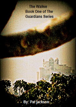
My first read on this is that the title is too small and feels almost like an afterthought. I also have a hard time understanding the imagery. And the black triangle in the top left feels a bit like a mistake.
My guess on it is that it is an urban werewolf story. Is that correct?
A) My first read on this is that the title is too small and feels almost like an afterthought. B) I also have a hard time understanding the imagery. C) And the black triangle in the top left feels a bit like a mistake.
D) My guess on it is that it is an urban werewolf story. Is that correct?
A) I did the font in paint they only have one font and only one size fit in the area.... I figured it was Ok for a mock up not a final product but I'll look into another way to do that asap.
B) Imagery- It is supposed to be a palace floating above the tree tops as seen though tree limbs. Think other worldly.
C) What you call a black triangle is a tree branch, unfortunately the layer that gives it the photo frameish blackening around the edges does kinda make that area look a bit solid. I'm not a photoshop pro.
D) Werewolves? No, not even close.
I'll wait and see what other people have to say. I thought it came out ok for using Paint, Picasa, and PhotoFlexer. I'll look into a font change and maybe see if there is something I can do about that stray branch.
I used a photo of the summer palace in Udaipur, Rajasthan I took from my balcony when I was there last spring.
A) I did the font in paint they only have one font and only one size fit in the area.... I figured it was Ok for a mock up not a final product but I'll look into another way to do that asap.
I can use every font on my laptop in Paint. Go to Tools, then select "Text Toolbar". When you use the text tool, a box will pop up with a drop-down menu for all your fonts, as well as basic formatting.
Sorry to be brutal but as an image it fails for me. It doesn't convey what you seem to want it to. The palace doesn't appear to be floating, I had no idea that that dark line was a tree branch, and there's nothing in it that suggests other worldly. And as an added problem the font size is too small for the title - remember the way readers will see this is as a thumbnail.
My thoughts would be to i) if you want a floating palace, paint a floating palace. Make it clear that that's what it is because you have only seconds to grab a potential reader's eye and make him wonder. ii) Increase the font size for "The Walker" so that it can be read in thumbnail. The rest of the tet isn't so important. Also play with the fonts to find one that matches the theme of your book. iii) get rid of the branch or else make it clear that that's what it is. iv) Play with the colour palette to add some sort of mood to the image. A colour scheme that says otherworldly or at least not this mundane one.
Sorry to be brutal but as an image it fails for me. It doesn't convey what you seem to want it to. The palace doesn't appear to be floating, I had no idea that that dark line was a tree branch, and there's nothing in it that suggests other worldly. And as an added problem the font size is too small for the title - remember the way readers will see this is as a thumbnail.
It doesn't work for me. The cover has no focus. That tree branch/frog hand is more annoying than compelling, and that I can't tell what it is defeats the purpose of having it. The text is lost on the top. And the trees glow brighter than the building, which detracts from what should be the focus. Take a look at the cover for BEAUTIFUL RUINS by Jess Walter which does something similar, but in a more vibrant way.
 Auror
Auror