• Welcome to the Fantasy Writing Forums. Register Now to join us!

Final Draft of Cover

Harbinger

Troubadour
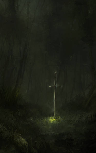
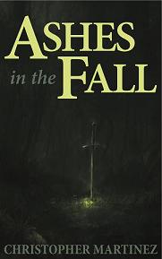
The artist I've been working with just sent me my cover. I think it came out pretty good. One step closer. Once I figure out how to add lettering I should be on amazon by the end of next week!


e-bookcoverfinal625x1000pix_.jpg
 

Sparkie

Auror
Very nice.

In case you're interested, Black Dragon had a thread started awhile back that discussed what fonts to use. There were, as I recall, some very helpful links in a couple of posts there.
 

Telcontar

Staff
Moderator
Nice. Only critique I can give (from the point of view of someone who has released a number of ebooks) is to enhance the contrast. Make the sword stand out more brightly against the background. It will help draw the eye of somebody skimming through a page of thumbnail images.
 

saellys

Inkling
Beautiful! I agree with Telcontar, but with the caveat that you should ask the artist to alter the contrast himself so you'll get the highest possible image quality. This has the added benefit of not pissing off your artist. I was once commissioned to create a score for a short animated film, only to find out that the film's director took the audio I sent him and sped it up by a few bpm in whatever crappy audio software he had. I'd used a pair of zil for percussion, and got a wonderful tone out of them, but that was gone in the version he used. My mandolin sounded like it was made of plastic. I considered asking him to take my name off the credits.

All of that is to say that the artist himself can make alterations and still give you a finished product that represents himself and you beautifully, so if you want some minor color and contrast tweaks, ask him first.

Also, I'd like to see what you can do with text over the image as it looks now--I really like the subdued nature of it (which I expect was what you requested and what the artist intended), and I think there's not enough of that in the world of eye-popping book covers nowadays.
 

Harbinger

Troubadour
Ya it came out a little dark I'll ask him and see what he can do. This will more or less be the final draft of it I think:

EX1_psd.jpg
 

lawrence

Troubadour
Quite good, but I think it would be better with more of the background showing, giving a mood of the forest. Maybe the contrast adjustment will sort that. I like the greenish light in the ground where the sword is standing. You may need to increase the font sizes, the amazon thumbnail plays havoc with titles.
 

Steerpike

Felis amatus
Moderator
I think Lawrence is right that you might want to increase the font size. Also, the bright green where the sword is sticking into the ground might make a good color for the text (you could even outline it in the gray you are using, or have gray with the green outlining).
 

saellys

Inkling
Yeah, that bright green would be lovely for the title text, and maybe split the title over multiple lines when you enlarge the font, so it would be like:

ASHES
IN THE
FALL

You could make "in the" a smaller font size too. Play around with staggering the words a bit--the sword is slightly off center, so they can be, too, to make it a little more dynamic. Symmetry is overrated. ;)

Otherwise, it's gorgeous! I look forward to reading it.
 
Hi,

It's a nice image but maybe a little too sombre. It needs some life too it. I'd ask the artist if he could maybe up the light green around the ground where the sword is to make it more dramatic. As for the text, powerpoint does a good job, however I wouldn't use the light grey colour. It needs to stand out and be easily read by the viewer in thumbnail.

Cheers, Greg.
 
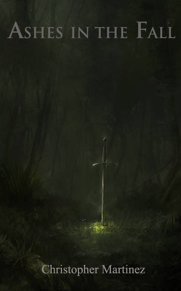
I your title up on Amazon and the font on their site is perfect. The key words stick out and are big enough to grab people's attention without robbing from the cover art. Good stuff!
 

Harbinger

Troubadour
Oh yeah the cover was changed once more haha. Props to saellys for the design.

e-bookcoverfinal01_3_psd.jpg
 
Last edited by a moderator:

saellys

Inkling
i meant ^saellys sorry wrong name.

That's me! ;) My services are available to anyone who already has a cover image but needs some typographical assistance. I can also do full cover design with a minimalist, iconic focus. I'll put up a thread over in the self-promotion section once my portfolio is up.
 
Top