• Welcome to the Fantasy Writing Forums. Register Now to join us!

What do you look for in a book cover?

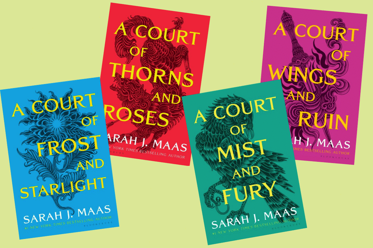
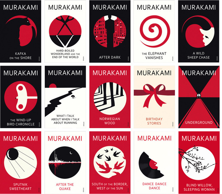
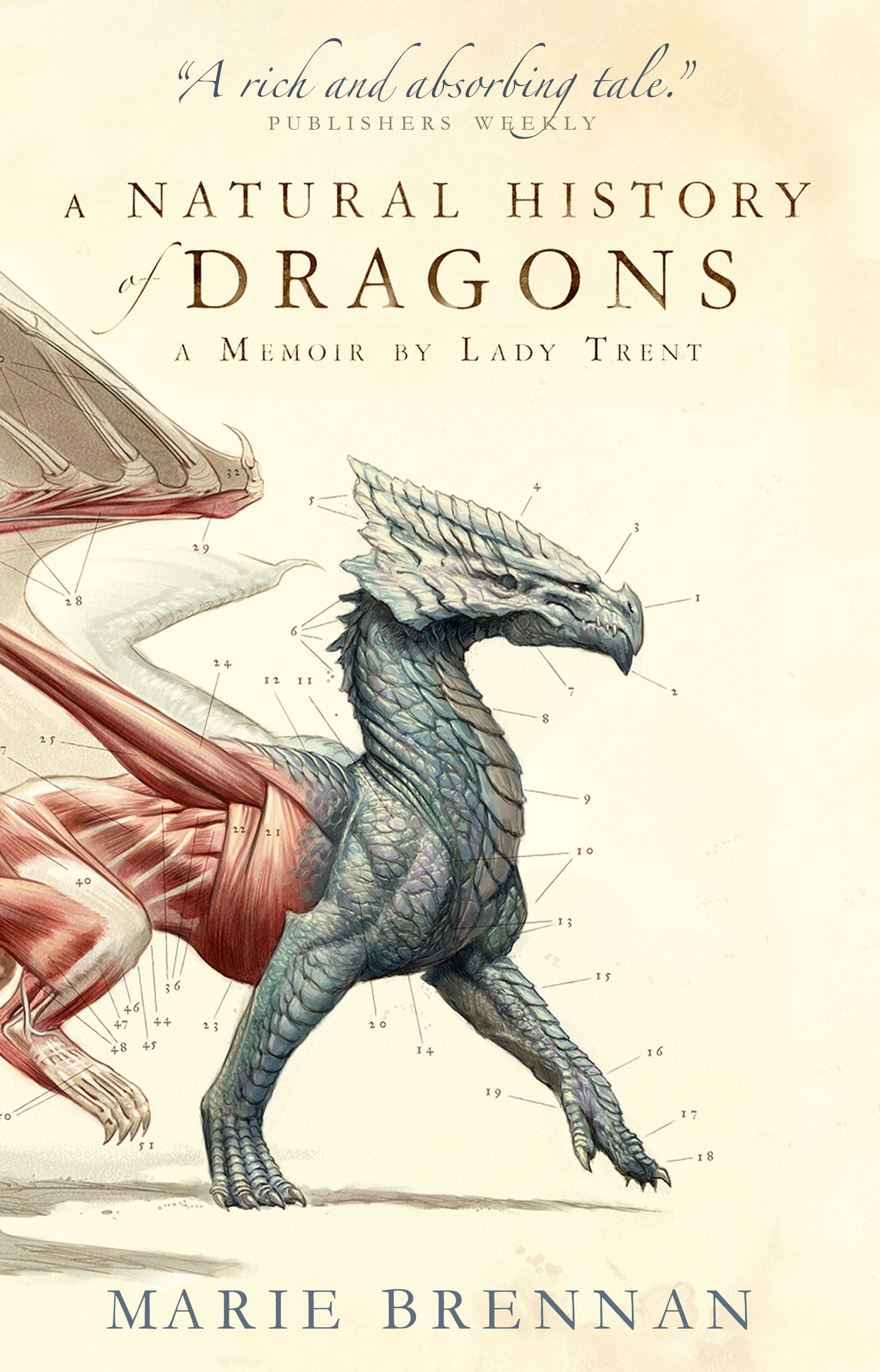
Let’s face it, we all judge a book by its cover! I mean, no it’s not the most important thing, but the designer in me is looking forward to playing around with visuals.

I have some fairytale / fantasy short stories that I’d like to publish online within the next month or so, and I’m starting to think about cover design along with promotional material to go with it. I’m doing everything myself, but I have a professional standard set for the design side of things - (the writing might be amateur) - but I’d like to know what you all look for in a cover design? What appeals to you?
 

BearBear

Archmage
It's absolutely necessary to have one that gives detail and context. They don't do this in adult books but I really miss the little illustrations they put in pre-teen and teen books, like one per chapter is more than enough. Why not do this? Anyway the cover is so important to me that I spent a year learning realistic digital art just to put covers on the books I'll likely never release. I wanted to see my characters for what they really looked like and I did have references. You could say the references kept my writing going. Having hyperphantasia means my imagination is a wonderful tool and to be able to capture that in a picture that's both authentic and aesthetically beautiful was a long and painful process, but I couldn't trust anyone else to do that. I do however understand that not everyone can do this. I tried to help a couple others do the same and well, they couldn't even achieve what I could do at 6 years old. I guess you can't train that kind of knack. Granted in any art class I took, I blew them all away until I hit college art and then I could see I'm a small fish after all. I have tallent, others have talent, style and effortless form. What took me 20 hours they punched out in 20 minutes. Anyway it's very important to me to have a good cover. Especially if you can capture the main protagonist(s) in it.
 
Last edited:

pmmg

Myth Weaver
Funny, I was just talking with someone else about starting a thread like this last night.

I think that book cover is super important, as it is the most effective marketing tool your book is going to get. And looking it up, there are a number of pointers artists would give, such a 70/30 rule for contrast, having things a little off center for vision interest and all that. There is also a lot of technical pieces too, cause its not just the front picture. Its got to fold over the pages and have the blurb on the back and all that. So its worth having a good tool or a professional's input.

For me, the cover has to have something that advertises the content, has something of visual interest, and something that makes me want to want to see more. For me, characters are almost a sure pick, cause characters are what we are reading for. And humans have a thing for other humans and human faces. But really anything that makes the person looking go 'Oh, that looks like it might cool.' is a win. If that cool things happens to be a pretty face, I think it is more of a win.

I also might suggest, that if one is not getting the sales they want, changing the book cover might be worth experimenting with.
 

Mad Swede

Auror
Book covers vary by country, in that they are related to the culture into which you're trying to sell your book. Swedish book covers are, as an example, generally much more restrained than those used in places like the US. The differences can be seen quite clearly if you wander into SF Bokhandeln (the main SF and fantasy bookshop down in Stockholm) and compare the Swedish language books with those in English. So I think you'd want to consider where you hope to sell your book.
 

pmmg

Myth Weaver
Thinking on this more (and having more time to input as I have stopped doing actual work), I find this is a hard thing to answer in a long thoughty post.

The whole book is a work of art, and the book cover should be an extension of the that, as well as a marketing tool. I looked at a bunch, and they vary so much, I find it would have so many subjective variables that I don't think there is a right answer. But...something should suggest its fantasy, something about the tone, and something to make someone want to actually pick it up and look inside. If it was part of a series, I would want a type of theme to it, and I would want it to stand out from all the others.

I think this guy said a good amount of what I would:


But I am going to disagree with him on Tolkien's books, who I always though has some awful book covers. Those middle print books were bad (and were the ones they used when I read them), but he was already famous then.

Somewhere along the way, I found someone talking about the binding, the blurbs, and framing and such, I'll see if I can find it again.
 
I can't speak for anyone else BearBear but I have possibly enough artistic ability to do stick figures or petroglyphs or runes and that's about the extent of my visual arts skills. That's why I don't illustrate anything. I know what my characters look like. I know what their settings look like. I can use words to describe it but if you try to make me draw or paint it, it's going to look like a 2nd-grade art project and might even end up with macaroni glued to it.
 
I'm going to disagree with the idea that a cover is art. Yes, creating it is definitely very artistic, and there are definitely covers as lovely as some paintings out there. But a cover's purpose is not to be art. It is to sell the book.

This means that you probably don't want an innovative and groundbreaking piece of art as a cover. Instead, you want something which follows the conventions of your genres. It needs to tell the buyer the sub-genre of the novel at a glance. It needs to convey the tone of the book and spark interest. It's a marketing tool, and probably the most important one there is.

How you do this very much depends on the book. For some genres having simple symbols on the cover works great. Others might get away with just pastel colors and plants, and still others want a scenery scene with or without characters in it. Also keep in mind that these days it's just as important that the cover looks great as a thumbnail, and not just as a large, printed image. Most books are sold online, which makes the thumbnail important.

An interesting thing here is that what people say they like and what they actually click on can be two very different things. Most people will tell you they want the art covers, simply because their idea is more appealing. However, that's not necessarily what people actually buy. Plenty of people (both traditionally published and indie) have experimented lots with this. And for some genres a few simply symbols actually works best. Just look at some of the Song of Ice and Fire covers for instance.
 
The point you’ve raised Prince of Spires is a good one, the job of any good design is to communicate.

I like to follow the principles that Dieter Rams layed out:

Good design is innovative.

Good design makes a product useful.

Good design is aesthetic.

Good design makes a product understandable.

Good design is unobtrusive.

Good design is honest.

Good design is long-lasting.

Good design is thorough down to the last detail.

Good design is environmentally-friendly.

Good design is as little design as possible.

My preference is for those more minimalistic designs that are clever and eye catching, Noma Bar created some really iconic designs for Murakami, and more recently, Sarah J Maas has been marketed very well. The book cover designs for her ACOTAR series probably do a great job of up-selling what is essentially a solidly mediocre fantasy series. BUT, I do also have in mind that people are also drawn to the more artistic image that perhaps depict a landscape or the main character/s.

Thing is, I’m a graphic designer not an artworker. I think the challenge lies in making an eye-catching cohesive range of both cover designs and marketing tools. An Mad Swede is right in saying that in the States the preference seems to be for more detailed artwork, and it’s similar in the UK for the preference of more minimalistic design - that being said, the platform I’m going upload my work to is North American based and although it has a global audience, I need to keep this in mind too…
 
I also love those little illustrations in children's books, and in some adult fiction just a small image at the beginning of each chapter is something I also love.
 
B2D0626-Hobbit_LordOfTheRings4Books-Yellow-Thumbnail_1024x1024.jpg


d5c3df2184d3e311c1301e7b41a649bc5cd6b1c4.png


82a9b532919399.569875c60e647.jpg
 
I would argue that covers are art. The easier way to break it down is cover illustrations and cover iconography- both are equally art just different approaches to it with differing strengths.

Cover illustrations are very effective for say comics, an already visual heavy medium. They're good for essentially 'what you see is what you will get.'
I would say certain novel covers also count as illustration due to the level of detail put into the subject, say Finch's example of A Court of Thorns and Roses. I would say a A Natural History of Dragons also falls into this to give a comparable example of this. The dragon is detailed yes, but the overall composition and design of the cover is simple and effective for what it wants to showcase about itself. A happy medium between the extremes of illustration and iconography if you will.

Cover iconography would cover the minimalist designs, very minimal covers which are what we see most often. As suggested by Prince of Spires, it definitely is the better way to market, if it's popularity is anything to go by lol, but it also provides a focal point to recognize the series off of. It becomes a benchmark to readers and to those who have not read it, it will still provide distinct enough imagery to be eye catching. Still a form of art, just a different methodology to it.

I'm not particularly picky about covers, all sides of the spectrum are appealing in different ways and I would say it comes down to my own mood in the moment for what I pick.

811jk9HIaSL.jpg
 

Rapturez2002

Acolyte
All points are well taken. I like to also think that book cover art allows us to see through the eyes of the writer. Inspiring us to see the characters or world as they see it. (In a quick way before you actually read the book.) This can be good or bad depending on the art and if it truly captures the essence of the writer's vision.
 

Demesnedenoir

Myth Weaver
Some covers are art. Some aren't. Depending on how you define art. The best-selling covers in the world are probably because of the names on the covers... STEPHEN KING in gigantic letters that dwarf the title, for example, heh heh heh.

I will also nitpick the idea of the cover is to sell the book, its purpose is to get someone to look inside. That's the most the cover is going to do on a regular basis. In fact, the cover "art" will only get me to glance at the cover, it's a combination of the title and cover art that will get me to look inside, and if the author's name is one I recognize. If I buy the book without looking inside, it's because I know the writer's work or have been referred to it by a friend.

I'm not a Maas fan, and probably not even in the target audience, but those covers do zilch for me. I am a Tolkien fan, and those covers back in the day, did zilch for me.
 
A picture is worth a thousand words. People won't turn a book around to read the description or see what the critics have said about a book unless the cover tells them that the book will tick off parts of their mental checklist.

A book cover should convey what time period/ technology age that a book is from. (Space, contemporary, swords)

I think a good cover also conveys action. A picture of an idyllic (or magical) setting tells something about a book, as do the covers where the main protagonist is staring back at you. But when you make a scene with action, you get the reader to 1. wonder what will happen next, and 2. Interpret the image as a short space in time rather than a static picture. This let's a single image count for several. And if a picture is worth a thousand words, you can have an entire foreword packed into good cover art.

Putting elements of the book's subgenre, as had been mentioned, fall right in line with this.
 

skip.knox

toujours gai, archie
Moderator
I can't really say I look for much of anything in a book cover. Some catch my eye and some don't, and that's about all the thought I give.

OTOH, I do put some thought to *my* book covers. There I think about what key element I think would work best as an illustration. First priority is that it needs to communicate genre. Second priority is that it not mislead in some grievous way. Third is that the title and essentials of the illustration be visible in a thumbnail. Beyond that, I try not to pick nits. I'm satisfied with my artist(s) and think the covers do their job. I ask no more.
 

Demesnedenoir

Myth Weaver
The interesting part, after all the details people throw in, is that when you look at the Big Five and many of their covers, you see little to none of this. One of my favorite digital covers is for Apple's special edition of Game of Thrones. Even without the name or author, if I saw that cover in a store I'd stop to look. It doesn't convey genre, subgenre, or much of anything except a lone wolf walking toward you with footprints in the snow and trees on the horizon in the background.

The ebook era has changed things up, but in the end, the cover is only one thing if it works... A foot in the door to a sale.
 

Svrtnsse

Staff
Article Team
I look for two things:
1. Does the author take the cover seriously? Does it look professional, with nice graphics and typography, or does it look like they just grabbed an image they liked and put some words on it, without considering what it says about them or their story. I'll definitely judge an author by their covers.
2. Does the cover indicate that the story hidden within is the kind I'm interested in reading at the moment? I'll judge the book by the cover as well.
 

Mad Swede

Auror
Covers might be art, but first and foremost they're design. They're part of the image we as authors are trying to convey to the public, they say something about what we write and who we are. The cover pulls potential readers in, gets them to pick the book off the shelf and open it. After that it's what we've written that matters.

As my publisher put it, that cover on your very first published book is important. That's where you as the author start to establish yourself. And you need to think it through, because it becomes part of the marketing for your writing. If you're writing and publishing several books you'll want a consistent style to build your image and profile over time. I've learnt that it helps if you work with the same designer, because it's like working with your editor - you need to know each other and what drives each of you, and you need to trust each other. The discussions you have about the cover design need to be open, because that's when you produce a design you both feel suits the book.
 
Top