• Welcome to the Fantasy Writing Forums. Register Now to join us!

Some Thoughts on a Cover Idea

tlbodine

Troubadour
I'm getting professional art done for my big Event Book, and plan to pull out all the stops for a blog tour and all sorts of promo for it when it comes time for release this fall. In the meantime, though, I want to release a smaller, quieter book. The kind of book that has a small niche audience and doesn't really need all that fanfare.

So, I'm doing this cover by myself.

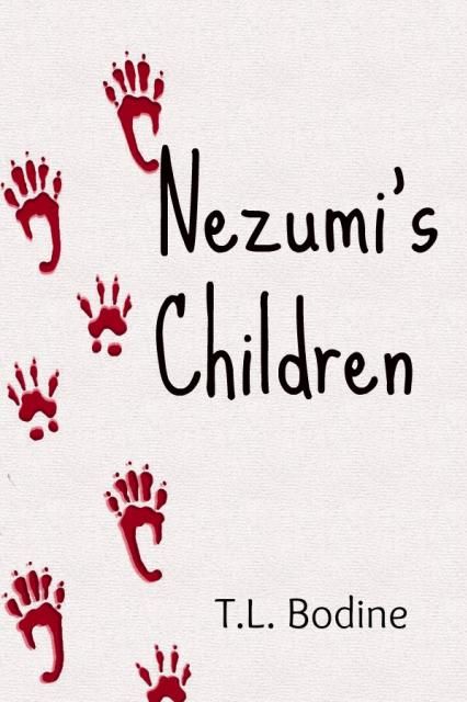
The book is called Nezumi's Children. It's sort of a feminist response to Watership Down, or a more adult version of the Warrior Cats, but with rats. The pitch is: Abandoned by the humans they once worshiped as gods, the rats of Rocco's Pet Emporium must learn to survive on their own against natural disaster and the murderous Wild Ones.

It's something of a survival/disaster adventure. It deals a lot with questions of religion -- "What do you do when your gods have abandoned you?" -- and issues of family.

Anyway. For the cover, one of my primary concerns is making it clear that this isn't a kid's book (talking rats notwithstanding, there's a fair amount of violence, some of it sexual, and this book doesn't pull any punches). So to signal the somewhat older/more sophisticated target audience, I thought a more symbolic/representative cover might be the way to go.

Here's one very tentative treatment I thought up. This is just a draft obviously:

NezumiCovertreatment_zps73986c01.jpg


Now then:
-- Any font suggestions?
-- I'm considering making the background have sort of a linoleum-ish texture, if I can find a good one. Or would plain white with a thin border be better?
-- Would it be better to make the paw prints smaller and more frequent?
-- I'm working on tweaking the effects to make the prints look a little bloody/smudged.

In general, does the "line of pawprints" work? Or should I just scrap this line of thinking and go for something else?
 

CupofJoe

Myth Weaver
I'm not a professional [but i have done a little image prep for academic publishing] but I feel that the linoleum effect will get lost [or worse - look like a jpg compression effect] when seen smaller.
In general I like the title font [for it's childish aspect], the layout [walking bloody paw prints - always nice to see and the blood is a nice colour] and overall look.
I will leave it to those with experience to give a more detailed critique.
 
I like the idea of the bloody foot(paw?) prints, but the first thing that jumps out at me is the font is way too friendly. Yes, I think the prints might look better smaller, but not necersarily more frequent. Other than that I'm afraid I'm not much good at cover critique.
 

rhd

Troubadour
The paw prints work, and would work better on linoleum, don't use the current background, it also has a tiny pencil mark in the left corner. The paw prints also look a bit blurred instead of smudged, did you do two stamps/layers of the paw print?-- unless it's deliberate I suggest making a clear shape as currently it doesn't give the implied effect of movement and speed, which is what you're going for right? because it will look like a bad quality print in your hard copy, meaning actual paper.
Now, suggestions for improvement. Your story is about rats, so the childish scrawl font, while it would work well in a situation where there are human children like the creepy kids in horror movies, it doesn't apply as well here. Your paw prints can easily gel with a grungy slashed/ripped font, giving an idea of the adult elements of conflict and violence in your story, like the rat has walked across the font itself, damaging it. If you can't do it yourself, I'll see if I can help...but you'll have to give me a few days.
 

tlbodine

Troubadour
I'm not planning to release til July, so I have all sorts of time :)

I knew the font was the wrong choice, I just sort of dumped it on as a place-holder. That's an interesting thought about a slashed/ripped/maybe industrial font choice. I'll have to do some searching to see what I can find.

Thanks for the feedback so far, guys. Happy to take more suggestions and tinkering.
 

Nihal

Vala
Often I look at the proposed covers before reading the author's post so my first impression will be impartial.

The first thing that caught my attention were the different kind of footsteps mixing. They make me think in an animal on all fours with different shapes for frontal and hinder legs, but even if they were this way they wouldn't produce this type of track, because the footsteps would overlap at some points—animals don't avoid walking on the tracks made by their frontal legs.

The second is that the footprints look as if pressed against the paper. I agree with rhd, they should be smudged, also, if it's blood there would be some drops too, which could even infer the speed the creature was walking for high velocity drops look different from the ones made by a stationary source. Here, two ps brushes packs that may help you: Blood Splatter Pack by ~nathradas on deviantART Blood Marks brushes by ~env1ro on deviantART

I've not used them but they look like they have what you need. Oh, and don't forget the footsteps wouldn't be perfect: think in a drying stamp. The more you use it without reloading, worse will be the result; it's not a ball pen with an unlimited supply of ink.

About the typography, I also agree it can help to show how your story isn't a story for children.
 

tlbodine

Troubadour
Maybe I'll go with my original plan of non-toxic fingerpaints and my rats in a bathtub with a few sheets of paper ;) If nothing else, the results are sure to be amusing.
 

Addison

Auror
The gentle font does give the book a gentle feel. The size and placement is good, just the font that needs changing.

The foot prints are a nice touch, but I don't think that's how rat-tracks really look. I don't know, they might, I don't spend a lot of time with rats.
 

Ireth

Myth Weaver
I'd make the rat prints red rather than pink, more of a bloody color, if you're going for an adult, darker feel. Also, Addison has a good point about the font.
 

tlbodine

Troubadour
I sat my rats down in the bathtub today with some paper and fingerpaint. They found this entire adventure to be much less amusing than I did, and I'm relatively certain they believed I was trying to murder them. I placated them afterward with french fries.

In the process, I did learn a few things about the way they walk. Primarily that they never walk in straight lines, especially when they're panicking about being in a horribly scary empty bathtub, and that they really hate getting their feet dirty and thus will avoid walking anywhere near the paint. So helpful, these rats ;)

On a completely different note, how do we feel about this piece of stock art?

can-stock-photo_csp9316011.jpg


In the book, the rats have two primary facets of their religious beliefs. The first are concerning the Great Ones, aka humans. The second is their belief in a spirit realm, a place where the souls of every rat that has ever died lives on and contributes its knowledge to them. It's how they explain away instinctive behaviors, and certain rats are believed to be able to speak directly to the spirits.

So I really like this particular piece of art because it has a sort of spirit-ish feel, and also something a little tribal. I could either center it or off-set it over in the bottom-ish lefthand side and keep the text aligned to the right.

((I might just buy this stock anyway, because this could be a sweet design for my next tattoo....))
 
Last edited:

rhd

Troubadour
It looks like a harmless animal on its haunches, not the fierce look you were originally going for, but the spirit like aura you want now is definitely there. It's just not as recognizable to an outsider as a rat, at least not to me. Perhaps you can alter a few features or add them after buying it. BTW have you googled 'rat tattoos', some intense stuff out there...
 
Last edited:
Top